Photo Notes A place to talk about making images.

October 1, 2013

Bike Shot in the Studio

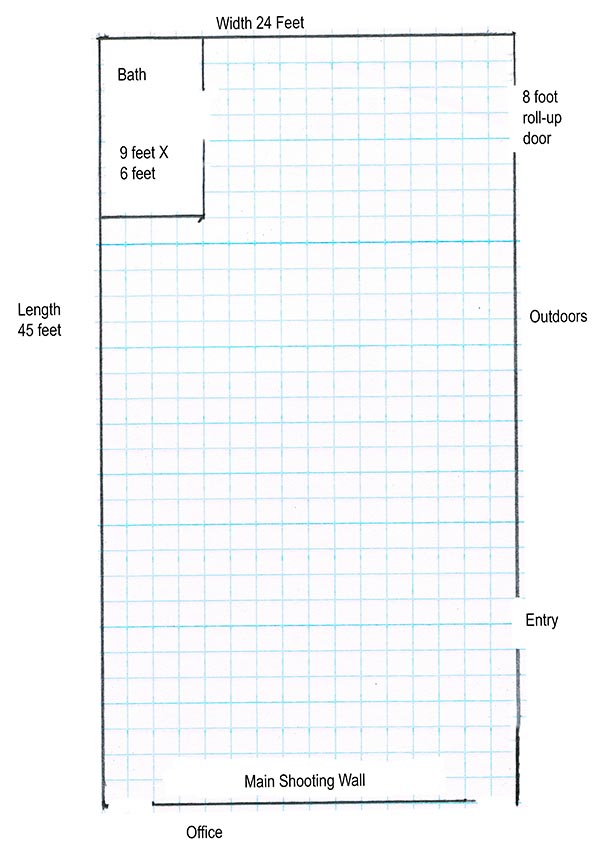
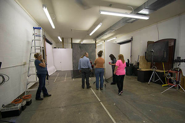
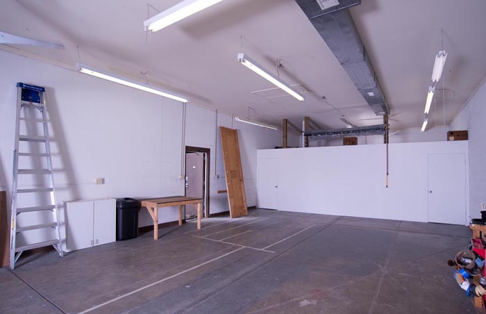
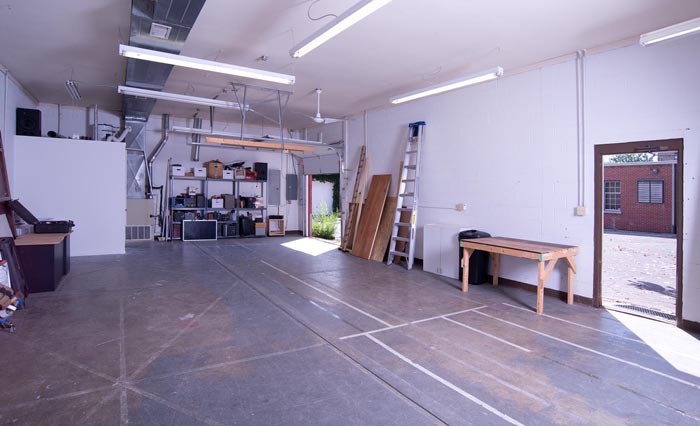
I’ve been working on the studio, no surprise there. I’m finally happy with the current situation, while there’s more to do, it doesn’t have to be done now. I’ve moved in the lights: 20 or so strobes, another half-dozen quartz lights and an armful of projectors. I think I have 10 tripods, not sure how that happened. Booms and light stands, umbrellas, soft boxes and light panels, and all the things that come from a life spent in photography. Of course the important thing now is to get the studio busy. That means shooting, and I just got a couple of new customers! I also want to rent out the studio and offer classes here. What I want to do in this blog is to show you the studio at work, shooting and teaching. Ginny Taylor-Rosner brought a few of her advanced student from Ivy Tech in for a motorcycle shoot. This entry has a lot of large shots; I hope you will follow it to the end. Here’s the studio plan:

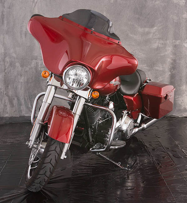
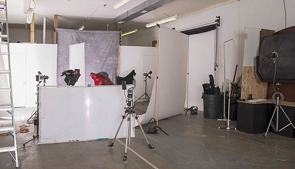
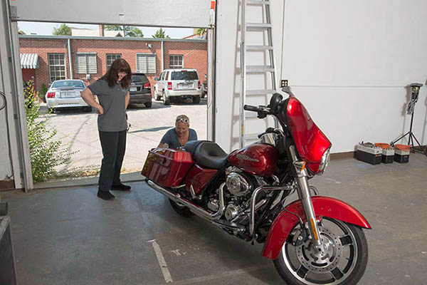
It’s easy to get large subjects into this studio, as you can see. I used a gray muslin on the back wall and black plastic muslin on the floor, so the set was really inexpensive.

The first thing I did was pull down white seamless along the side walls. I installed seamless holders on the side walls so that I could use them for very large reflectors with white paper, and so I could pull down black paper to reduce bounce light. It worked really well in this shot. In the shot marked Side Lights I only have the lights that are on the side seamless on, not the light on the front seamless. The light on camera left was placed at the front of the seamless to rake across the paper. This creates a very big light source. On camera right I place a light set at 750 watt-second at the back of the seamless. It spread across the side seamless and onto the diagonal seamless.

I put another roll of seamless on a pair of seamless stands on a diagonal in front of the bike. Once again I used a strobe raking across the seamless to give me a big light source. This light was set at only 400 watt-seconds. You can see what this light added in the image marked Front Light. This image has the all three of the large light sources. It’s important to have barn doors on the lights when you are bouncing light off seamless paper. The barn doors keep the light from spilling directly onto the bike and the background. I had to use cine-foil, black aluminum foil, in addition to the barn doors, for the front light because of spill light.

Only the light on the diagonal seamless.

I made some small changes in the position of the lights that rake across the paper. It’s much easier to move the lights than it is to move the bike or the paper. We also moved in a gobo (large black light panel) at the back of the bike to make the light on the saddlebag more even. Then I put a bare bulb light set at 200 watt-seconds, covered with a pale lavender gel, behind the bike. This added the highlight below the bike and put a little color into the background. If I’d used a darker background we could have added more drama with this light. This shot is marked Last Light.

Added a small strobe behind the bike. Bare bulb with a gel.

In this shot, Final Set-Up, you can see the position of most lights in the set. I added the light panel in front of the bile late in the shoot. It helps to open up the tire and to even some of the reflection on the front of the bike.

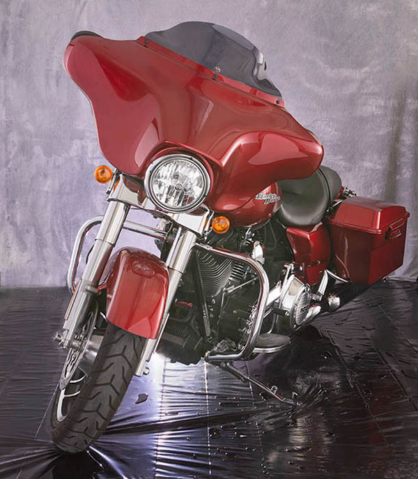
I was a little concerned about the density of the engine and the high light from the light behind the bike, so I made a couple of bracketed exposures. I used these captures to give me a little more control over these areas by using them as layers in Photoshop. I did a few other quick touch-up to make my Final Image.

Thanks for visiting the studio here in the blog. If you’re in Indianapolis give me a call and come by 317.473.0406. If you need to rent a studio I’m ready. Special price for October: $275 for the day! I hope to have classes available in the next few weeks. If you need a private session let me know as well. The Portfolio Class is meeting on TUESDAY OCTOBER 15. This class will help you present your work. There’s more information, and a sign-up link here. I hope to see you soon!


Here are a couple more images from the shoot!

Shot by Terry Pitman

Don’t forget about the classes at BetterPhoto and my books!
: An Introduction to Photographic Lighting
Portrait Lighting on Location and in the Studio
Getting Started in Commercial Photography


September 3, 2013

The Studio is Open!

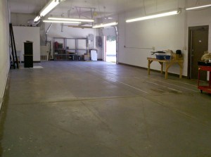
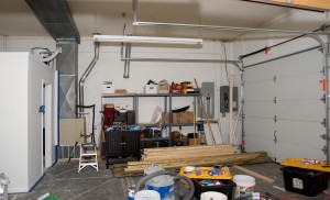
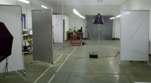
I’m going to keep thins simple in this entry: just a bunch of pictures of the new studio. It’s possible to shoot here, but not everything is put in the right place yet. The shooting space is about 42X24 feet, pretty damn large. The background holders are up. I’m going to put some more holders on the sides so that I can pull down white or black to add or subtract bounce fill. I need a little help to finish, some things are to big to lift. If you’re local maybe you could help me out, or help with a shoot. I’m trying to set up a shot of a Mini-Cooper, maybe for this weekend. You can also arrange to drop by and have a look. Thanks for your attention! I’ll just remind you about the BetterPhoto classes: An Introduction to Photographic Lighting, Portrait Lighting on Location and in the Studio and Getting Started in Commercial Photography and the books:


The shooting wall. You can see the background holders above the wall.

Another view of the shooting wall.

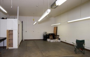
The back of the studio. You can see the cargo door.

This is the outside. It's a separate building. There is parking, particularly on evenings and weekends.

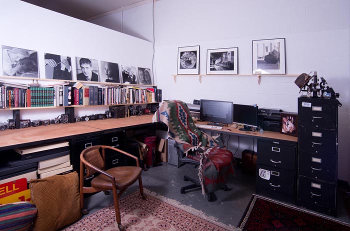
My office. I'm very happy about the way it turned out.

August 13, 2013

Building the Studio

Filed under: Indianapolis — John Siskin @ 10:34 am

My new studio is coming along. I’m adding a few notes about the process. First, I’ll just remind you about the classes: An Introduction to Photographic Lighting, Portrait Lighting on Location and in the Studio and Getting Started in Commercial Photography and the books:


I just wanted to add a few notes about the new studio. There are a lot of things to arrange, as you can imagine. I’ve got the utilities set up. I had to pay hundreds of dollars in deposits to do this. I also got business insurance. Right now I just have liability insurance. I’ll have to do an inventory of equipment pretty soon. When I do that I’ll also add pictures of the equipment that should be in each case, so I can make sure I take everything back from a location shoot. I’ve also arranged a decent internet hook-up, which you can imagine is important.

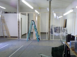
This is the wall that will define the offices. Note the posts to hold backgrounds.

I’ve included pictures of the construction. The first thing that needed to happen was rebuilding the bathroom. It’s finally finished!! The landlord paid for this. I’m also getting a couple of walls built to create some office space. I’ve built walls myself over the years, but I wanted them to actually look good. I’m paying for this part of the construction myself. Photography is a business about images, and I want the studio to have a good image! The pictures are all of the construction; no prizes will be awarded for guessing which one was taken with my phone.

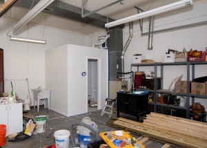
The bathroom is finished!!

I’ll need to do a few more things. First I’ll need to arrange background rollers. You can see that there are some large posts that are being built into the wall. These posts will be for the seamless rollers. I’ll also upgrade my computer and monitor before I finish with the office. I want to move some of the fluorescent lights out of the way as well. I’ll build a box around the shelves in the back; lots of little things need to happen.

Before the office wall was built. The small office on the left side of the shot was already in the studio

The shelves are already starting to fill with equipment!

The portfolio class will meet again next week. If you’re in the Indianapolis area I hope you’ll consider joining us! You can find more information at the workshop page on my website: http://www.siskinphoto.com/Workshop.html. The class will meet at the studio. There’s plenty of parking, at least in the evening. This class exists to help you create a more coherent body of work. Please remember the classes and the books!
An Introduction to Photographic Lighting

Portrait Lighting on Location and in the Studio
Getting Started in Commercial Photography.


August 4, 2013

Using the Studio!

Filed under: Indianapolis,Lighting Technique,New Studio! — John Siskin @ 1:00 pm

I’m back a little quicker this time around. I’ll just remind you about the classes: An Introduction to Photographic Lighting, Portrait Lighting on Location and in the Studio and Getting Started in Commercial Photography and the books:


Three different one light set ups in the new studio. Taken with my phone.

Things at the studio are progressing nicely. I had a group over from the Irvington Photo Club. I gave them a chance to play with a couple one light set-ups. I’ve included a couple of shots of the set-ups I took with the phone. I also did some consulting with a couple of other students that wanted to work with portrait set-ups. So a couple of people have seen what’s going on at the North Delaware Studio. I am still taking suggestions for studio names.


One soft box 3X3 foot. Positioned above and in front of the subject.

I can’t say anything is finished. The bathroom is going to be rebuilt, which is a really great thing. I’m going to be building a couple of offices at one end of the space, another nice up grade. I brought in some industrial shelves and put them at the back of the studio. I’ll enclose them in a few days. This will give me a place for lights and cameras. I’ll store the light stands in trashcans, probably at the back of the studio.


The goal is to have a large empty space. The whole studio is about 24X60 feet. When I’ve finished the shooting space should be 24X40, or close to that. There’s a roll up garage door at one end of the studio, which is really useful.


A set-up with a snoot.

I did three set-ups for the Irvington Photo club. The first one is a 3X3 foot soft box placed in front and above the subject. This is an easy light to set up. It gives you soft shadows under the nose and chin, which gives some shape to the face. The second one was a hard light set-up using just a snoot. This gives dramatic light, but the position of the light is really important. Finally I did a set-up with three light panels. This is a set-up I use frequently because it provides such nice soft light. I wrote about this light design in this article: www.siskinphoto.com/magazine/zpdf/Portrait.pdf.


I used the light panels the next day, with two

I did a one light set-up with two light panels.

students, and I added a bare bulb light behind the subject. In this case the bare bulb light, as well as the light from the umbrella, bounces off the reflector. In addition you get rim light and hair light from the bare bulb. So both lights are doing a lot of work in this set-up. One more thing: the bare bulb light puts light on the background. I put a warm gel (Rosco full CTO) over the back of the bare bulb light, so the light going forward had a daylight balance, but the light on the background was a tungsten balance.


I hope people are interested in these posts, but

With the light panels and the bare bulb

I really don’t know. If you want to leave a comment you have to log in. I’m sorry about that, but I was getting a huge amount of spam posts, so I had to change to registration. If you’d like you can send me an e-mail with your comments, john@siskinphoto.com. Also please remember the classes and the books!
An Introduction to Photographic Lighting

Portrait Lighting on Location and in the Studio
Getting Started in Commercial Photography.


July 24, 2013

Comparing Lights

Filed under: Lighting Technique,Photographic Education,Photographic Equipment — John Siskin @ 4:47 pm

It’s been a few weeks since I caught up with the blog. There has just been a lot going on. I’ve been trying to get the studio open. I’ve got a new client, and, oh yeah, my wife and I bought a house. I’m cheating this time around because most of this entry is an answer to one of the students in my class: An Introduction to Photographic Lighting . I hope you’ll take this class or one of my others: Portrait Lighting on Location and in the Studio and Getting Started in Commercial Photography. I have to remind you about the books as well.


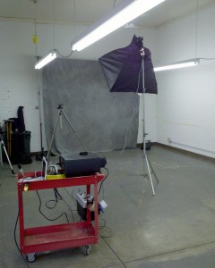
Anyway, this is a picture of the studio today. My goal is a big empty space, and well it’s big and empty right now. I’ve got utilities, which is important. I also have business insurance. I got insurance from a local broker because it was quick. I’ll be reevaluating my insurance in the next few months. I still need to do an equipment list. The most important thing is to have liability, and that’s covered. The rest of the pictures in this entry are taken with at least one projected light source, which I’ll mention again below.
The problem with the built in strobe on your camera (you can call it a flash if you must) is that it’s right on top of the lens. There are few situations in which your world is lit by a light right over your eyes: miners’ helmets do this and a few flashlights. Still nobody ever said it was good light, just convenient. And because it’s easy to do the camera manufactures put it into your camera. I think the only thing it is good for is flash fill, and there are a lot better ways to do flash fill.

It’s extremely difficult to understand how lighting gear compares across brands and types. I’m going to try to explain why. First I’ll mention how light is used, and what you might want to compare. There are three types of light: hard light, soft light and projected light. The first two are covered extensively in my Introduction to Photographic Lighting class, but I need to mention a couple of things. Projected light isn’t in the class for good reasons. But I will say a few things about it here. Also I’m going to try and attach some projected light shots. Hard light is light from a small source. It acts like direct sunlight: hard shadows and a lot of sparkle. You create this by using direct flash with out diffusers. Because you aren’t using anything to make the light into a larger softer source you can often get by with a strobe that doesn’t have much power, like the built in strobe. You can make very interesting and dramatic light with hard light, but the position of the light is critical. Position is the big problem with the built in strobe. When you make the light source bigger, with a light panel, soft box or umbrella, you’ve lit the subject from more angles, which makes soft light. This softens shadows and makes a smoother transition from light to shadow. An overcast day is soft light: light comes from the entire sky and there are few shadows. Large light modifiers inevitably absorb a lot of your light. In addition they leak light into places you don’t need lit. As a consequence you’ll need more powerful strobes to make very soft light. You should remember that it is the size of the light source that is important, not the type of light modifier. So a 60-inch umbrella will always be softer than a 30-inch umbrella at the same distance from the same subject. A large umbrella and a large soft box give similar light if they have similar surface area. Of course you can have a light is softer or harder depending on the size and the distance from the subject.
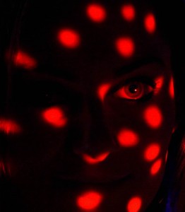
Projected light uses a lens to focus the light, or an image, onto the subject. A simple source for projected light is a slide projector. This article shows how projected light can be used in a shot. There have been very few strobes made that created projected light; one of the few was the Tri-Lite by Norman. I have done some experiments with using strobe for projected light you can see them at my blog: here and here.  Projected light can light very small details, but it does require considerable attention to detail.

You should understand from this that creating good soft light requires considerable power, and the more tools (light modifiers) you can work with the better. Large modifiers, like umbrellas and soft boxes, will fit many different units. Small modifiers, like barn doors and snoots, are usually designed for a specific strobe.
So the next thing to consider is where does the electricity that makes the light come from? If you are using mono-lights then you’ll be using AC power: wall current. The full-power recycling time on your strobes will stay the same all day and all night. If you go where you can’t plug in there are batteries, or you can use a generator. While generators are heavy, you can refill them quickly, which is important for big shoots. Battery strobes are obviously necessary for events, like weddings. They can also be very helpful for architectural lighting because you can hide them and you don’t need power cords. Recycling times depends on how fresh the batteries are, and what kind you use. Manufacturers often lie about recycling times; which makes it tough to compare this critical feature. The basic problem is that batteries put a low limit on the number of shots you can make without more batteries, usually around 200 full power shots. Also extra batteries add weight. There are mono-lights available that have much more power than battery powered units. If you have special needs for battery powered units you might check Lumedyne strobes. They make gear that can be customized in interesting ways.
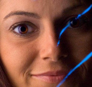
There are basically three methods for controlling exposure with a strobe. The first is manual, and if you have time to set-up the lights, this is undoubtedly your best choice. You need to use your eyes to design the light, to perfect it for each subject. If you depend on formulas or auto systems you can easily get a perfect exposure, the right amount of light, but the light may have the wrong placement and balance. The human eye/brain is much better at designing light to fit a subject than any meter. An important goal of my classes is to help you to visualize good light for different subjects. Mono-lights are manual lights. The problem with manual lighting is that it takes time to get it right. The second system is a strobe with a built in meter. These do not use the camera meter; they just specify the aperture the camera should use. They are quicker to use than a manual strobe. Actually these are pretty good and cheap. I use this sort of equipment when I need to shoot an event. The classic Vivitar 283 has this sort of automation, so do a lot of Metz units. I’m using Sunpak 120J units that controls light this way. I’m not sure who makes these strobes currently. Finally there are dedicated strobes that meter through the camera. These are very accurate at creating the right amount of light, although, as noted above, that doesn’t mean the light will be designed well. These units are expensive, considering the amount of power they provide: $550 for a Canon 600EX. Several units can be used together, and still metered by the camera. All of this makes these units very good for weddings and other events. You can use them for other types of lighting, but I don’t think they are the best choice.
I want to talk about the problem with discussing power. You can check out this article, although it isn’t my favorite. Basically a strobe with a built in reflector like a Canon 600EX or a LumoPro can be compared with another strobe with a built in reflector pretty accurately. However mono-lights and studio strobes take a large number of different accessories, even different heads, so you can’t do an accurate comparison between them or between mono-lights or studio strobes and strobes with built in reflectors. Some of the manufacturers of various strobes will inflate their numbers. The article describes how to determine a guide number and what watt-seconds are.

I just now mentioned studio strobes. Basically these do what a mono-light unit does, but you have to plug the head into a separate pack and then plug the pack into the wall. These are not battery packs: the unit still needs to be plugged into the wall. The packs create the high power spark for the strobe heads. Usually several heads will plug into one pack. These can be very economical to buy used. I have Norman 900 series strobe units, some of which, I’ve used for more than thirty years. Keep in mind that strobes can last quite a long time, so if can make sense to invest in good equipment. We’ll probably still need lights to design better pictures in another thirty years.

I hope people are interested in these posts, but I really don’t know. If you want to leave a comment you have to log in. I’m sorry about that, but I was getting a huge amount of spam posts, so I had to change to registration. If you’d like you can send me an e-mail with your comments, john@siskinphoto.com. Also please remember the classes and the books!
An Introduction to Photographic Lighting

Portrait Lighting on Location and in the Studio
Getting Started in Commercial Photography.

June 25, 2013

Building: Birth, Decay Renewal

Filed under: Indianapolis — John Siskin @ 10:47 am

I hope you’ll check out my books: Photographing Architecture and Understanding and Controlling Strobe Lighting. Please get copies, if you haven’t already. Of course you know that one reason for this blog is introduce the books and get you to consider one of my classes at BetterPhoto.com: An Introduction to Photographic Lighting, Portrait Lighting on Location and in the Studio, Getting Started in Commercial Photography

This is just a short note to remind you that you have just a few more days to see The show Buildings:  Birth, Decay, Renewal  at Indiana Landmarks. I did this show with Ginny Taylor Rosner, and it turned out very well. You can see a video version of the show below, but I hope you’ll see the real thing. A more substantial entry soon!
Thanks, John

Video Link: Building: Birth, Decay, Renewal

Please check out my classes at BetterPhoto.com:

An Introduction to Photographic Lighting,

Portrait Lighting on Location and in the Studio,

Getting Started in Commercial Photography

May 30, 2013

Print Types

I hope you’ll check out my books: Photographing Architecture and Understanding and Controlling Strobe Lighting. Please get copies, if you haven’t already. Of course you know that one reason for this blog is introduce the books and get you to consider one of my classes at BetterPhoto.com: An Introduction to Photographic Lighting, Portrait Lighting on Location and in the Studio, Getting Started in Commercial Photography

The second portfolio class was great. Please let me know if you want to be on the mailing list. Here’s some more information the next meeting is Tuesday June 18, 2013, 6:30 pm. We may be meeting at my new studio. Stay tuned for more about that! The class is a great opportunity to make a greater commitment to your work and learn more about how others see your work. Still only $20. I look forward to seeing you if you’re near Indianapolis.

I’m going to discuss the kinds of prints I’ll be using in my show at Indiana Landmarks. The opening is on June 7 at 6pm. I hope I’ll see you there! For more information check this link. Most of the images in this week’s blog are going to the show at Landmarks. Please keep in mind that images on your screen aren’t good representations of what real prints look like. The images are linked to the fine art part of my website, which you can use to buy a print. The prints available on my website are made on the Moab Entrada rag paper discussed below.

I’ll start with silver gelatin prints because in many ways they’re my favorites. These were the most common black and white prints for most of the twentieth century. The black part of the image is silver and the emulsion is made of gelatin, which is probably the reason for the name. One of the most beautiful aspects of these prints is the bright whites created by a layer of barium clay called baryta. This layer is on most prints made on a paper base, usually called fiber based paper. This layer was replaced by a titanium layer when resin coated papers were introduced. I think resin papers aren’t as beautiful because they don’t have the baryta layer.

Fiber based silver gelatin papers are still available ready to use. The prints are exposed in a darkroom with an enlarger. Processing time is over an hour; most of this is wash time. If the prints are properly handled, particularly given through washing, they will last for at more than a hundred years. There are many examples of prints that have lasted longer than a hundred years. The photographer has considerable control over the print; in addition to changing density the photographer can also change contrast tone and local density.

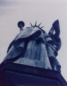
Cyanotypes have bright blue images on a base that is the color of the paper or other material you print on. Sir John Herschel invented the process in 1842. The light sensitive chemistry is iron based, and the final image is an iron compound. The final dye is called Prussian blue. The chemistry is mixed by hand and brush coated on the paper. Multiple coatings add to the saturation of the image, which is why I usually triple coat the paper I use for cyanotypes. Processing is just a long wash.


Cyanotype, Vandyke and other processes are usually referred to as alternate processes or alt process. The idea is that these are different from the more commercial photographic processed used for most photography. These processes are much more personal, for instance the paper is hand coated by the photographer. The processes are not very sensitive to light so enlargers can’t be used. Most often the original camera negative is pressed right against the hand coated paper. An alt process print is a handmade object and each print will be unique. Of course the photographer has to exercise considerable care when preparing and processing these prints in the darkroom.

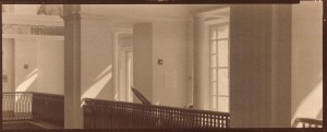
The Vandyke process produces a brown toned image. The image is made of silver, but the light sensitivity is based on iron chemistry, like cyanotypes rather than silver chemistry like a silver gelatin print. This process is often referred to as Kallitype. The sensitizer contains Ferric Ammonium Citrate, Tartaric Acid and Silver Nitrate. Processing includes considerable wash time as well as a bath in sodium thiosulfate. Properly processed Vandyke images have lasted for about a hundred years.


From the time that George Eastman introduced the Kodak camera with the slogan “You press the button, we do the rest” there have been places to get your processing work done for you. In some cases, for instance Kodachrome processing, there was literally no way to do it yourself. In addition much processing can’t be done economically unless you do a lot of printing everyday. Certainly many people have noticed that their ink jet printers don’t work well after sitting unused for several weeks. There are several things that are important to the photographer and the viewer with all of these processes; first is how much control does the photographer have over the images. The printer that I am using allows me to manipulate the image files in Photoshop. This gives me incredible control over the final print. Another consideration is how long will the prints last. While none of these processes have been around long enough to prove durability, prints can tested using light and heat.

Fuji Type R Paper was actually used when photo labs had enlargers. The R stood for reversal. It allowed the lab to maker a print directly from a slide or a larger film positive. So you could make prints from Kodachrome or Ektachrome without making an inter negative. Labs generally used enlargers to work with this paper, so you could do dodging and burning, but there was not much other control. I am not sure if anyone is still making Type R paper. These prints had good saturation and good durability.

Moab Entrada Rag 290 Bright paper is made to high standards and designed for specialized ink jet printers. It is a rag paper and has no acid or lignin. The Epson Ultrachrome inks are used. These are pigment inks so they will last for an exceptionally long time. I find that these prints have a very long tonal scale and very fine color. These prints are made from files that have been prepared with Photoshop. Both color and black and white prints can be made on this paper.

I am showing a 20X50 inch print of this image! It looks great.

Fuji Crystal Archive Matte paper is a color photographic paper designed to be used with digital enlargers. Prints are made from files that have been prepared with Photoshop. This kind of paper is usually used to make color prints. I often use it to make mono-chrome images with a warm tone. Prints made with this product are expected to last more than twenty years.

Please check out my classes at BetterPhoto.com:

An Introduction to Photographic Lighting,

Portrait Lighting on Location and in the Studio,

Getting Started in Commercial Photography

Thanks, John


May 6, 2013

Working in Black and White

I hope you’ll check out my books: Photographing Architecture and Understanding and Controlling Strobe Lighting. Please get copies, if you haven’t already. Of course you know that one reason for this blog is introduce the books and get you to consider one of my classes at BetterPhoto.com: An Introduction to Photographic Lighting, Portrait Lighting on Location and in the Studio, Getting Started in Commercial Photography

The first portfolio class went really well. Please let me know if you want to be on the mailing list. Here’s some more information the next meeting is Tuesday May 21, 2013, 6:30 pm room 407 at the Indianapolis Central Library. This is a great opportunity to make a greater commitment to your work and learn more about how others see your work. Still only $20. I look forward to seeing you if you’re near Indianapolis.

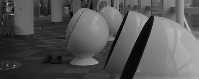
I started out with a Kodak Retina and a roll of Plus-X. The first film developer I used was D-76 and I printed with Dektol. I guess you could say that I have my roots in black and white. If you’ve looked at my work you can see that I still see a lot of shots in black and white. I’ve mentioned, in these notes, that I’m doing some work with my 8X10 film camera. I wanted to talk about how I’m working with those images in digital. It doesn’t really matter whether you start with a digital image or a film image; these techniques make better final images. I start with a low contrast scan of my negative. If I were shooting film, for traditional silver gelatin printing, I would want a negative that I could interpret in the darkroom and that is a low contrast negative. Of course my new negatives aren’t really low contrast, because they need high density so I can print them using the Vandyke technique. Even though these techniques aren’t  really new I think it’s important to work with them from time to time.

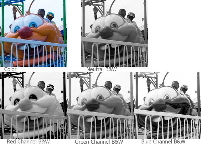
If I’m starting with a color image, usually from my digital camera, I’ll look at the red, green and blue channels. The differences can be really huge. When I shoot with black and white film I use color filters to get the kind of control. The important thing to keep in mind is that you can make choices about what parts of the picture you want to make black & white. In addition to the red, green and blue channels you can mix the channels together.

I know there are a lot of programs for working with your images, but I use Photoshop for just about everything. It’s big, it’s complex and it offers wonderful control over your image. I mention this because I’m going to show the changes I make to an image in Photoshop.

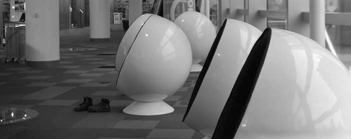
Scans always have some dust and perhaps the negative has some defects, so I’ll fix those right away. I like to do this at the beginning because I’m working on a gray-scale image rather than a color image so the fixes are quicker, especially with a big file. In this case the file is over 100 megs, because the original negative is 4X10 inches. I want to get the biggest scan I can. Negatives are delicate so it’s best to make a digital copy as soon as possible. I make a flat, long scale, scan to capture as much information as possible. I shoot digital images in RAW for the same reason: to have a copy that can be interpreted as many ways as possible. I’ll save this image, so I can return to it.

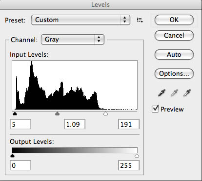
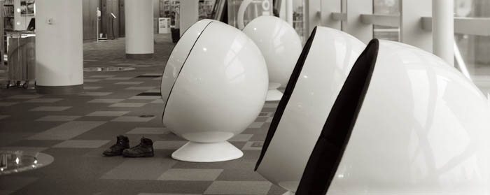
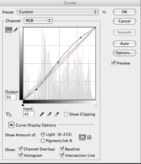
I’ll create a new copy of the image, and the first thing I’ll do is open up Levels. I’ll position the sliders at the edges of the histogram. I may move the center slider to adjust the middle of the curve. This isn’t as controlled as using curves, but it makes the image look better quickly. Next I convert the file to RGB using mode. When I printed with an enlarger on silver gelatin black & white paper I used warm toned paper much of the time. Even when I used a neutral toned paper I usually developed in Selectol to warm the paper up a little. I can change the pallet, warmer, cooler or whatever once I have an RGB file. Now I open up curves. I like to depress the bottom left of the curve and raise up the upper right, usually I don’t make big changes here.  This makes the middle tones of the shot a little more contrasty and makes the highlight ands shadows look a little more like a silver gelatin print. Next I’ll add color, while still in curves, by choosing the red curve. For most images I’ll raise the bottom of the curve about 7 units. Then I’ll go to the blue curve and remove about 8 units from the middle of the curve. You can add as much color as you would like this way.

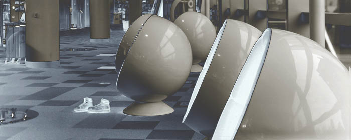
I wanted to lighten the boots, so I used the dodging tool. On the original I also did some sharpening, but that doesn’t really show up on this small file.

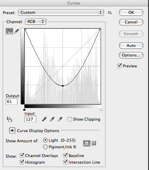
I wanted to discuss another thing I like to do in curves. If you take the bottom left of the curve up to the top of the graph you file will be all white. If you pull the center of the curve back down, usually around 1/4 from the bottom of the graph, interesting things will happen.  If you didn’t add any color to your shot it will look a little like a solarisation (also referred to as the Sabatier Effect) an old darkroom technique. However if you did the toning you’ll get a sort of dual tone solarisation, which is really fun. You can see how well it worked here. I usually refer to this as a u-shaped curve.


Please check out my classes at BetterPhoto.com:
An Introduction to Photographic Lighting,
Portrait Lighting on Location and in the Studio,

Getting Started in Commercial Photography
Thanks, John


April 28, 2013

New Images from Indianapolis Central Library

I hope you’ll check out my books: Photographing Architecture and Understanding and Controlling Strobe Lighting. I hope you’ll get copies, if you haven’t already. Of course you know that one reason for this blog is introduce the books and get you to consider one of my classes at BetterPhoto.com: An Introduction to Photographic Lighting, Portrait Lighting on Location and in the Studio, Getting Started in Commercial Photography

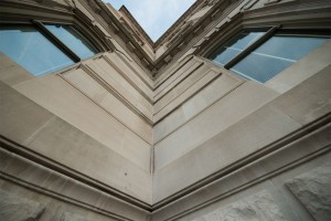
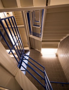
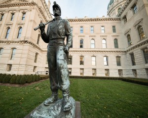
Pictures this week are from a shoot I did at the Indianapolis Central Library. The first portfolio class went really well. Please let me know if you want to be on the mailing list. Here’s some more information the next meeting is Tuesday May 21, 2013 at the Indianapolis Central Library. This is a great opportunity to make a greater commitment to your work and learn more about how others see your work. Still only $20. I look forward to seeing you if you’re near Indianapolis.

I’m still looking for a studio space here in Indianapolis. I’ve checked on a couple of spaces, but they have been too large, and therefore too expensive. I’d like to have the extra space and I could have a couple of offices for related businesses, but I don’t want to have to commit to a more expensive lease. I’m going to continue checking out spaces. My goals, right now, are to have about 1600 feet, with a large commercial or cargo door. The actual studio space must be at least 20X30 feet. I will need air conditioning and heat. You always here “location, location, location” applied to real estate. I think the key is to be sure you understand what you want in a location. I want to be in a good area of town, but I don’t need to be in a mall or on an expensive street. I can be a couple of blocks off the boulevard especially if the parking is good.


I’ve written about processing film and scanning it before, but as I did a lot of work with my 8X10 Toyo recently I thought I would discuss this again. I’ve made some changes in the way I’m processing film for printing Vandykes. I’ll be discussing how I’m scanning the film as well.


I started out working with a two-part developer based on Kodak D-23. The idea of a two-part developer: separating developer and activator, is that you can process almost any film at almost any temperature, which certainly makes things easier. The problem was that the Vandyke process, and most alternate printing processes, requires a very long density range with a very high maximum density. That is the film records the information in a way the makes the whites and blacks further apart, because the printing process tends to push the tones closer together. So I’ve switched to Ilford ID-11 developer. The biggest differences between the two developers is the addition of hydroquinone and the inclusion of the activator (borax) in the single solution developer. I’m using a dilute version of this developer with a very long development time because it makes a longer tonal range. Of course it’s kind of annoying that the processing time is now thirty minutes. If I were going to try and print these negatives on traditional silver gelatin photographic paper it would be difficult, and would require special paper or special handling.


One of the great advantages of scanning a negative is that you make a good scan of a negative that wouldn’t print well without special handling. I set the scan to keep the detail in the whites and black while maintaining a lot of detail and light in the mid-tones. My actual scan looks pretty flat. Of course the scan is in black and white, and I scan in 8-bit depth. I’m making very large scans: 3200 dpi. The first thing I do with these scans is basically spotting. I remove dust and so on. Since the scans are the first thing I do after processing there isn’t much of this. The next step is to make a copy of the scan and convert it to RGB. As many of you know I like a warm color palette. I use curves for this. I will raise the red curve about 7 units at the very bottom of the curve. Then I’ll move the center of the blue curve down into the yellow about 8 to 10 units. This makes my black and white image a slightly warm black and white image. Then I’ll adjust the whole curve, usually by deepening the shadows and lightening the highlights. This is how I make the final image less flat. Of course sometimes the curves will get rather complex. Then I’ll do a little sharpening, usually with smart sharpening in Photoshop.

I used my own shoes


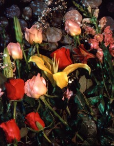
There is one more thing I do with curves: you can see it in the shot below. This is a u shaped curve. I raise the bottom left of the curve to the top of the box and lower the center of the curve, usually to about the 1/4 line. If you do this without adding the red and yellow first you get an image that looks a little like a solarization that you might make in a darkroom. If you change the curve after you change the color you get the two-tone effect you can see in this image. I think this is a really interesting effect; of course it doesn’t work with most images.

This image was processed with a U shaped curve

Please check out my classes at BetterPhoto.com:
An Introduction to Photographic Lighting,
Portrait Lighting on Location and in the Studio,

Getting Started in Commercial Photography
Thanks, John

April 14, 2013

Filed under: Uncategorized — John Siskin @ 2:54 pm

I hope you’ll check out my books: Photographing Architecture and Understanding and Controlling Strobe Lighting. I hope you’ll get copies, if you haven’t already. Of course you know that one reason for this blog is introduce the books and get you to consider one of my classes at BetterPhoto.com: An Introduction to Photographic Lighting, Portrait Lighting on Location and in the Studio, Getting Started in Commercial Photography

I’m stating a portfolio building class this Tuesday, here in Indianapolis. It will meet at the Central Library at 6:30 pm April 16. As this class goes on it will meet in the studio I’m going to open. I really hope you’ll be interested in this class. I think it is a very good thing to get feedback on your images and to build a group of images that work together. This is going to be a small class, about 10 people, so you’ll want to sign up now. You can contact me by e-mail: john@siskinphoto.com or you can sign-up with PayPal. I’ll be bringing a few shots that will be part of my show at Indiana Landmarks in June. I’ve attached a few of those shots to this blog post. I really think it’s important to hear what others have to say about your images and to learn to talk about photographs.


It looks like I’m going to open a studio here in Indianapolis. I hope to actually write a book about the experience, and you’ll be able to see what’s going on here in the blog. Right now I’m looking for the right location. I have a couple of appointments to go searching next week.


When you want to start a studio the first thing to decide is what you’re going to do in the space. If you’re going to shoot portraits and book weddings you’ll need a studio on the boulevard, whatever the local boulevard is, and you’ll need a window full of portraits on canvas. Of course I have more commercial goals than that, so I want a studio with a cargo door in an industrial park. I expect to need at least 600 sq. ft. of shooting space, and maybe an office and a lock-up area. I don’t expect to ever get a walk-in customer. I would like to be near printers and machinists, as well as graphic artists. I may work with a partner, so I might need another office. A partner drops your costs by 50% which means a great deal. I don’t think I’ll shoot cars, but I want to be able to shoot a motorcycle. I want to keep a low profile. I want to be able to load items into the studio easily. I want people to feel secure when they came to the studio for classes or for jobs.


When I started my studio in Los Angeles, I was in my early twenties, and didn’t have any money. So the choices I made were more about cost than anything else. This was the only choice, but it was a choice that created trouble for the quarter century I had that studio. The location had some problems, but it did have fabulous parking. I can’t really explain how important parking is for an LA studio. Many of the things I built into that studio could have been better. Things like the seamless holders and the rail system I built to hold lights near the ceiling, but the bottom line is that they worked. I wrote this article (www.siskinphoto.com/magazine/zpdf/buildastudio.pdf) a few years ago about building a studio. I expect to do things a little differently now. I will do more articles, and maybe a book, about this new studio.


And don’t forget the books!

Understanding and Controlling Strobe Lighting: A Guide for Digital Photographers
Photographing Architecture

B  Four


Thanks, John


« Newer PostsOlder Posts »

Powered by WordPress