I hope you’ll check out my books: Photographing Architecture and Understanding and Controlling Strobe Lighting
. Please get copies, if you haven’t already. Of course you know that one reason for this blog is introduce the books and get you to consider one of my classes at BetterPhoto.com: An Introduction to Photographic Lighting, Portrait Lighting on Location and in the Studio, Getting Started in Commercial Photography
The first portfolio class went really well. Please let me know if you want to be on the mailing list. Here’s some more information the next meeting is Tuesday May 21, 2013, 6:30 pm room 407 at the Indianapolis Central Library. This is a great opportunity to make a greater commitment to your work and learn more about how others see your work. Still only $20. I look forward to seeing you if you’re near Indianapolis.
I started out with a Kodak Retina and a roll of Plus-X. The first film developer I used was D-76 and I printed with Dektol. I guess you could say that I have my roots in black and white. If you’ve looked at my work you can see that I still see a lot of shots in black and white. I’ve mentioned, in these notes, that I’m doing some work with my 8X10 film camera. I wanted to talk about how I’m working with those images in digital. It doesn’t really matter whether you start with a digital image or a film image; these techniques make better final images. I start with a low contrast scan of my negative. If I were shooting film, for traditional silver gelatin printing, I would want a negative that I could interpret in the darkroom and that is a low contrast negative. Of course my new negatives aren’t really low contrast, because they need high density so I can print them using the Vandyke technique. Even though these techniques aren’t really new I think it’s important to work with them from time to time.
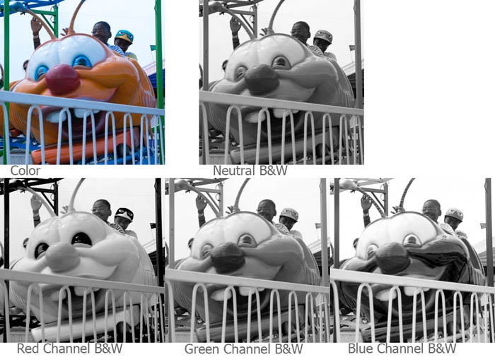
If I’m starting with a color image, usually from my digital camera, I’ll look at the red, green and blue channels. The differences can be really huge. When I shoot with black and white film I use color filters to get the kind of control. The important thing to keep in mind is that you can make choices about what parts of the picture you want to make black & white. In addition to the red, green and blue channels you can mix the channels together.
I know there are a lot of programs for working with your images, but I use Photoshop for just about everything. It’s big, it’s complex and it offers wonderful control over your image. I mention this because I’m going to show the changes I make to an image in Photoshop.
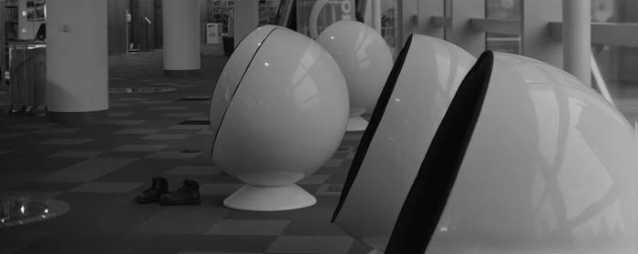
Scans always have some dust and perhaps the negative has some defects, so I’ll fix those right away. I like to do this at the beginning because I’m working on a gray-scale image rather than a color image so the fixes are quicker, especially with a big file. In this case the file is over 100 megs, because the original negative is 4X10 inches. I want to get the biggest scan I can. Negatives are delicate so it’s best to make a digital copy as soon as possible. I make a flat, long scale, scan to capture as much information as possible. I shoot digital images in RAW for the same reason: to have a copy that can be interpreted as many ways as possible. I’ll save this image, so I can return to it.
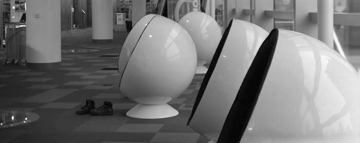
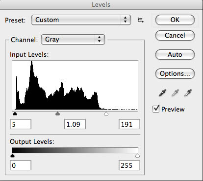
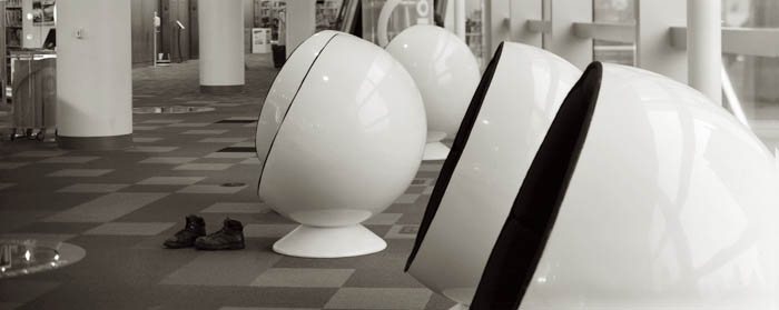
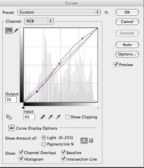
I’ll create a new copy of the image, and the first thing I’ll do is open up Levels. I’ll position the sliders at the edges of the histogram. I may move the center slider to adjust the middle of the curve. This isn’t as controlled as using curves, but it makes the image look better quickly. Next I convert the file to RGB using mode. When I printed with an enlarger on silver gelatin black & white paper I used warm toned paper much of the time. Even when I used a neutral toned paper I usually developed in Selectol to warm the paper up a little. I can change the pallet, warmer, cooler or whatever once I have an RGB file. Now I open up curves. I like to depress the bottom left of the curve and raise up the upper right, usually I don’t make big changes here. This makes the middle tones of the shot a little more contrasty and makes the highlight ands shadows look a little more like a silver gelatin print. Next I’ll add color, while still in curves, by choosing the red curve. For most images I’ll raise the bottom of the curve about 7 units. Then I’ll go to the blue curve and remove about 8 units from the middle of the curve. You can add as much color as you would like this way.
I wanted to lighten the boots, so I used the dodging tool. On the original I also did some sharpening, but that doesn’t really show up on this small file.
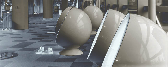
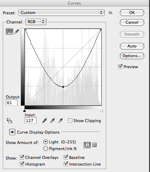
I wanted to discuss another thing I like to do in curves. If you take the bottom left of the curve up to the top of the graph you file will be all white. If you pull the center of the curve back down, usually around 1/4 from the bottom of the graph, interesting things will happen. If you didn’t add any color to your shot it will look a little like a solarisation (also referred to as the Sabatier Effect) an old darkroom technique. However if you did the toning you’ll get a sort of dual tone solarisation, which is really fun. You can see how well it worked here. I usually refer to this as a u-shaped curve.
Please check out my classes at BetterPhoto.com:
An Introduction to Photographic Lighting,
Portrait Lighting on Location and in the Studio,
Getting Started in Commercial Photography
Thanks, John


