Photo Notes A place to talk about making images.

November 15, 2018

Courting Chaos-The show, Part 3-Kodak Color Glossy prints

This post includes the two Kodak color glossy prints from my current show at Indiana Landmarks. The color begins in the original process, but it is modified and enhanced in these images. The show is going to be on display until the end of November, so you still have a chance to see the real photographs. I say real photographs because looking at an online version of an image adds a sameness to all images. On your phone or monitor images always about the same size and the color is always affected by your monitor. These two images are BIG, 30 inches wide and about 40 inches tall. If you care about photography its a really good idea to see actual photographs, not just digital versions. I used 3 types of prints in the show: silver gelatin prints, cyanotypes and a couple of Kodak color glossy prints. As I mentioned in the last post you can visit this previous post for more information about print types: https://siskinphoto.com/blog/?p=2243. The other images, the silver gelatin and the color glossy images are posted as parts 2 and 3 of the show. The Silver Gelatin prints are at: https://siskinphoto.com/blog/?p=3571. The cyanotype images are at: https://siskinphoto.com/blog/?p=3630


The show has 41 images up on the walls; these are the two Kodak Color Glossy images. These are machine made images. I could print a hundred of them, all exactly the same, by pushing a button. The images are for sale. The images are about 30×40 inches and mounted on Gator board. The price is $350. The price includes shipping in the U.S. For this and all the other images please contact me directly at john@siskinphoto.com to arrange the purchase. Please contact me for more information about any of these images. These images are copyright by me and are NOT INTENDED to be shared. You are welcome to post the link to this blog, but do not re-post my images. Thanks for your respect.

Kodak Color Glossy Images

Curt #2

Leslie #6

December 27, 2016

On Editing

Griffith Observatory

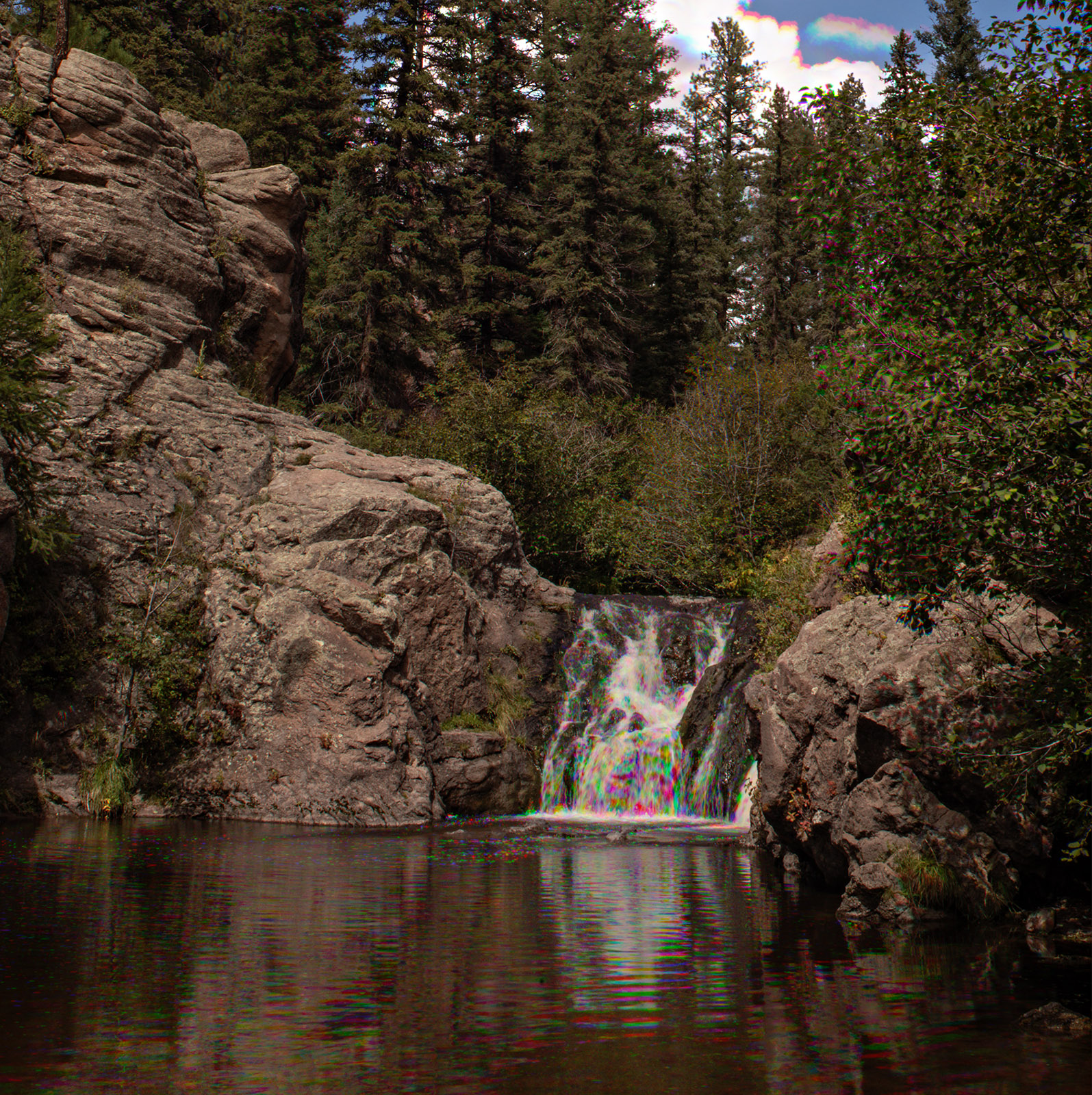
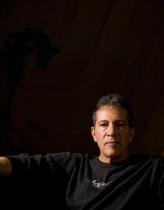
I have been a working professional photographer for several decades. I actually started taking pictures much earlier. In all that time I’ve never lost my love of actually making an exposure. There is a hopefulness about each exposure: maybe this one will be great or maybe this one will please the client. The actual moment of creation is special.

The thing is, taking a picture is a personal moment. Inevitably there is something left out of the frame. It might be the experience of getting to the shoot or something completely unrelated. If I had a great breakfast before the shoot that part of my experience will never be part of the picture. Perhaps this is obvious, put most people taking pictures seem to miss this fact. One of the signs that the experience is outside the frame of the picture is when the photographer needs to explain the shot. Since most people take pictures to make a sort of visual diary of there lives this is a natural part of picture taking. Most people take picture to capture a part of there experience: this is what my child looked like at three or this is where I stayed on my last vacation. I think that this has a lot to do with the popularity of selfies. Of course I occasionally take pictures to capture moments of my life, but such pictures are not my business.

I make a lot of photograph for clients and for art. When I make a photograph I am shooting to communicate with the viewer of the photograph rather than trying to save a personal experience. This means that I must understand the way a viewer will see my photograph. The viewer will never have the experience of pushing down the shutter button. He or she comes to the photograph with a whole different set of expectations and experience than I had when I made the image. First the viewer expects to be shown something interesting. When I make photographs I am always involved in a process of discovery. I am trying to find what is interesting, compelling or just effective in an image. The viewer expects to be shown what I found; they do not expect to make their own journey of discovery. While it might be interesting to create art that requires such a journey on the part of the viewer, effective photographs present the viewer with the discovered.

Editing is the process of choosing what to share with the viewer. What I choose to share depends on the viewer. If I am working for other creatives, for instance an ad agency or a graphic designer I might share everything. Such people expect to go on to do their own process of discovery in my images. However if the images are for other uses, whether for business or for art, I need to choose images that will communicate with the intended viewers. I need to see my images as other people will see them. It can be very difficult to see images in this way. I must pay attention to what is in the frame, and how others see that content, and just what a photograph can actually communicate. This is a difficult process. Many good photographers are unable to make the shift to editor. I’ve often been shown images that represent something very special to the photographer, but weren’t effective in communicating to any one else. I’ve done this myself: tried to explain what was great about an image I made, only to realize that my audience was only concerned with the actual image.

When I edit my first step is to get rid of all the images that are so technically flawed that nothing can be done with them. While I don’t actually destroy any digital files or negatives, I don’t keep such images in the folder I’m editing. If I’m working with digital files my next step is to do basic corrections for color and exposure on any images that will benefit. Usually I can do this in batches, so it doesn’t take very long. If I’m working with another creative, or a client that wants to see everything, I may present all these images. I only present images at this stage if the client wants to be part of the editing process. The client often has special information they want to display or special insights into how they present their images. I never know everything a client knows; they always have special expertise. It’s important to use that information. So it can be very important to engage the client in the editing process. If I’m working for a client that wants to see only choice images I need to start to see like the client, and I have to start making more difficult picks.

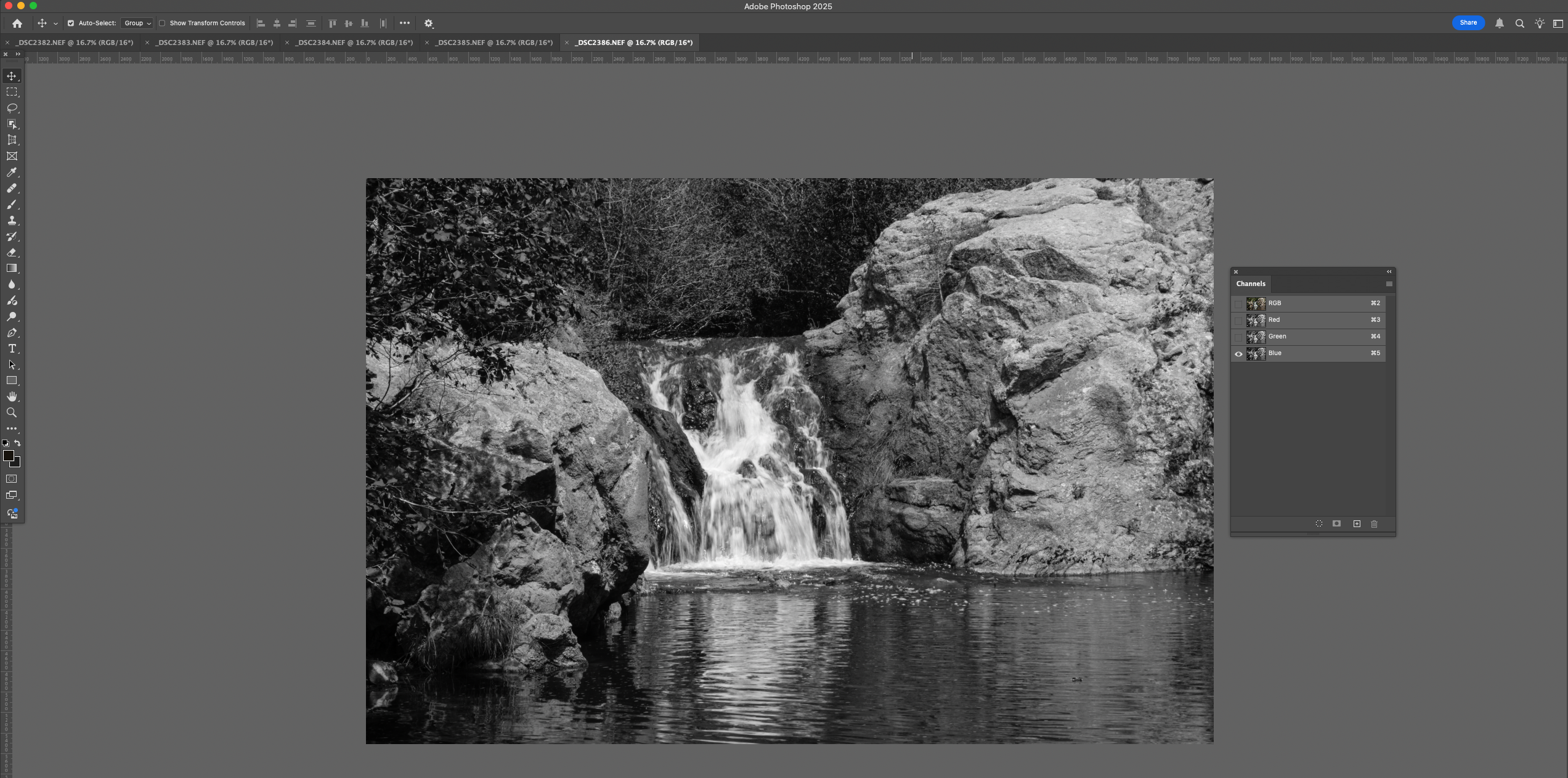
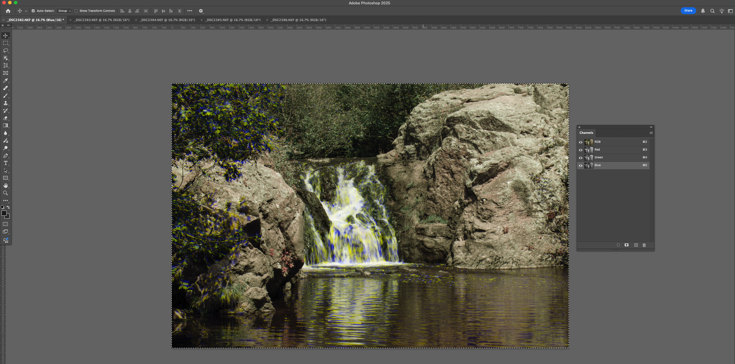
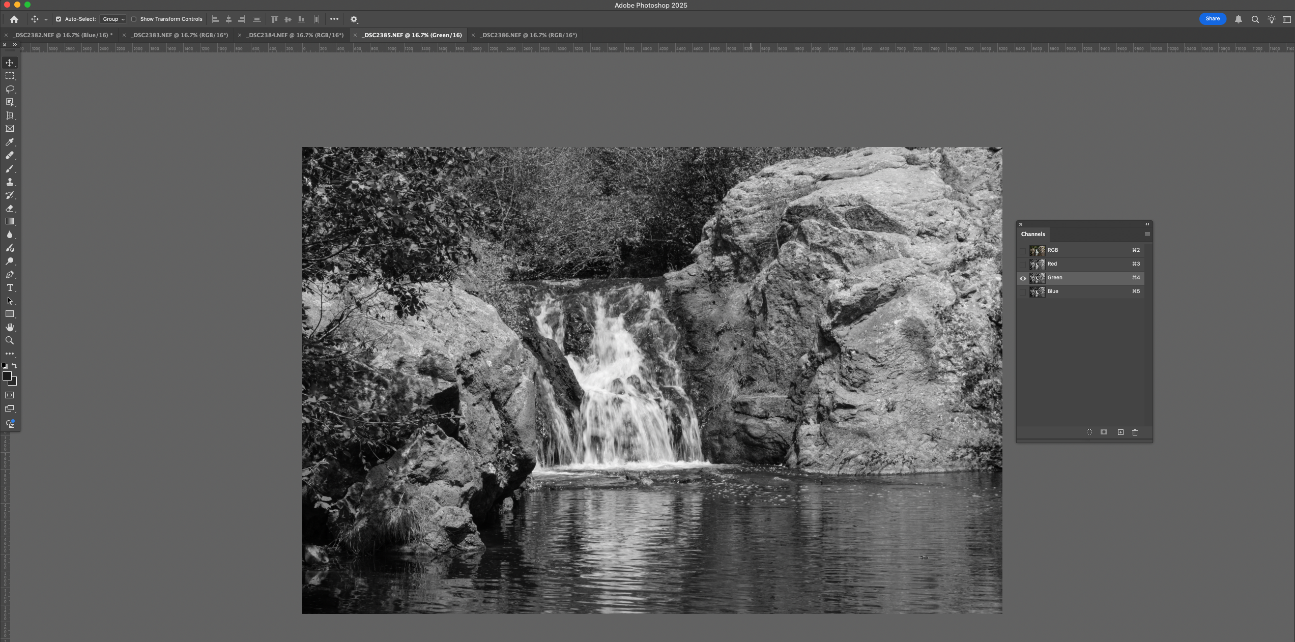
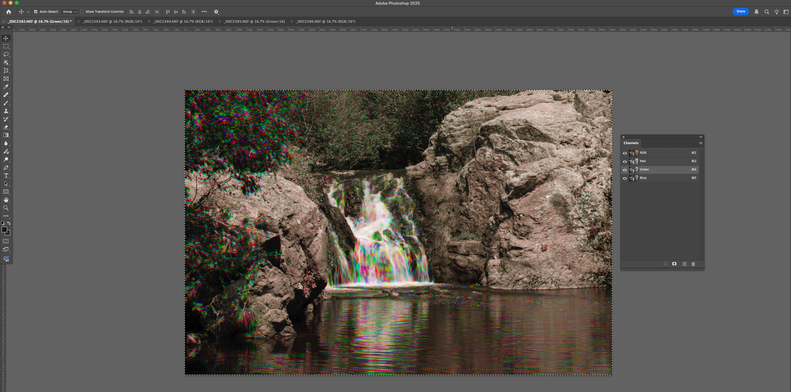
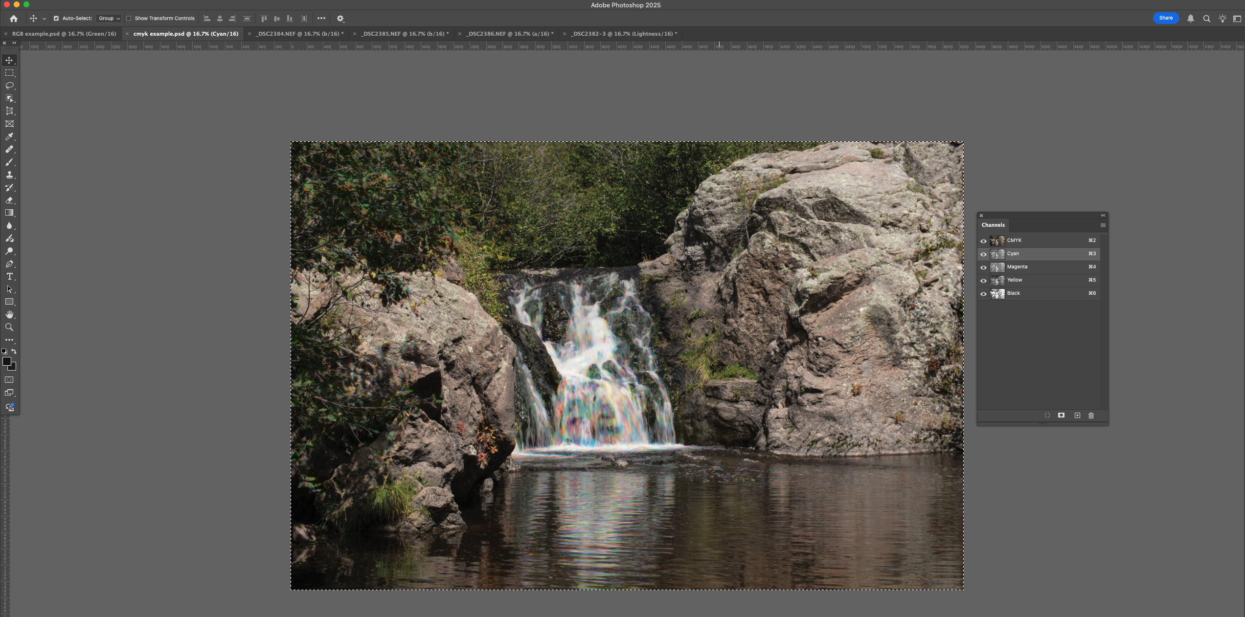
On another pass through the images I’ll pick out any image that is particularly effective. At this point I am always looking for what is good about an image. I’m still trying to be inclusive. So I might keep an image that has a particularly effective portion, even if part of the image is flawed. If I have several images that are redundant this is the point where I’ll let some of them go. I’ll also pick out images that are grouped for special handling, say a group of shots that were made for HDR or focus staking. No part of photography is divorced from the technology of image making, but this process of examining images is effective if I’m using a loupe and grease pencil on a proof sheet or Lightroom. In fact I usually use Adobe Bridge and Adobe Raw to handle digital images.

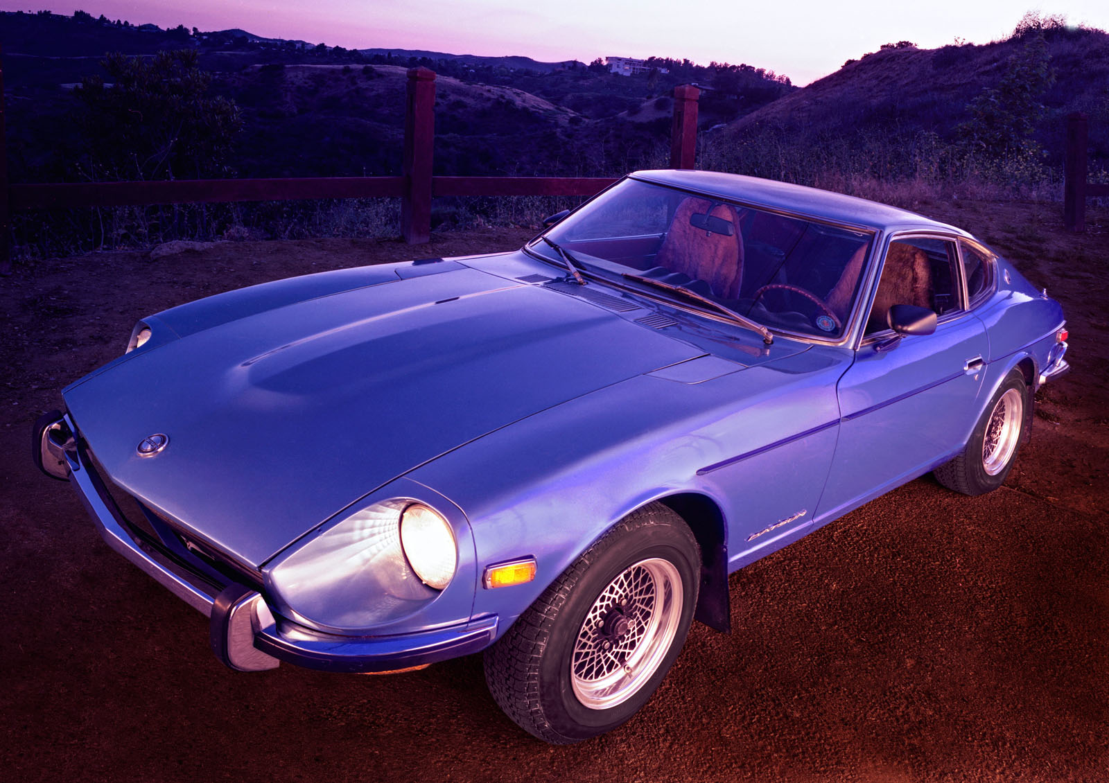
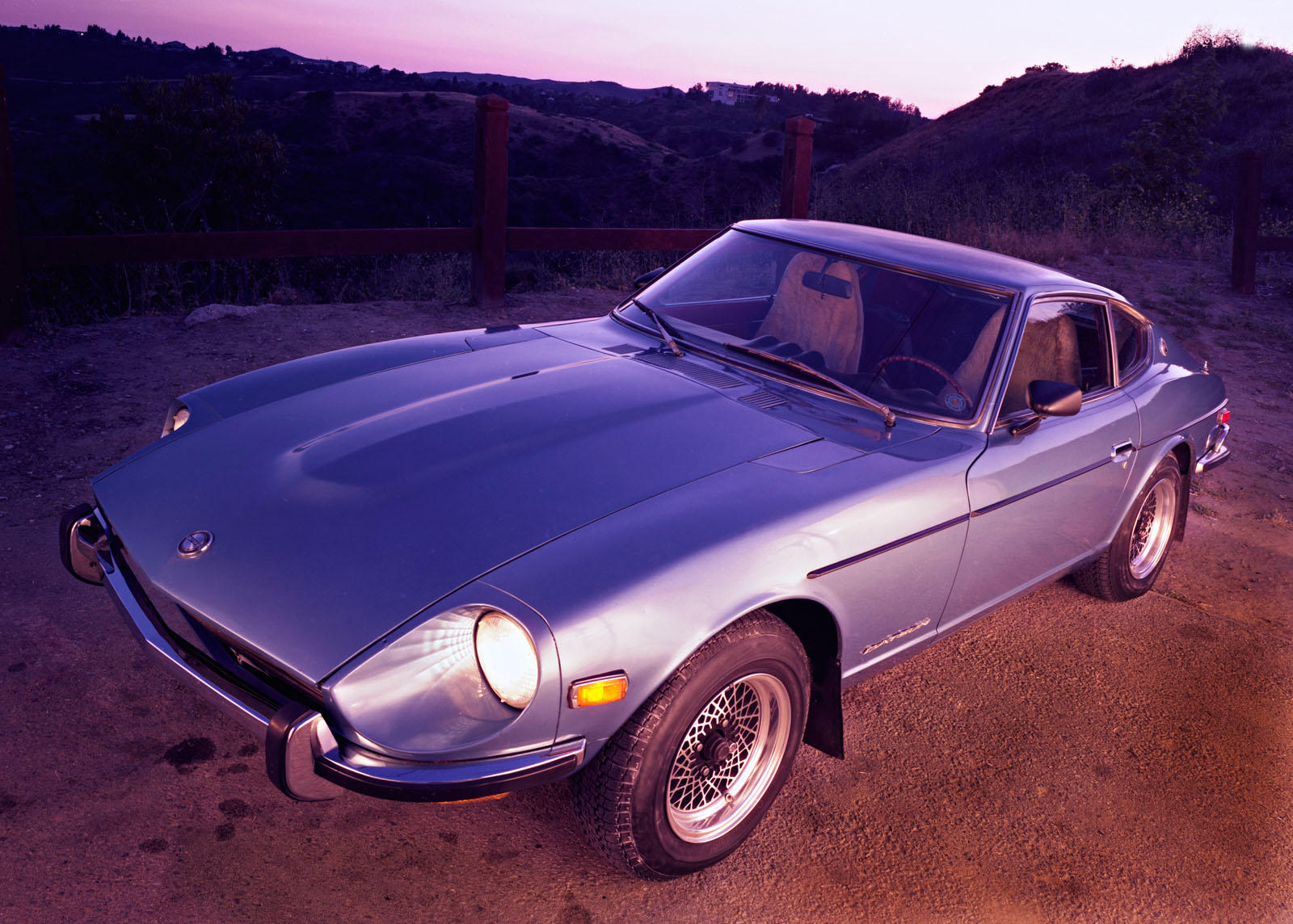
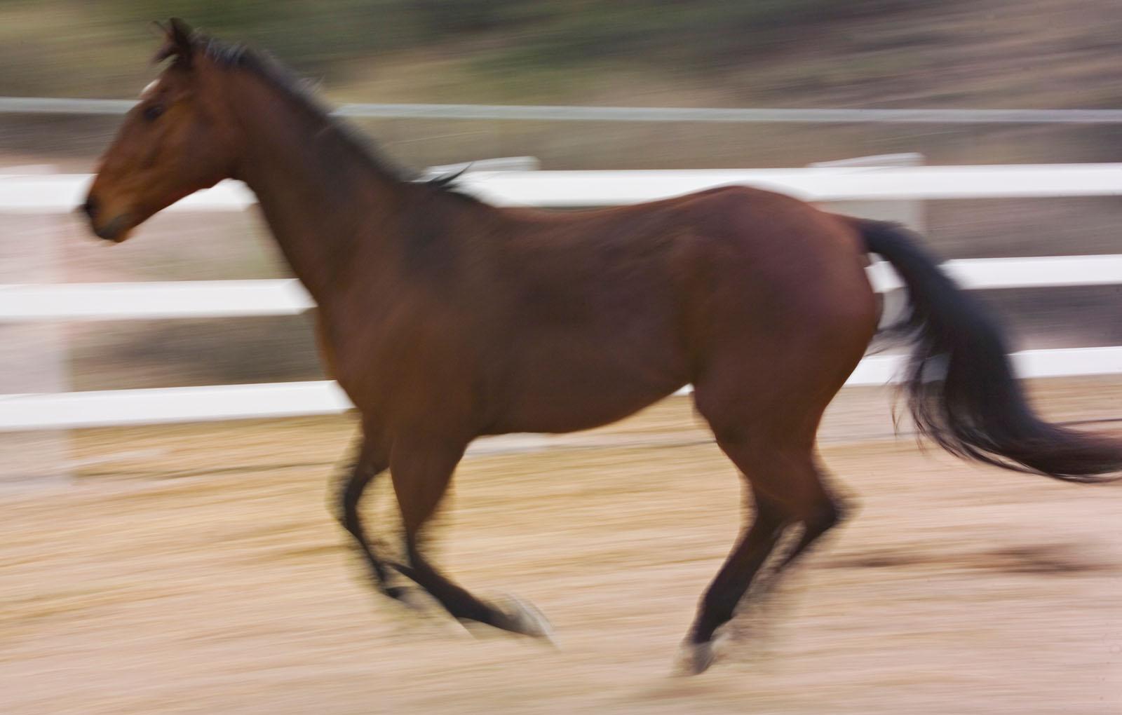
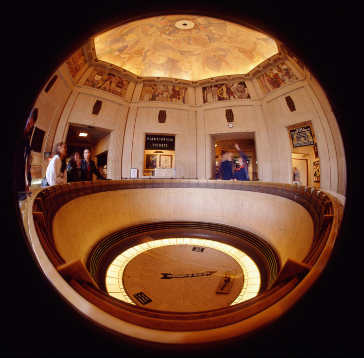
At this point I begin to edit the actual image rather than the editing the shoot. This is a very important transition. Of course I’m going to continue to throw out images, for technical and esthetic reasons, but the next step is to begin edition the individual images. At this point it’s even more important to look at the images as a viewer would. Remember that the viewer won’t recreate the moment of capturing the image. Just like a client you have special information, but it may not be possible to express that experience in your photograph. So it’s time to get rid of the stuff that doesn’t work in an image. This means crop your image. There was an idea among photographers that you should crop the image in camera; that the actual image captured in the camera was almost sacred. One of the reasons for this was that we shot a lot slides, which were used for projection. You couldn’t edit these images, without a great deal of special handling: what you shot was what you showed. With current digital cameras there is no technical reason to shoot this way. In fact there are good reasons to shoot a little extra around your image, for instance you may need to do perspective control or compensate for lens distortion. It is also possible that an image may work best in another shape. There is nothing special about the 2:3 ratio of most digital sensors, square images or different rectangles may work better. It’s even possible that a circle or oval might be the best choice for the image. It’s important to be guided by the image rather than by a frame size or print size. If I end up with a special size image I can always mat the image for a standard frame.

Cropping is so important. It tells the viewer what to look at and keeps the viewer’s eye engaged with the photograph. I have seen so many images that would benefit from a little judicious cropping. There are probably a number of technical things I’ll do to an image when I first open it in Adobe Raw, but nothing is more important to the finished image than cropping. I may crop as a multi-step process, doing a rough crop in Adobe Raw and doing my final cropping in Photoshop. Of course this two-step process is particularly important if I’m going to be doing a perspective crop.

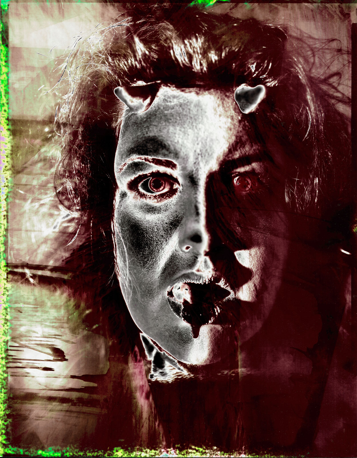
I think that Photoshop has had a more significant and lasting affect on image making than digital cameras have. The previous technology: either wet darkroom or offset printing, didn’t allow for much image manipulation, at least not without extreme costs. Photoshop allows us to get into the image and perfect it. As photographers we should use these tools to create a better visual experience for the viewer. There are so many ways to do this that are beyond the scope of this essay. However it’s important to be open to utilizing this tool kit. Whether you choose to do become a Photoshop expert or to send out your retouching you need to have an idea of the possible. There are limits for photojournalistic images, but those limits don’t apply to personal work, however it’s still important to keeps the viewer’s experience in your mind. Keeping a sense of the real is important to engaging a viewer.

If you’re still reading this you may want to share it. That’s ok with me, but please attribute it to me, for good or ill. If you have another opinion I’d like to hear it. You can e-mail me at john@siskinphoto.com.

My home page is at

http://www.siskinphoto.com/index.php

If you’re interested in more information from me you can find my workshops at:

http://www.siskinphoto.com/workshop.php

There are a couple of free classes that I used to offer through BetterPhoto, on the page as well.

You can read my magazine articles at:

http://www.siskinphoto.com/magazinearticles.php

There are a couple of dozen of them at that link, all free.

You can also find my books at Amazon, of course you’ll have to pay for them:

Understanding and Controlling Strobe Lighting: A Guide for Digital Photographers

Photographing Architecture

My blog is at

https://siskinphoto.com/blog/

and I’ve posted this essay at the blog.

And just for fun here’s a link to my do it yourself page

http://www.siskinphoto.com/cameraeqp.php


March 31, 2016

Box Canyon #3

Filed under: Fine Art Portfolio,Landscape Photography,Post-Processing — John Siskin @ 3:09 pm
Box Canyon #3U

Box Canyon #3U


I’m making two versions of this image available today. As before these posts are part of my on going update of the fine art part of my site. If you’d like to purchase either version of this shot be sure to use the PayPal link below the version you want.

These images were made form the same negative, taken with my Speed Graphic. The place is in Box Canyon, which is between the San Fernando Valley and Simi Valley. One of the great things about living in Los Angeles is how many really wild places there are inside the city. Of course wild can be interpreted in several ways, and some areas, like Laurel Canon have been wild in nature and in people. Box Canyon is a little like that: very rustic with a wild population. I lived there for several years, and I still miss it. I’m adding more pictures from this area, so I hope you’ll keep looking at my site and the blog.

The first version of the image uses false color to make the image much more dramatic. I like both versions. I’ve written about the technique I used on this image before, so if you’re interested in the technical details look at this link: https://siskinphoto.com/blog/?p=431

Below is a more neutral interpretation of the negative. All photographic printing involves interpretation; even a “straight” from a chemical darkroom involves choosing a paper and a contrast. Of course Photoshop allows us more room for interpretation, which can be a good thing.

Box Canyon #3

Box Canyon #3


If you’d like to buy a print of either or both versions of Box Canyon #3 please use the PayPal links. You’ll get a print mounted and matted to 16X20-ready to pop into a frame. Why not order one now?

I’m offering several workshops on my site; why not visit now? siskinphoto.com/workshop.php
I hope you’ll also check out my books, use the links below:

October 10, 2015

Tool Kit

Of course I’m thinking about the workshop next weekend. There are only two spaces left, so you should SIGN UP NOW!

Samantha will be one of the models for Sunday October 18th.

Samantha will be one of the models for Sunday October 18th.

One of the things I want to examine at the workshop is the lighting tool kit for a photographer. The equipment manufacturers want us to buy everything; they’re not exactly on our side. Many of the available tools are of little use, or totally redundant. So I hope that this workshop will actually help you to save money by experimenting with the tools. I’ve seen a lot of people who work with hammers: carpenters, roofers and neurologists. The all use different kinds of hammers; purpose built for their applications. When we choose our tools we need to exercise the same care a carpenter does when he buys a hammer.

harley

The main tools we use as photographers are designed to work for a large variety of applications. So my Nikon D800 is a terrific camera to fit onto a microscope or use for architectural photography or even an auto race. While the camera will work well in all those applications, I’ll need to use different lenses for each situation. This is one of the great strengths of camera design: a good camera can be adapted to different situations. Can you imagine buying a whole new camera everything you needed a lens or even a filter? Strobe lights are the same way: a basic strobe can be used for a lot of applications, if you have the light modifiers for the job. This is one of the good aspects of strobe lights over movie lights, which are purpose built. Over the years I’ve worked with many light modifiers for strobes, everything from large soft boxes to fiber optics. These modifiers are designed to make the lights useful in all kinds of applications. Some of modifiers have been good, some bad; some work in a lot of situations and some are only good for one kind of job. I hope one of the things you’ll receive from the workshop is a better way to choose your tools.

The first step in adding a tool to your kit is identifying the reason you need or want that tool. So I may choose a new light because I didn’t have the lights I felt I could use at my last job, but I may also choose a tool because it inspires me. I think this second reason is really important. I often get tools because they make me want to work, or because they open up new ideas for shots. I also get tools because they replace or upgrade or back up the tools that I have. Of course one problem is that I now have too many tools to take on location.

When i shoot a motorcycle i need to use large light modifiers to build good light.

When I shoot a motorcycle I need to use large light modifiers to build good light.

I’ve got a large studio so I have some tools that are only useful in a full time studio. One of the best is my Broncolor Hazylight. I picked up the frame in a studio sale, and adapted a Norman head to fit the frame. Then I put the whole thing on a camera stand, so it’s easy to position in my studio. Most photographers don’t have a space for a light modifier this big. If you’re going to use a smaller studio you might want to use light panels. The panels are cheap to make and incredibly adaptable.

Here's a shot that mixes hard light, soft light and continuous light effectively.

Here’s a shot that mixes hard light, soft light and continuous light effectively. Effective catch lights as well.

One of the important aspects of a portrait is the catch light in the eyes. The catch light, which is really just a small reflection of you’re the light, can change the whole quality of a portrait. If you don’t see a catch light, or if you see an umbrella, or just a tiny pin prick of light, it can damage an image. There are all kinds of light sources for portraits shooting that address this problem. I’ve used quite a few: portrait dish, soft box, octabox, umbrella and so on. One of the things that makes better catch lights is a large circular light source, which will make a round catch light in the subject’s eyes. For this reason I’ve got a cover with a circular cut out for my Hazylight. I would build a similar cover for a soft box, if I were using one. I also use a light panel and a snoot to make a circular light source. I can use the snoot to put a circle of light onto the panel. I can use these tools to make other shapes and control the direction of the light. This gives me a round catch light, or I can change the angle of the snoot and get many different shapes on the light panel. So both the snoot and the light panels are at the top of my list for light modifiers. I also use the snoot as a hard light source in my shots. I’ve found that the snoot is an incredibly fun tool to have in my lighting kit.

Just a guy using thee right tool for the job!

Just a guy using thee right tool for the job!

I also like using a set of barn doors with my light for illuminating the light panels. The barn doors can even crate a strip with the light panel. I also like the barn doors for shooting architecture. I can control a bounce off a ceiling or other surface, to keep the light out of my image. Of course the barn doors can help to place a highlight in a subject, say a hair light or a rim light. Both the snoot and the barn doors are small light sources, so the position of the light is important, but if you use the snoot or the barn doors with a modifier like the light panel you can make a large light source.

It really doesn’t matter whether you make light with a mono-light or a dedicated strobe. What matters is controlling just a few things: the color of the light, the power of the light, the size and shape of the light source and the position of the light. The color and power of the light really only matter relative to other light sources in your shot. So if you were using just one light you could change the ISO or the aperture to control the amount of light, but if you have two lights they have to be balanced. Not necessarily the same power, but a balance that suits your vision for the shot. Similarly you might want all the lights in a shot to have the same color balance, but you might also want one light to be warmer. A warmer light might give the effect of sunlight coming into your shot. You can control the color of one light in your camera, but the camera won’t make one light warm and another cool. Controlling power and color are tools that you use to build your shot. The size of the light source, relative to your subject, affects the quality of the light: hard or soft. The larger your light source is the less that the position of the light matters; consider how the light comes from the whole sky on an overcast day, no shadows and no direction.

F2359911

The image should start in your mind. If you have an idea of how to position a model, or how to light a face, or a room, or a product, then you can start to build that shot. If you start with the same light each time, or only use existing light, then you have much less control over your shot. So it’s important to understand how each tool works, how you can use the tools together, to build the images you want to make. One of my heroes is Felix the Cat, because whenever he gets in a fix, he reaches into his bag of tricks. As photographers we need a big bag of tricks. Here are a couple of things I have in my bag of tricks whenever I go on location: umbrellas (white, silver, gold all with black covers) gaffers tape, magic arm and super clamp, small tripod, large tripod, lighting filters (Rosco gels) light stands, maybe even a reflector or two. Of course I’ve also got some interesting strobes on location, mine work with both ac and dc power. The heads are small enough to fit almost anywhere. I’ve been doing this for more than forty years, which means a couple of things: I’ve got multiple kits for different location work. I can grab just one box if I’m shooting an executive portrait, but I’ll add a couple of boxes to this, if I’m making room shots. The time I’ve spent shooting also means that the way I use the tools, and the tricks I use, have evolved over the years. Part of being a creative photographer is learning to see what could be, not just what is. I want to help you to build the images that could be.

This is shot made with just a snoot.

This is shot made with just a snoot.

Of course I want to see you at the lighting workshop on October 17 & 18. You can sign up here. You can also see another post about the workshop here. There are only two spaces left for the shoot on Sunday. You can also sign up for just Saturday, which will be demonstrations and explanations. Of course if you just can’t make it to the workshop, you can still get my books.

July 28, 2014

Retouching with Deep Etch

Filed under: Post-Processing — John Siskin @ 9:45 am

My books and my classes give me a reason to keep doing this blog. If you’re in Indiana I hope you’ll consider taking my Portfolio Workshop. You can see a little more information about this workshop if you check out this blog post . I’ve listed my BetterPhoto classes at the end of this post. Thanks so much for your attention.
My relationship with post-production has evolved over the years. When I first started capturing images with a digital back (a leaf DCB II) I was suspicious of Photoshop. I’d been working with transparency film for years, and with transparency film if you didn’t get the image just right in camera then it was never going to be right. It took me a while to understand that making good images didn’t stop when you pressed the button. I’ve been buying updates of Photoshop since version 3 or 4, but I don’t think I’ve ever been an expert user. Photoshop requires practice and regular use to achieve mastery. I’m quite good at the things I do regularly, practice will do that, but there are things I don’t do very often or at all. In addition Photoshop requires some hand skills that I never seem to get good at. Finally all post-production work takes time. Sometimes I’d rather do other things than spend hours retouching.

Fortunately there are companies that will do handle some of this for me. I’ve been sending out some retouching to Deepetch.com. There are many companies that do this work, but Deepetch came to me for some content for their site when they were starting out. I came to understand that post-production is like lab work was when I shot transparencies: yes I can do it, but others do it better and cheaper. I’m attaching a couple of before and after shots that Deepetch worked on for me. These images were just placed on the updated web site. Right now I’m usually sending Deepetch images for clipping paths and retouching, but they do provide other services. By the way Deepetch hasn’t asked for this blog post, I just wanted it to post it. You can send me any thoughts you have about retouching. You can always send at e-mail to john@siskinphoto.com

240Z: Adjusted the color. Smoothed out the light on the side of the car. Darkened the ground in front of the car.

Retouched version

Retouched version

Before Deepetch

Before Deepetch


Atlanta Airport, New Terminal: Removed crane, porta-potties and exit sign.

Retouched version

Retouched version

Before Deepetch

Before Deepetch


Horse: Removed the fence and sharpening.


Retouched version

Retouched version

Before Deepetch

Before Deepetch


This site now has 695 subscribers, and more join everyday! Frankly I don’t know why since nobody posts. If you have any thoughts about this blog please let me know. I appreciate your membership. Of course there are other ways of improving your photograsphs, like taking a BetterPhoto course. Here are the three I teach, perhaps you’d like to take another one or share them with a friend.
An Introduction to Photographic Lighting
Portrait Lighting on Location and in the Studio
Getting Started in Commercial Photography
One other note about BetterPhoto: I’ve been in the habit of sending out a private note to all my former students at BetterPhoto (Almost a thousand people!) each month. There’s some sort of hang up in the e-mail system for this so, for a while anyway, I won’t be sending that note. I hope no one is too disappointed.
Thanks, John

April 4, 2014

Working With Clients

Filed under: Commercial Photography,Marketing,Post-Processing — John Siskin @ 1:51 pm

Please check out my on-line classes at BetterPhoto: An Introduction to Photographic Lighting, Portrait Lighting on Location and in the Studio and Getting Started in Commercial Photography, take a look at my site for workshops in Indianapolis and check out my books:

I’ve been doing commercial photography for several decades. One of the problems with what I do is communication with my clients. Often they haven’t worked with photographers, and really don’t have an idea about the process. I’ve been wanting to update the information I give them about the jobs I do. Most of my clients are businesses rather than ad agencies, so this is particularly important. As I thought about this I realized it might be a good thing to put this on the blog because I’d like to get feedback about how you work with clients. As you read this keep in mind that my clients are looking for shots of their jobs and products rather than weddings and babies. I like working with businesses; there is more variety in the work and businesses come back for more work sooner than families. I’ve included a couple of pictures just to keep things interesting.

The most important thing in creating an effective image for a client is to engage the client in building that image. Without an ad agency the client is the only source of expertise on the subject. I have shot things the size of a pinhead and subjects about as big as a city block. I have literally shot everything from cuticle cream to parts for a submarine. While I find it’s useful to know a little about a lot of things the only subjects I know in depth are photography and lighting. So if I can’t get the client to help me tell the story many jobs will be worse off. Whenever possible I want the client, or their representative, at the shoot. Certainly someone should be at the first shoot, after that I will know more about the product and the client’s taste. However the results are usually better when the client is engaged. I have a wireless system for showing the images to the client as the shoot progresses.

Before I can begin a job there needs to be a shot list. The client and I need to agree on a time and place for the shoot, and of course the price. It’s at this point that I explain to the client that my price is largely based on the amount of time that will be involved doing the client’s shoot. In three hours I might have finished shooting a bank’s board of directors, but I’d still be doing the set up for a motorcycle shoot in my studio. One of the problems of negotiating with a client is that they often think that the prep, shot and clean up happen in almost no time at all. I’ll just walk in with a camera and shoot. Not only is this a problem when we’re negotiating the price, it can be difficult to get the client to block out enough time for the shoot. If you don’t address this issue before the shoot you might have trouble during the shoot. In addition the material needed for the shoot, assistant and the location will affect the price.

Before I can give the client a price the client and I need to agree on what will be delivered when. My preference is to give the client an edited low-res version of most of the files. Then I hope the client will choose the files they’re most interested in and final retouching can be done on those files. I will include the time to prepare the edited version of the files in the original estimate. When I do the editing I will remove images that are just bad and others that are redundant. I will open each file in Adobe Camera Raw and adjust such things as color, exposure, cropping, sharpness and lens distortion. While this only take a few seconds on a single image, a shoot with 500 images can take a while to edit. I reduce the size of the files to them easier to review. I spend the time to prepare this set of files because I want to show the client a good version of my work, obviously this group of images will reflect on my talents. The difficulty is that the client doesn’t always review these files. I don’t know if I should reduce the number of files I send or make other changes. Regardless I will deliver whatever version of the files the client wants, but I do try to keep the mistakes to myself. The client can even have my Raw files if they want, but since most clients can’t open these files I generally don’t deliver them. I will give the client an estimate for image editing, if any, before I do any additional work to a particular file. This is all part of the negotiation with the client. We need to define just what the client will get and when.

I’ll get a deposit from the client before the day of the shoot. Generally the deposit is 50% of the estimate. I try to deliver the first version of the files to the client in 48 hours or less, and I’ll include a bill for the balance with these files.

If you know what usage means to a photographer you are in the minority. Of course this can make it difficult or impossible to charge a usage fee to a client, and most of the time I don’t. Usage is simply the way the image is used, say in a magazine or on a web site. By extension it is a license, for a fee, to use the image in a specific way. If a photographer sells a photo from his/her files to be used once in a magazine and then sees it used on a billboard or a national advertising campaign the photographer has been cheated and the usage agreement has been violated. This can result in litigation. My policy is the when the client pays me to create a custom photograph, rather than buying an image from my files, that purchase includes the right to use the photograph to aid the client’s business for as long as the client feels the image is useful, with few exceptions. The client can’t sell the photograph, as a photograph and not part of packaging, to a third party. So a contractor can’t sell a photo to a window manufacturer with out negotiating compensation for me. If the client chooses to give the image away, well that’s the clients business. Any stock images that I license a client to use have specific limits on usage. I hope that my clients will be successful, and that they will return to me for more photographs. I also do consulting for businesses setting up in house photographic systems. I expect that the material I create for these businesses will not be shared outside the business. In addition to my concerns about how my images are used I understand that the client has concerns about how I use the images. My policy is that I don’t offer client images for sale to other clients or third parties. Specifically I don’t license client images through any stock agency. I will use the images to promote my business: in print, on line and in magazine articles. However I appreciate that some images have proprietary information so I will give the client a chance to review images before I use them.

There are things I’m still thinking about, for instance weather and working hours. When I had a business in Los Angeles years would go by without a weather conflict. That isn’t true in Indiana. I would prefer that a client reschedule a job if the weather is predicted to be unworkable two days in advance. If the client insists and the job can’t be done then there’s a problem.  I haven’t been able to use the time in another way and I think I should charge the client. Any thoughts? In addition I wonder about what hours I’m expected to keep? A wedding photographer expects to work weekends and evenings, as an architectural photographer I might have to be on site a dawn to shoot a building. Should I charge extra for special hours? Should I charge extra if I have to do rush work on the files? Of course I do charge extra for a day that is more than 10 hours long. I fyou’d like to let me know what you thing please (john@siskinphoto.com) or register with this site.

There’s no such thing as a package job around here. At least the first job with any client requires us to create a mutual understanding of possibilities and responsibilities
Of course, if you can’t come to Indianapolis you can still get my books or take my classes. And I hope you will!
Books:
Understanding and Controlling Strobe Lighting: A Guide for Digital Photographer

Photographing Architecture

My Classes at BetterPhoto.com:

An Introduction to Photographic Lighting
Portrait Lighting on Location and in the Studio

Getting Started in Commercial Photography


May 30, 2013

Print Types

I hope you’ll check out my books: Photographing Architecture and Understanding and Controlling Strobe Lighting. Please get copies, if you haven’t already. Of course you know that one reason for this blog is introduce the books and get you to consider one of my classes at BetterPhoto.com: An Introduction to Photographic Lighting, Portrait Lighting on Location and in the Studio, Getting Started in Commercial Photography

The second portfolio class was great. Please let me know if you want to be on the mailing list. Here’s some more information the next meeting is Tuesday June 18, 2013, 6:30 pm. We may be meeting at my new studio. Stay tuned for more about that! The class is a great opportunity to make a greater commitment to your work and learn more about how others see your work. Still only $20. I look forward to seeing you if you’re near Indianapolis.

I’m going to discuss the kinds of prints I’ll be using in my show at Indiana Landmarks. The opening is on June 7 at 6pm. I hope I’ll see you there! For more information check this link. Most of the images in this week’s blog are going to the show at Landmarks. Please keep in mind that images on your screen aren’t good representations of what real prints look like. The images are linked to the fine art part of my website, which you can use to buy a print. The prints available on my website are made on the Moab Entrada rag paper discussed below.

I’ll start with silver gelatin prints because in many ways they’re my favorites. These were the most common black and white prints for most of the twentieth century. The black part of the image is silver and the emulsion is made of gelatin, which is probably the reason for the name. One of the most beautiful aspects of these prints is the bright whites created by a layer of barium clay called baryta. This layer is on most prints made on a paper base, usually called fiber based paper. This layer was replaced by a titanium layer when resin coated papers were introduced. I think resin papers aren’t as beautiful because they don’t have the baryta layer.

Fiber based silver gelatin papers are still available ready to use. The prints are exposed in a darkroom with an enlarger. Processing time is over an hour; most of this is wash time. If the prints are properly handled, particularly given through washing, they will last for at more than a hundred years. There are many examples of prints that have lasted longer than a hundred years. The photographer has considerable control over the print; in addition to changing density the photographer can also change contrast tone and local density.

Cyanotypes have bright blue images on a base that is the color of the paper or other material you print on. Sir John Herschel invented the process in 1842. The light sensitive chemistry is iron based, and the final image is an iron compound. The final dye is called Prussian blue. The chemistry is mixed by hand and brush coated on the paper. Multiple coatings add to the saturation of the image, which is why I usually triple coat the paper I use for cyanotypes. Processing is just a long wash.


Cyanotype, Vandyke and other processes are usually referred to as alternate processes or alt process. The idea is that these are different from the more commercial photographic processed used for most photography. These processes are much more personal, for instance the paper is hand coated by the photographer. The processes are not very sensitive to light so enlargers can’t be used. Most often the original camera negative is pressed right against the hand coated paper. An alt process print is a handmade object and each print will be unique. Of course the photographer has to exercise considerable care when preparing and processing these prints in the darkroom.

The Vandyke process produces a brown toned image. The image is made of silver, but the light sensitivity is based on iron chemistry, like cyanotypes rather than silver chemistry like a silver gelatin print. This process is often referred to as Kallitype. The sensitizer contains Ferric Ammonium Citrate, Tartaric Acid and Silver Nitrate. Processing includes considerable wash time as well as a bath in sodium thiosulfate. Properly processed Vandyke images have lasted for about a hundred years.


From the time that George Eastman introduced the Kodak camera with the slogan “You press the button, we do the rest” there have been places to get your processing work done for you. In some cases, for instance Kodachrome processing, there was literally no way to do it yourself. In addition much processing can’t be done economically unless you do a lot of printing everyday. Certainly many people have noticed that their ink jet printers don’t work well after sitting unused for several weeks. There are several things that are important to the photographer and the viewer with all of these processes; first is how much control does the photographer have over the images. The printer that I am using allows me to manipulate the image files in Photoshop. This gives me incredible control over the final print. Another consideration is how long will the prints last. While none of these processes have been around long enough to prove durability, prints can tested using light and heat.

Fuji Type R Paper was actually used when photo labs had enlargers. The R stood for reversal. It allowed the lab to maker a print directly from a slide or a larger film positive. So you could make prints from Kodachrome or Ektachrome without making an inter negative. Labs generally used enlargers to work with this paper, so you could do dodging and burning, but there was not much other control. I am not sure if anyone is still making Type R paper. These prints had good saturation and good durability.

Moab Entrada Rag 290 Bright paper is made to high standards and designed for specialized ink jet printers. It is a rag paper and has no acid or lignin. The Epson Ultrachrome inks are used. These are pigment inks so they will last for an exceptionally long time. I find that these prints have a very long tonal scale and very fine color. These prints are made from files that have been prepared with Photoshop. Both color and black and white prints can be made on this paper.

I am showing a 20X50 inch print of this image! It looks great.

Fuji Crystal Archive Matte paper is a color photographic paper designed to be used with digital enlargers. Prints are made from files that have been prepared with Photoshop. This kind of paper is usually used to make color prints. I often use it to make mono-chrome images with a warm tone. Prints made with this product are expected to last more than twenty years.

Please check out my classes at BetterPhoto.com:

An Introduction to Photographic Lighting,

Portrait Lighting on Location and in the Studio,

Getting Started in Commercial Photography

Thanks, John


May 6, 2013

Working in Black and White

I hope you’ll check out my books: Photographing Architecture and Understanding and Controlling Strobe Lighting. Please get copies, if you haven’t already. Of course you know that one reason for this blog is introduce the books and get you to consider one of my classes at BetterPhoto.com: An Introduction to Photographic Lighting, Portrait Lighting on Location and in the Studio, Getting Started in Commercial Photography

The first portfolio class went really well. Please let me know if you want to be on the mailing list. Here’s some more information the next meeting is Tuesday May 21, 2013, 6:30 pm room 407 at the Indianapolis Central Library. This is a great opportunity to make a greater commitment to your work and learn more about how others see your work. Still only $20. I look forward to seeing you if you’re near Indianapolis.

I started out with a Kodak Retina and a roll of Plus-X. The first film developer I used was D-76 and I printed with Dektol. I guess you could say that I have my roots in black and white. If you’ve looked at my work you can see that I still see a lot of shots in black and white. I’ve mentioned, in these notes, that I’m doing some work with my 8X10 film camera. I wanted to talk about how I’m working with those images in digital. It doesn’t really matter whether you start with a digital image or a film image; these techniques make better final images. I start with a low contrast scan of my negative. If I were shooting film, for traditional silver gelatin printing, I would want a negative that I could interpret in the darkroom and that is a low contrast negative. Of course my new negatives aren’t really low contrast, because they need high density so I can print them using the Vandyke technique. Even though these techniques aren’t  really new I think it’s important to work with them from time to time.

If I’m starting with a color image, usually from my digital camera, I’ll look at the red, green and blue channels. The differences can be really huge. When I shoot with black and white film I use color filters to get the kind of control. The important thing to keep in mind is that you can make choices about what parts of the picture you want to make black & white. In addition to the red, green and blue channels you can mix the channels together.

I know there are a lot of programs for working with your images, but I use Photoshop for just about everything. It’s big, it’s complex and it offers wonderful control over your image. I mention this because I’m going to show the changes I make to an image in Photoshop.

Scans always have some dust and perhaps the negative has some defects, so I’ll fix those right away. I like to do this at the beginning because I’m working on a gray-scale image rather than a color image so the fixes are quicker, especially with a big file. In this case the file is over 100 megs, because the original negative is 4X10 inches. I want to get the biggest scan I can. Negatives are delicate so it’s best to make a digital copy as soon as possible. I make a flat, long scale, scan to capture as much information as possible. I shoot digital images in RAW for the same reason: to have a copy that can be interpreted as many ways as possible. I’ll save this image, so I can return to it.

I’ll create a new copy of the image, and the first thing I’ll do is open up Levels. I’ll position the sliders at the edges of the histogram. I may move the center slider to adjust the middle of the curve. This isn’t as controlled as using curves, but it makes the image look better quickly. Next I convert the file to RGB using mode. When I printed with an enlarger on silver gelatin black & white paper I used warm toned paper much of the time. Even when I used a neutral toned paper I usually developed in Selectol to warm the paper up a little. I can change the pallet, warmer, cooler or whatever once I have an RGB file. Now I open up curves. I like to depress the bottom left of the curve and raise up the upper right, usually I don’t make big changes here.  This makes the middle tones of the shot a little more contrasty and makes the highlight ands shadows look a little more like a silver gelatin print. Next I’ll add color, while still in curves, by choosing the red curve. For most images I’ll raise the bottom of the curve about 7 units. Then I’ll go to the blue curve and remove about 8 units from the middle of the curve. You can add as much color as you would like this way.

I wanted to lighten the boots, so I used the dodging tool. On the original I also did some sharpening, but that doesn’t really show up on this small file.

I wanted to discuss another thing I like to do in curves. If you take the bottom left of the curve up to the top of the graph you file will be all white. If you pull the center of the curve back down, usually around 1/4 from the bottom of the graph, interesting things will happen.  If you didn’t add any color to your shot it will look a little like a solarisation (also referred to as the Sabatier Effect) an old darkroom technique. However if you did the toning you’ll get a sort of dual tone solarisation, which is really fun. You can see how well it worked here. I usually refer to this as a u-shaped curve.


Please check out my classes at BetterPhoto.com:
An Introduction to Photographic Lighting,
Portrait Lighting on Location and in the Studio,

Getting Started in Commercial Photography
Thanks, John


April 28, 2013

New Images from Indianapolis Central Library

I hope you’ll check out my books: Photographing Architecture and Understanding and Controlling Strobe Lighting. I hope you’ll get copies, if you haven’t already. Of course you know that one reason for this blog is introduce the books and get you to consider one of my classes at BetterPhoto.com: An Introduction to Photographic Lighting, Portrait Lighting on Location and in the Studio, Getting Started in Commercial Photography

Pictures this week are from a shoot I did at the Indianapolis Central Library. The first portfolio class went really well. Please let me know if you want to be on the mailing list. Here’s some more information the next meeting is Tuesday May 21, 2013 at the Indianapolis Central Library. This is a great opportunity to make a greater commitment to your work and learn more about how others see your work. Still only $20. I look forward to seeing you if you’re near Indianapolis.

I’m still looking for a studio space here in Indianapolis. I’ve checked on a couple of spaces, but they have been too large, and therefore too expensive. I’d like to have the extra space and I could have a couple of offices for related businesses, but I don’t want to have to commit to a more expensive lease. I’m going to continue checking out spaces. My goals, right now, are to have about 1600 feet, with a large commercial or cargo door. The actual studio space must be at least 20X30 feet. I will need air conditioning and heat. You always here “location, location, location” applied to real estate. I think the key is to be sure you understand what you want in a location. I want to be in a good area of town, but I don’t need to be in a mall or on an expensive street. I can be a couple of blocks off the boulevard especially if the parking is good.


I’ve written about processing film and scanning it before, but as I did a lot of work with my 8X10 Toyo recently I thought I would discuss this again. I’ve made some changes in the way I’m processing film for printing Vandykes. I’ll be discussing how I’m scanning the film as well.


I started out working with a two-part developer based on Kodak D-23. The idea of a two-part developer: separating developer and activator, is that you can process almost any film at almost any temperature, which certainly makes things easier. The problem was that the Vandyke process, and most alternate printing processes, requires a very long density range with a very high maximum density. That is the film records the information in a way the makes the whites and blacks further apart, because the printing process tends to push the tones closer together. So I’ve switched to Ilford ID-11 developer. The biggest differences between the two developers is the addition of hydroquinone and the inclusion of the activator (borax) in the single solution developer. I’m using a dilute version of this developer with a very long development time because it makes a longer tonal range. Of course it’s kind of annoying that the processing time is now thirty minutes. If I were going to try and print these negatives on traditional silver gelatin photographic paper it would be difficult, and would require special paper or special handling.


One of the great advantages of scanning a negative is that you make a good scan of a negative that wouldn’t print well without special handling. I set the scan to keep the detail in the whites and black while maintaining a lot of detail and light in the mid-tones. My actual scan looks pretty flat. Of course the scan is in black and white, and I scan in 8-bit depth. I’m making very large scans: 3200 dpi. The first thing I do with these scans is basically spotting. I remove dust and so on. Since the scans are the first thing I do after processing there isn’t much of this. The next step is to make a copy of the scan and convert it to RGB. As many of you know I like a warm color palette. I use curves for this. I will raise the red curve about 7 units at the very bottom of the curve. Then I’ll move the center of the blue curve down into the yellow about 8 to 10 units. This makes my black and white image a slightly warm black and white image. Then I’ll adjust the whole curve, usually by deepening the shadows and lightening the highlights. This is how I make the final image less flat. Of course sometimes the curves will get rather complex. Then I’ll do a little sharpening, usually with smart sharpening in Photoshop.

I used my own shoes


There is one more thing I do with curves: you can see it in the shot below. This is a u shaped curve. I raise the bottom left of the curve to the top of the box and lower the center of the curve, usually to about the 1/4 line. If you do this without adding the red and yellow first you get an image that looks a little like a solarization that you might make in a darkroom. If you change the curve after you change the color you get the two-tone effect you can see in this image. I think this is a really interesting effect; of course it doesn’t work with most images.

This image was processed with a U shaped curve

Please check out my classes at BetterPhoto.com:
An Introduction to Photographic Lighting,
Portrait Lighting on Location and in the Studio,

Getting Started in Commercial Photography
Thanks, John

March 4, 2013

Candlelight Home Tour #1

I hope you’ll check out my books: Photographing Architecture and Understanding and Controlling Strobe Lighting. I hope you’ll get copies if you haven’t already. Of course you know that one reason for this blog is to sell the book and get you to consider one of my classes at BetterPhoto.com: An Introduction to Photographic Lighting, Portrait Lighting on Location and in the Studio, Getting Started in Commercial Photography

I am involved with Candlelight Home Tour in the Old North Side of Indianapolis. The tour will happen on Halloween this year. I’ll add more information about the tour in later entries. I am also doing this with a few people from the Indy MU Photo Club. So I have a small audience for these shoots. The plan is that I’ll shoot one room, with my lights, and they’ll shoot the rest of the house. Yesterday was the first shoot, and it went very well, although more time would have been welcome, especially for the people from the club.

I started by looking around the house, and I settled on the dining room, because of the look of the room, and also because of the complexity. I was particularly interested in shooting into the two connecting rooms and the windows at the same time. The second camera angle was interesting because of the way the staircase was framed in the door. It was easier to shoot, first because the lights were set up and because there weren’t any windows.


You can see the position of the lights in this diagram, of course everything isn’t exactly to scale. The A light is a Calumet 750 Travelite set at 1/4 power. It creates the overall light of the shot, and is positioned near the camera so that the shadows are less visible from the camera. I bounced the light off a 60-inch umbrella, with a black back, to create soft shadows. Of course there is a lot of information about placing lights in my book: Photographing Architecture: Lighting, Composition, Postproduction and Marketing Techniques The B light is a Norman 200B modified with a 30-inch shoot through umbrella. I normally don’t use umbrellas in this way, but here I’m trying to add light quickly to a small ancillary room, and this is a quick way to do it. I used a 1/4 CTO filter over the light because I wanted the two rooms on the side of the shot to have different colors of light. Rosco makes these filters that enable you to modify single lights in a shot. Of course you can modify all the lights in a shot in the camera and in post-production. Light C is also a Norman 200B with a 30-inch shoot through umbrella, but it doesn’t have the 1/4 CTO filter so the color is cooler. This fits because there is a window this room. The light moved from the first position, which is shown to the other side of the room to keep the reflection of the light out of the mirror. In the first shot I placed the D light to open up the left half of the room. I used another Norman 200 B and a silver umbrella. The silver umbrella is a little brighter than the white satin umbrellas I use most of the time, but the light is a little harder. In this case the extra brightness helped. I also used a 1/8 CTO filter to add just a little warmth to the edge of the room. When I made the second shot I pulled this light back just a little and changed its direction so it lit the hall rather than the room, position D2. This wasn’t quite enough to create separation on the staircase so I added a Sunpak 120J light at about 1/4 power. I used the standard bowl reflector on this light, so it was hard light, and pretty bright. I like the sparkle it added to the staircase. I just got a couple of the Sunpak 120J units, they are similar to an older Quantum strobe, but use high voltage batteries I already had. I use a lot of older equipment mostly because I started buying strobes a long time ago. I spend a lot of time helping the students in one of my BetterPhoto classes identify the type of equipment that will work best for them. The exposure was f11 at 1/15 and ISO 200. The exposure needed to be long for the windows and the lighting.


I looked at the shots in Adobe Bridge, and of course it was easy to choose the shots I wanted to work on. When I do architectural shooting the last shots are usually the ones I want to use. Next I opened the horizontal version of shot 1 in Adobe Raw. I reduced the blacks to 3, and I moved the fill light to 12. The exposure was a little dark, so I increased the exposure using the exposure slide. Then, since the right wall was too dark, I opened two separate versions of the file. The second version was much brighter than the first, almost a stop. I mixed the two versions of the shot using layers in Photoshop. I also did a little sharpening and use the dodging and burning tools here and there. The result is at the top of the shot, and I think it worked really well. Oh, I also adjusted the perspective just a little to get the verticals right.

This version was handled the same way, except that I used a little vibrance and saturation to make the carpet a little more colorful.

On this shot I increased the exposure a little and added just a little fill light. I only needed one version of this shot, so it was quick to process. I didn’t have as much time to do this shot, so I’m quite pleased at how well it turned out. About the only thing I had to do in Photoshop was use the burn tool to darken a couple of highlights.

Older Posts »

Powered by WordPress