I hope you’ll check out my books: Photographing Architecture and Understanding and Controlling Strobe Lighting
. I hope you’ll get copies, if you haven’t already. Of course you know that one reason for this blog is introduce the books and get you to consider one of my classes at BetterPhoto.com: An Introduction to Photographic Lighting, Portrait Lighting on Location and in the Studio, Getting Started in Commercial Photography
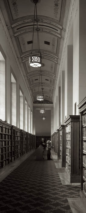
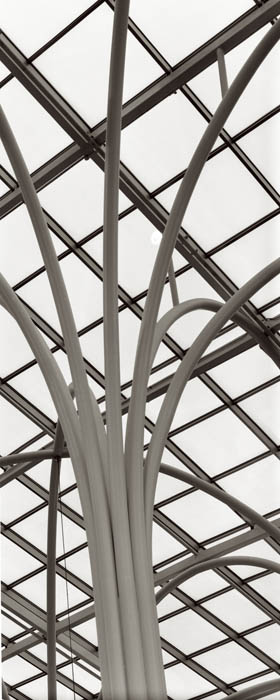
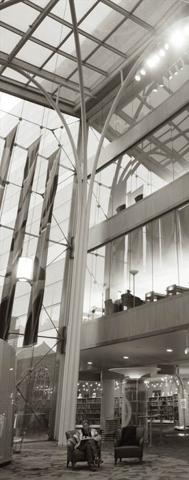
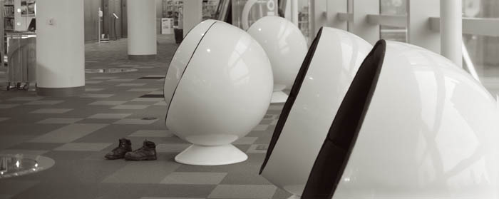
Pictures this week are from a shoot I did at the Indianapolis Central Library. The first portfolio class went really well. Please let me know if you want to be on the mailing list. Here’s some more information the next meeting is Tuesday May 21, 2013 at the Indianapolis Central Library. This is a great opportunity to make a greater commitment to your work and learn more about how others see your work. Still only $20. I look forward to seeing you if you’re near Indianapolis.

I’m still looking for a studio space here in Indianapolis. I’ve checked on a couple of spaces, but they have been too large, and therefore too expensive. I’d like to have the extra space and I could have a couple of offices for related businesses, but I don’t want to have to commit to a more expensive lease. I’m going to continue checking out spaces. My goals, right now, are to have about 1600 feet, with a large commercial or cargo door. The actual studio space must be at least 20X30 feet. I will need air conditioning and heat. You always here “location, location, location” applied to real estate. I think the key is to be sure you understand what you want in a location. I want to be in a good area of town, but I don’t need to be in a mall or on an expensive street. I can be a couple of blocks off the boulevard especially if the parking is good.
I’ve written about processing film and scanning it before, but as I did a lot of work with my 8X10 Toyo recently I thought I would discuss this again. I’ve made some changes in the way I’m processing film for printing Vandykes. I’ll be discussing how I’m scanning the film as well.
I started out working with a two-part developer based on Kodak D-23. The idea of a two-part developer: separating developer and activator, is that you can process almost any film at almost any temperature, which certainly makes things easier. The problem was that the Vandyke process, and most alternate printing processes, requires a very long density range with a very high maximum density. That is the film records the information in a way the makes the whites and blacks further apart, because the printing process tends to push the tones closer together. So I’ve switched to Ilford ID-11 developer. The biggest differences between the two developers is the addition of hydroquinone and the inclusion of the activator (borax) in the single solution developer. I’m using a dilute version of this developer with a very long development time because it makes a longer tonal range. Of course it’s kind of annoying that the processing time is now thirty minutes. If I were going to try and print these negatives on traditional silver gelatin photographic paper it would be difficult, and would require special paper or special handling.
One of the great advantages of scanning a negative is that you make a good scan of a negative that wouldn’t print well without special handling. I set the scan to keep the detail in the whites and black while maintaining a lot of detail and light in the mid-tones. My actual scan looks pretty flat. Of course the scan is in black and white, and I scan in 8-bit depth. I’m making very large scans: 3200 dpi. The first thing I do with these scans is basically spotting. I remove dust and so on. Since the scans are the first thing I do after processing there isn’t much of this. The next step is to make a copy of the scan and convert it to RGB. As many of you know I like a warm color palette. I use curves for this. I will raise the red curve about 7 units at the very bottom of the curve. Then I’ll move the center of the blue curve down into the yellow about 8 to 10 units. This makes my black and white image a slightly warm black and white image. Then I’ll adjust the whole curve, usually by deepening the shadows and lightening the highlights. This is how I make the final image less flat. Of course sometimes the curves will get rather complex. Then I’ll do a little sharpening, usually with smart sharpening in Photoshop.
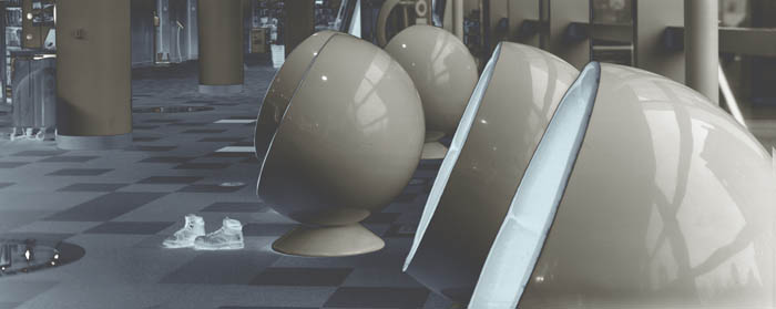
There is one more thing I do with curves: you can see it in the shot below. This is a u shaped curve. I raise the bottom left of the curve to the top of the box and lower the center of the curve, usually to about the 1/4 line. If you do this without adding the red and yellow first you get an image that looks a little like a solarization that you might make in a darkroom. If you change the curve after you change the color you get the two-tone effect you can see in this image. I think this is a really interesting effect; of course it doesn’t work with most images.
Please check out my classes at BetterPhoto.com:
An Introduction to Photographic Lighting,
Portrait Lighting on Location and in the Studio,
Getting Started in Commercial Photography
Thanks, John


