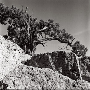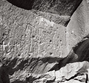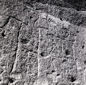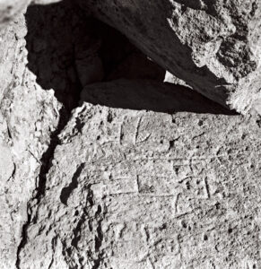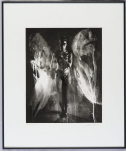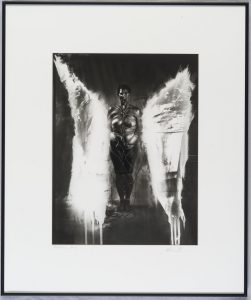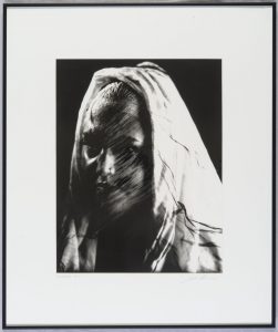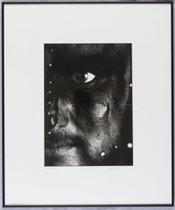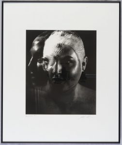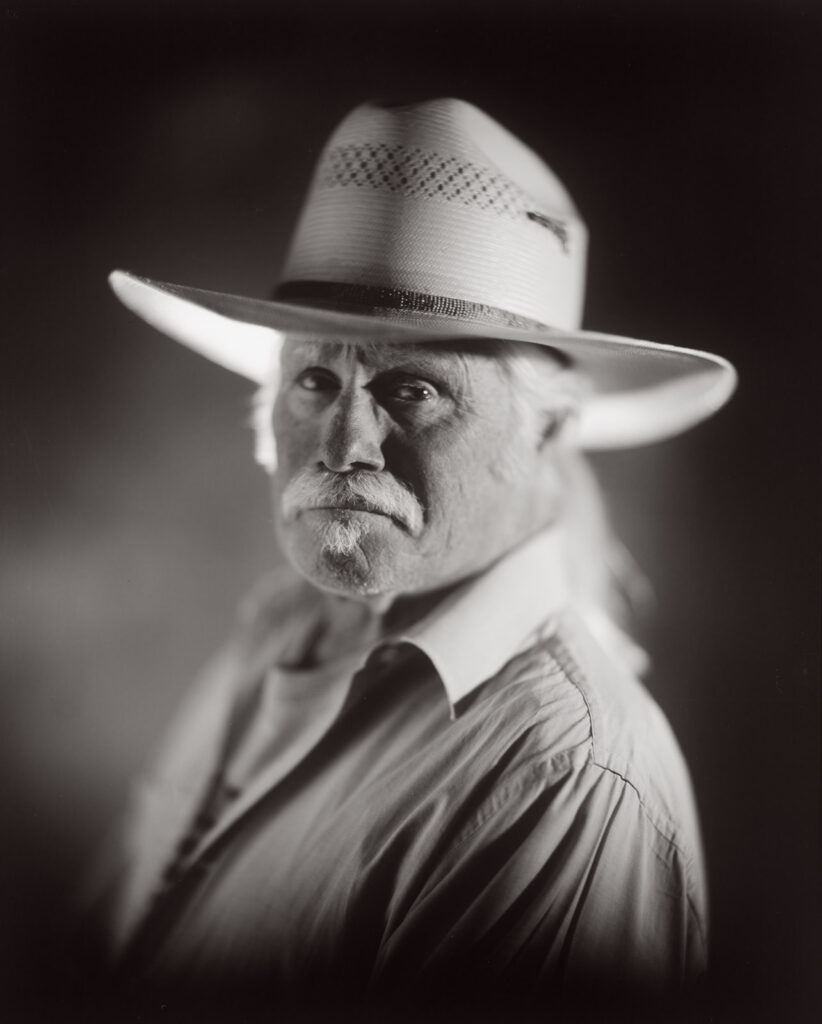
Photo Notes A place to talk about making images.

September 9, 2023

Around Navajo Lake

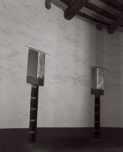
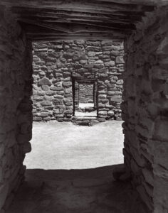
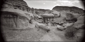
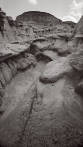
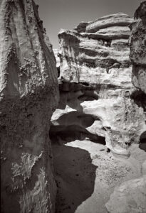
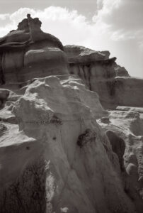
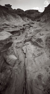
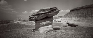
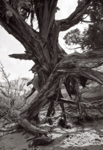
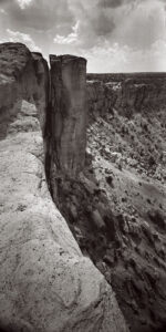
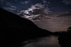
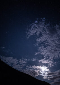
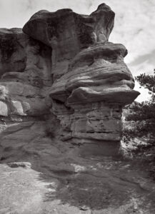
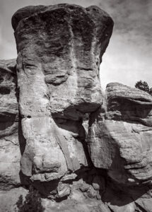
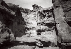
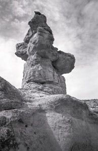
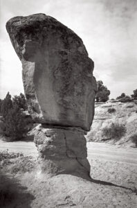
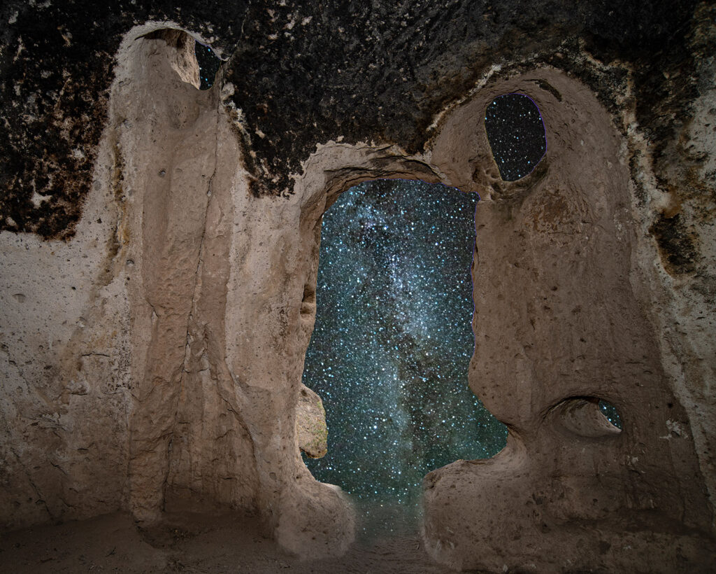
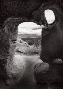
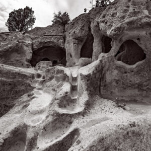
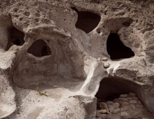
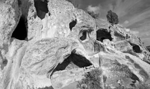
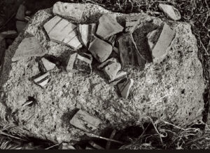
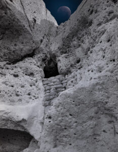
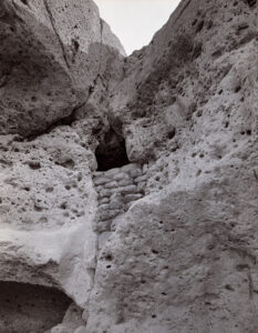
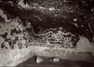
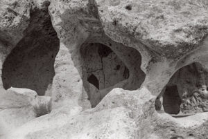
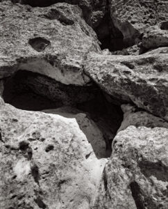
I thought I might start grouping some of the pictures from my trips here. Not a lot of organization here, but these are my favorites from my trip up to Navajo Lake. Didn’t actually see much off the lake, but I did get to Aztec Ruins, Bisti Badlands and Cottonwood Loop campground, so the shots grouped into these three areas. As Always, thanks for your attention

As you might imagine I’d prefer that these pages don’t get filled with a great deal of text. If you’d like information about a specific image, please e-mail me at john@siskinphoto.com and I’ll let you know what I know. Of course, if you have specific requests about an image you’d like to purchase please use the same address. If you’d like to go ahead and purchase an image, just contact me by e-mail.

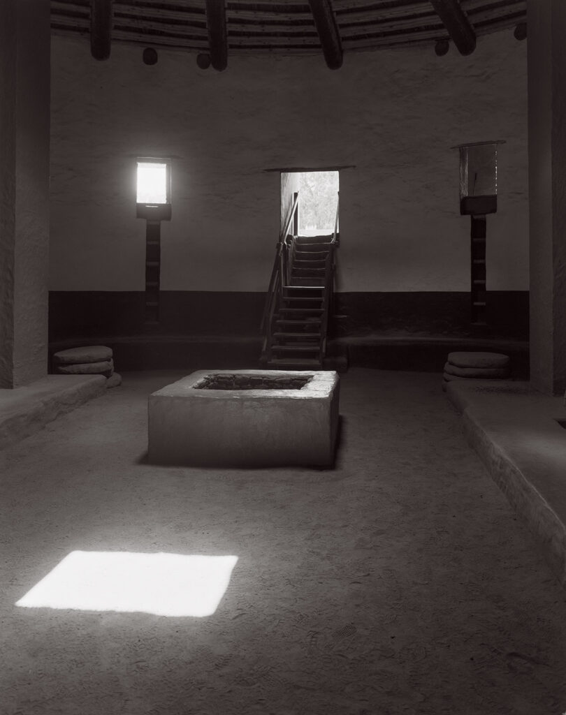
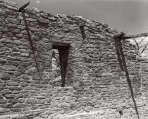
Aztec Ruins. All of these shots were made with the 8×10 Toyo Field

Aztec 3

Aztec 5

Aztec 6

Aztec 7

Aztec 8

Aztec

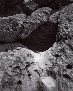
Bisti Bad Lands. These images wer made with my Mamiya Press camera and a panorama camera I built that uses Mamiya Lenses

Bisti 7

Bisiti 2

Bisti 24

Bisti 28

Bisti 4

Bisti 9

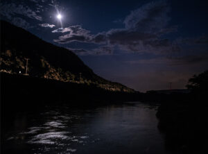
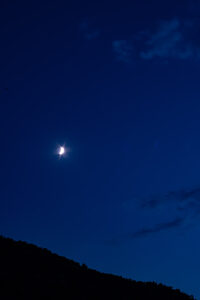
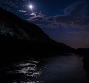
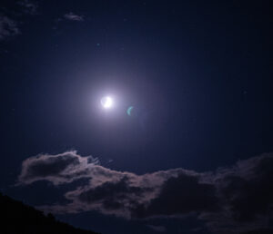
And a few more around the campground and traveling. Used the Nikon D-850 for the night time work

On HWY 25-1

On Hwy 25-2

Cottonwood Loop Night #1

Cottonwood Loop Night #2

Cottonwood Loop Night #3

Cottonwood Loop Night #4

Cottonwood Loop Night #5

Cottonwood Loop Night #6

Cottonwood Loop #15

Cottonwood Loop #16

Cottonwood Loop #18

Cottonwood Loop #19

Cottonwood Loop #20

A few links

Siskinphoto.Home

Introduction Page

Monument Valley

Taos Pueblo

Night Sky

Flowers

Monastery Road

Petroglyphs

Rock

Ice and Snow

Tsankawi

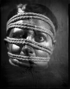
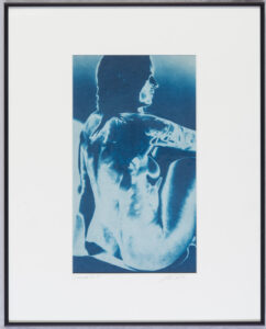
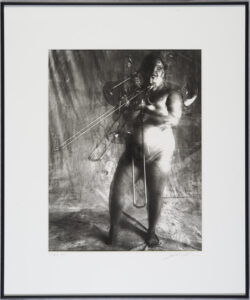
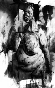
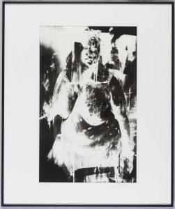
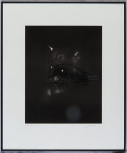
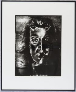
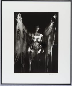
I did a large show when I was still in Indianapolis called Courting Chaos. The link will take you to the pages which describe the work and its evolution. These images are, well, chaotic and many of them are nudes. I hope you’ll find it interesting.

Links to my books, still available at Amazon!

August 17, 2023

Shooting a Bausch & Lomb Petzval Lens

I’m going to try to explain a project that I’m trying to work on. Unfortunately, for explanation, it’s a complex explanation with many threads; the good news, for me anyway, is that the complexity makes the project more interesting. You see one of my problems, as an image maker, is that I get bored with the simple things. Anyway, I’ve often heard that writing should begin at the beginning.
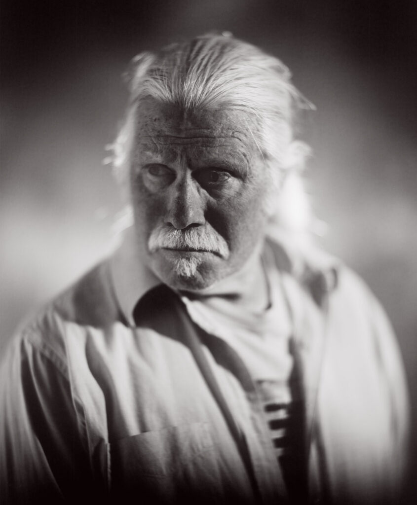
I

Photography was introduced in 1839. There were two competing methods of capturing an image with a chemical process. One was a direct positive image process called Daguerreotype, this is one of the threads which I hope to come back to. The more interesting process, to me anyway, was introduced by William Henry Fox Talbot. This process called photogenic drawing, involved making a negative, usually with a camera. The negative was dark where the original scene was bright and light where the scene was dark, a reversal of the original tones. Then the negative is put in contact with a second piece of sensitized paper and exposing this second piece of paper through the original paper negative. This produced a positive image, and you could make multiple positive prints. In terms of my project, it’s important to point out that he was using paper to make his negatives. There was no flexible film, which was invented by George Eastman. It would be quite a while before anyone found a process of making a photographically sensitive material that would stick to glass. Fox Talbot did the first book which explained how to do photography and was illustrated with actual photographs. You can see a good reproduction of the book Pencil Of Nature at this link: https://www.gutenberg.org/ebooks/33447

Very early in the practice of making photographs the martial used to make the negative, exposed in the camera, diverged from the materials used to make prints intended for display. The negative needed to be as light sensitive as possible, it needed to be on a translucent or, preferably, transparent material. The actual look of the negative was less important than the way it recorded information, since no one was really intending to look at negatives. In addition to being as sensitive to light as possible, it was a continuing challenge to make negatives that recorded color in ways that seemed intuitively right. For instance, the sensitive material, usually called emulsion, was unable to record red properly until the early years of the 20th century. Before that red, say red lips, were reproduced as black on prints. This panchromatic film and plate material was important to making negatives, but it made no difference for making prints. In fact, using an emulsion which was only sensitive to blue light made darkroom work much easier since you could work under red or amber light, called safelight. Many different ways of making photographic prints were introduced from the beginning of photography. Early methods included cyanotypes, platinotypes and kallitypes. By the middle of the 20th century the standard print was called a silver gelatin print. I’ll mention little more about working with direct positive materials at the end of this essay. I’ll want to mention are the introduction of color film, particularly Kodachrome, which was a direct positive material.

The positive black and white silver gelatin print was how most people experienced actual photographs for a long time. Of course, people experienced more images that were reproduced in ink, as newspapers, books and so on, but this essay is following photographic print making, rather than photomechanical printing. At the same time this was the dominant mode there were many creative photographers making images in unusual ways. For a long time, people continued to use film that wasn’t red sensitive, called orthochromatic film. In fact, Ilford still produces this sort of film. This made it possible to develop film by inspecting it during processing, rather developing film in total darkness which is necessary with panchromatic film. Kodak used to suggest using orthochromatic film for making portraits of European skin tones that had a reddish “ruddy” hue. I have no first-hand information about this technique. I am not sure when people started using silver gelatin paper in cameras instead of film. It was very popular with pin hole cameras because paper is cheaper than film and much easier to process. Kodak used to make a very thin paper, Ad Type, which was considered to be particularly good for making paper negatives, since it was more transparent that usual paper.

If you are currently making, or interested in making, paper negatives the situation is quite good. In the 1970s photo paper on a vinyl base, rather than paper, was introduced. This stuff is easy and quick to process. It dries flat. It scans very well. It is much cheaper than large film; 25 sheets of 8×10 Ilford HP-5 is over $200 and Ilford Multigrade paper is about $130 for 100 sheets ($8 per exposure vs. $1.30). The paper is sensitive to colors excepting amber and red, more than the original papers were. In addition, current photo paper, such as Ilford Multigrade RC is hugely more sensitive to light than 19th century materials. My tests tell me that the Ilford paper is something like 64 times more sensitive than tintype (an early and popular direct print) material was. Translated into modern film speeds I find that Ilford Multigrade RC can be exposed at ISO 64 with strobe (electronic flash) illumination. With daylight the ISO might be as low as 25.


II
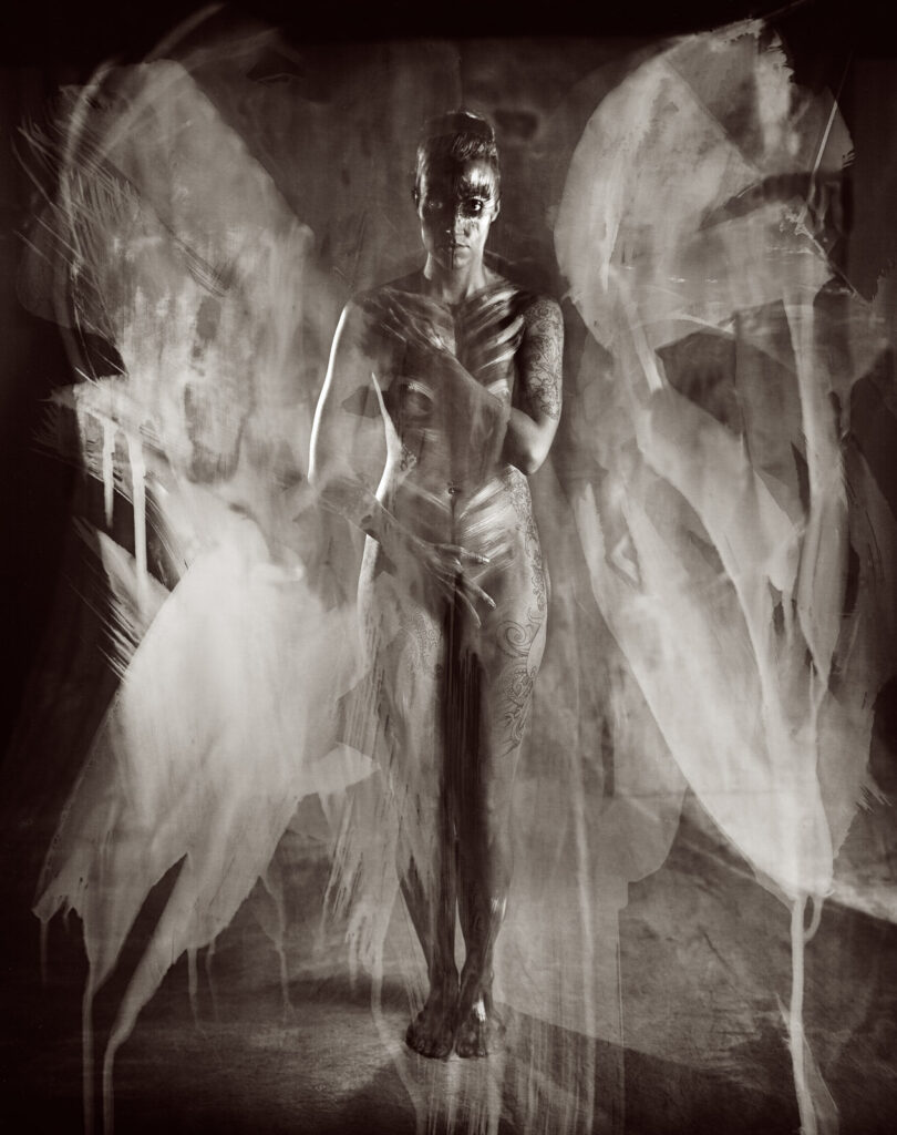
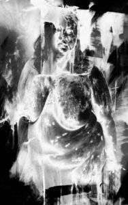
Cassie #14 from Courting Chaos

I am writing this as I begin a second project with paper negatives. The first project, Courting Chaos, began with an 11×14 camera and a desire to experiment with solarizing negative. Much of the inspiration came from Man Ray. You can see a lot of this project by starting with this link: https://siskinphoto.com/blog/?p=4397 (some of this project is not “work safe”). Whatever I’m doing now began when a friend sent me a Bausch & Lomb Rapid Portrait lens a couple of months ago. I am very fortunate. The lens is a Petzval design and built in the 1890s, about 135 years ago. For a long time, these sorts of lenses were the big deal portrait lenses. They are incredibly sharp in the center, almost three dimensional. Sharpness degrades quickly at you move out from the center. In addition, they were very fast lenses, especially for large format cameras, so they had almost no depth of field. They create a very compelling portrait. Often people don’t consider that the lens can do a lot more than just a neutral rendition of the subject.
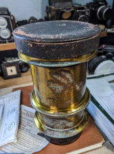
The Bausch & Lomb Rapid Portrait Lens

The Petzval was designed in 1840, just after Daguerre and Fox Talbot introduced methods of making photographs. Cameras existed before photographic materials. They were used as drawing aids. Of course, they had lenses, but, since an image for drawing could be re-focused and shifted, the lenses for these cameras weren’t suitable for making photographs where good focus had to cover most of the photographic plate. The Petzval was the first lens designed by mathematical computation rather than experience and experiment. Joseph Petzval was loaned several mathematicians by Archduke Louis of Austria, commander of artillery. The artillery was one of the few places where there were any people who could do the trigonometric calculations necessary for lens design. In addition to being incredibly sharp in the center of the image, theses lenses also had extremely high light transmission; they were “fast.” Even today this is one of the fastest lenses, for large format cameras, I have ever owned. I have owned a whole lot of lenses.

I should point out that there are some modern lenses, primarily from a company called Lomography, which are inspired by Petzval’s design. Of course, Petzval never made lenses designed to cover the small formats of today’s digital cameras; all of the original lenses were designed for cameras which shot plates that were quite large: a whole plate was 6.5×8.5 inches. Thus, these modern lenses are more inspired by than copies. Petzval lenses were not made for cameras much after 1900, but they were used for projecting images: movies and slides. Because they are fast lenses, and projection lenses are longer than shooting lenses this old formula worked well for this application.

These old lenses are quite prized by modern photographers making portraits with large format cameras. Also, modern photographers who make tintype and other wet plate images, the techniques used between the 1850s and the 1880s, are always looking for Petzval lenses. I am very fortunate to have been given this lens.


III

In order for any camera, modern digital or old large format, it needs to accomplish several things. It must focus light, which can be achieved with something as simple as a pinhole or with a complex modern zoom lens. While a pinhole doesn’t have to be in a particular position to achieve good focus, more complex lenses must be positioned quite precisely. A camera must hold the sensitive material in a the right position as well, or the focus will be degraded. A camera must control the amount of light which hits the sensitive material. This is achieved by controlling how much light comes through the lens and by how long the lens is open. The amount of light coming through the lens is controlled by a diaphragm in the middle of the lens. This control is usually measured in “f-stops.” These numbers are often confusing to new photographers. The amount of time the film or sensor is exposed to light is usually controlled by the aptly named “shutter.” When photography was beginning, since the sensitive materials were not very sensitive a lens cap could easily manage the exposure time. Modern cameras will generally have shutter speeds between several seconds and something as short as 1/4000th of a second. A camera must also block any stray light, light which doesn’t come through the lens, from exposing the film.
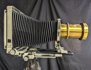
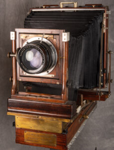
The Petzval mounted on my 8×10 Toyo. This is a camera from the 1980s

A camera from the 19th century generally had a ground glass back to focus the lens. The plate was in a holder which went the ground glass had been. The camera often had bellows between the film holding section, back standard, and the front standard, where the lens was mounted. Either the front or back, or both, could be moved to achieve correct focus. The diaphragm was most often in the middle of the lens, as a part of the lens. Sometimes a flat brass plate with a hole was used instead of a variable diaphragm. And the photographer might use his or her hat as a shutter. By the end of the 20th century all lenses designed for shooting had, in addition to a diaphragm, a leaf shutter. This shutter usually had speeds from 1 second to about 1/500th of a second. Photographers needed these shutters because, as mentioned, film is at least 50 times more light sensitive than the wet plate materials photographers were using when my Petzval was made. While I might make a 1 hour exposure, it was unusual to make an exposure longer than ¼ of a second.
IV

Perhaps all writing of done so far will make the problem clear to some readers. Certainly a few readers simply haven’t made it this far. The problem is how to actually make a picture with the Bausch Rapid Portrait lens. Often, I’ll read someone’s explanation of how to do a thing and it sounds as though they new exactly how to do a thing before even trying. I wish it was like that for me. First, I have to understand the problem then I begin to work through solutions.
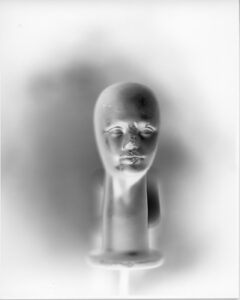
A first test shooting the Petzval. Note that this is the negative

Problem #1
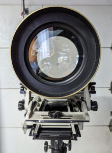
Getting the lens onto a camera. I actually have considerable experience with this one. I use Toyo 6.25×6.25-inch lens boards for large lenses. I’ve done a blog post which describes one way of cutting a large hole for a large lens: https://siskinphoto.com/blog/?p=3662. There are other ways to cut lens boards, but this is about the only way I can cut very large holes, such as I need for the Bausch & Lomb lens. This lens did not come with a retaining ring, which is a threaded piece which holds the lens onto the board. When you don’t have the retaining ring, you can find a really good machinist to cut you one. Expensive. An alternative is the hose clamp method I’ve used here. It’s not elegant, but it does work. In addition to the clamp, I used some rubber as a sleeve which makes the lens more secure. I also used Permatex 82180 Ultra Black Maximum Oil Resistance RTV Silicone Gasket Maker. I’ve used this with a number of camera hacks, it’s really good stuff. Keep in mind you really, really don’t want the lens to fall off, really.
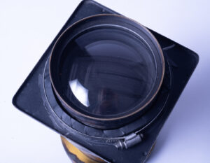
The lens held to the board with a hose clamp
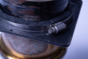
Close up of the hose clamp mount

Problem #2
Controlling the exposure time. Since the lens is very fast, about f4 and I’m using modern material this is a heck of a problem. If I was going
to shoot this lens outdoors in full daylight, I’d need a shutter speed of about 1/1000th of a second. I could shut the diaphragm down block most of the light, but this would remove the Petzval effect: extremely sharp center and diffused sides of the frame. I could use a very dark neutral density filter, but this adds another step between focusing and shooting. If your subject moves you picture could be ruined. Still if I could find an 8 stop neutral density filter that was about 5 inches across it might work.

I have not solved the shutter problem. If you are interested in shutter hack, please check out this link: https://siskinphoto.com/blog/?p=3695. Unfortunately, I don’t currently have any shutter large enough for this lens. I have found a work around.
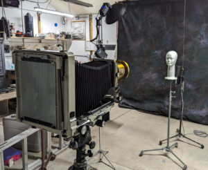
Studio set up for testing. Note the ground glass back on the camera

This is the method I’ve used to shoot with this lens without a shutter. I’ve blocked out all the windows in my shooting area. I know that many people prefer what is called a daylight studio, but since I’ve written a couple of books about shooting with strobes (available at Amazon). I have a sodium vapor safelight set up in the studio. This is a relatively bright light that won’t expose modern photo papers, such as Ilford Multigrade. You could use other safelights, but it’s very helpful to have a bright safelight. You will be evaluating the moment to make your picture under just the safelight illumination.
I usually begin a portrait session with 3 lights set up. While I might use more gear as a session goes on, I find if I have a bunch of extra lights out the subject will often want me to explain why I’m not using them. For anyone whose know me for a long time, yes, I am still using Norman LH2000 lights and power packs. These days I’ll have one light with a 5-inch reflector and barn doors, a second with a stove pipe snoot and the third will start as bare bulb. The bare bulb light will be behind the subject to light the background and to give edge light to the subject. In addition, I’ll have a light panel with a silver reflector and a second panel with rip stop nylon. All the lights are strobes, once the modeling lights are turned off, they make no light until triggered. Then they make A LOT of light for about 1/1000th of a second. While I could imagine trying to do this with continuous lights, on some sort of short timer, I think it would be very difficult. Particularly since you can set the amount of light an individual strobe will put out, which would be more difficult with continuous lights. I’ve done several magazine articles about portrait photography which might be helpful. You can see them at this link https://www.siskinphoto.com/magazinearticles.php which includes most of my magazine work. I’ll start with 5 film holders. Each holder has two sides, so I’ll have 10 pieces of Ilford Multigrade or other photo paper loaded. Just like I start with a limited number of lights out, I start with a limited number of exposures. When I had an assistant, I would start with more film loaded.

I do have one continuous white light set up on a foot switch I use this to help focus, frame and direct the shot.

Once I have the shot arranged, I’ll turn off the white light. I have to get the subject to stay still. This is ALWAYS a problem with large format portraiture. People have the expectation that I can somehow correct the exposure even after the film holder is in the back of the camera. It’s not more difficult with this set up, except you have even less depth of field than you might have in a normal large format portrait session.
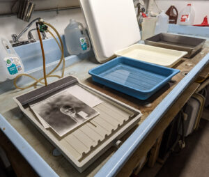

The greatest advantage of this method of working is that you can develop the images as you go. The first reason you’ll want to do this is that it makes it much easier to evaluate exposure and lighting. Since the processing time on modern paper is about 60 seconds this is almost as fast as Polaroid used to be in my 4×5 camera. Also, this tends to really impress the subject, who has likely never seen a print develop in a tray. The process helps to keep the subject engaged and motivated.

Thread 1

Direct positive photography was a very important part of commercial photography. Both of the early color photographic processes, Lumierre Autochrome and Kodak Kodachrome, were direct positive processes. The film you shot in the camera was put through several chemical baths and the product was positive color transparency or slide. This was particularly important for commercial color work because transparencies were easier to make color separations from for ink printing. Of course, Polaroid was a direct positive process as well and so were all those Super-8 movies. It was possible to use direct positive color paper, which was used for making color prints from transparencies and slides in the camera. Basically, the process was as described above but there was no safelight. So, in the moment you were making the shot, you were in the dark. This was interesting. Processing color paper is somewhat more difficult than processing black and white paper, but it wasn’t beyond what an amateur could do. Unfortunately, I can’t find anyone supplying direct positive color paper anymore. So it goes.
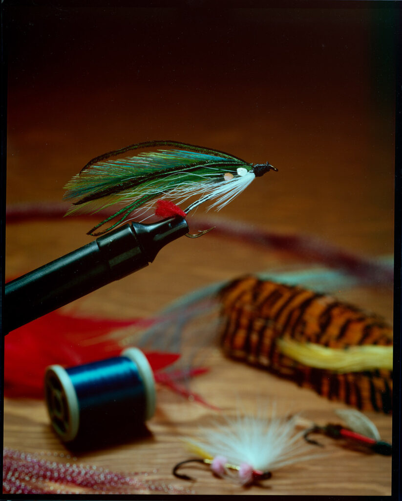
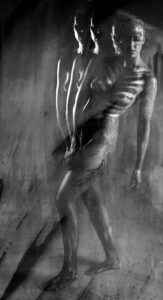
This shot was made by shooting Cibachrome print material in the camera. I did this shot more than 30 years ago. The print still looks fresh

A few links: Siskinphoto.Home

Introduction Page

Monument Valley

Taos Pueblo

Night Sky

Flowers

Monastery Road

Petroglyphs

Rock

Ice and Snow

Tsankawi

I did a large show when I was still in Indianapolis called Courting Chaos. The link will take you to the pages which describe the work and its evolution. These images are, well, chaotic and many of them are nudes. I hope you’ll find it interesting.

Links to my books, still available at Amazon!
November 29, 2022

Tsankawi

Filed under: Fine Art,Fine Art Portfolio,Landscape Photography,Other — John Siskin @ 12:22 pm

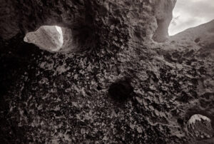
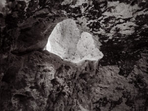
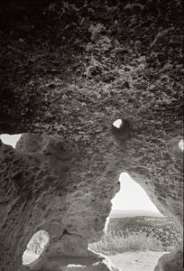
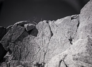
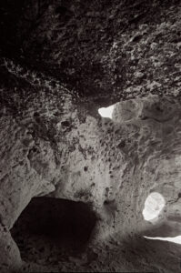
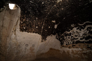
Tsankawi was home for indigenous peoples in 15th and 16th centuries. Today the site is one of my favorites to explore, because it has less infrastructure from the forest service than a site like Bandolier. I’ve been to this place several times with a variety of gear and always been rewarded with interesting images. I’ve also been grateful that few people actually stop here. There are multiple caves that were used as dwellings and for storage. There are also petroglyphs and other signs of former inhabitants.

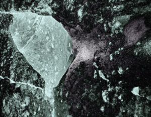
I’ve used a variety of cameras at this site including my Mamiya Technika, Mamiya Universal Press and Nikon D-850. As you’ll notice in these images, I’ve also played around with post-processing techniques on these images. If you are interested in a specific image, please contact me at the e-mail address below. As always, thanks for your attention.

Thanks for visiting this page. I would always appreciate feedback and you can send your comments to me at john@siskinphoto.com

If you’d like to purchase a print please use the link below and give me the browser link to the image and your shipping address.


I am also trying a couple of things that will give people an opportunity to support this work. While I am fortunate to have enough money to continue to do this work, some things are pretty expensive. For instance 11×14 film is hard to get and costs about $300 for just 25 shots and a 120 roll of Ilford Delta 400 is close to $9.

A few links

Siskinphoto.Home

Introduction Page

Monument Valley

Taos Pueblo

Night Sky

Flowers

Monastery Road

Petroglyphs

Rock

Ice and Snow

Tsankawi

Sugarite Campground

Churchs


I did a large show when I was still in Indianapolis called Courting Chaos. The link will take you to the pages which describe the work and its evolution. These images are, well, chaotic and many of them are nudes. I hope you’ll find it interesting.


Links to my books, still available at Amazon!
November 13, 2022

Ice and Snow

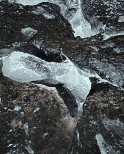
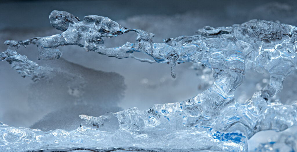
At 32º Fahrenheit (0º Celsius) something magical happens to water: it crystalizes. Of course, we often don’t’ see the individual crystals; we just see snow, ice, hail and wintery mix-and it’s often annoying. However, if you look closely, it’s beautiful. One of my favorite things to do with cameras is to look closely, very closely. With winter about to set in here I thought I’d share some snow and ice on this page.

I have a lot of really strange gear for looking closely. The most normal lens I use is a Nikkor 60mm f2.8 micro. The others include a Vivitar 90-180 Series 1 flat field lens, a Medical Nikkor, two Zeiss Luminars (the 25mm and the 63mm) and a bunch of microscope lenses. I also have bellows, extension tubes and a pile of adapters, so I have the tools to look at the very small. I used to use large format cameras to do this work, but new digital cameras, particularly the Nikon D-850 make the work easier and better! If you’re interested you can find an article I did, some years ago, on photo microscopy using this link: www.siskinphoto.com/magazine/zpdf/microscope.pdf. I really enjoy the challenges of using this gear and hope that will enjoy the images I’ve found.

As you might imagine I’d prefer that these pages don’t get filled with a great deal of text. If you’d like information about a specific image, please e-mail me at john@siskinphoto.com and I’ll let you know what I know. Of course, if you have specific requests about an image you’d like to purchase please use the same address. If you’d like to go ahead and purchase an image, please use the Paypal link below and give me the browser link to the image and your shipping address.


I am also trying a couple of things that will give people an opportunity to support this work. While I am fortunate to have enough money to continue to do this work, some things are pretty expensive. For instance 11×14 film is hard to get and costs about $300 for just 25 shots and a 120 roll of Ilford Delta 400 is close to $9.

A few links

Siskinphoto.Home

Introduction Page

Monument Valley

Taos Pueblo

Night Sky

Flowers

Monastery Road

Petroglyphs

Rock

Ice and Snow

Tsankawi

Sugarite Campground

Churchs

I did a large show when I was still in Indianapolis called Courting Chaos. The link will take you to the pages which describe the work and its evolution. These images are, well, chaotic and many of them are nudes. I hope you’ll find it interesting.

Links to my books, still available at Amazon!
October 23, 2022

Petroglyphs

Filed under: Fine Art,Fine Art Portfolio,Other — John Siskin @ 12:16 pm

Monument Valley Petroglyph

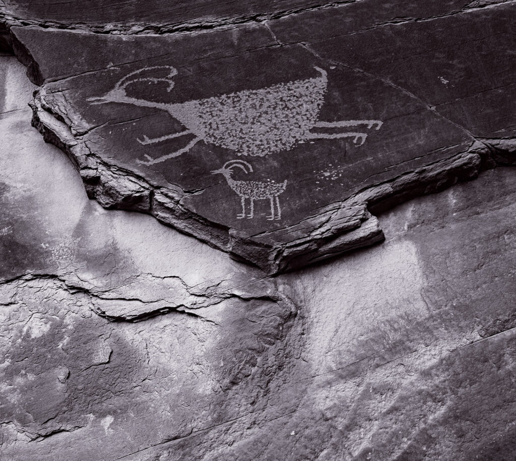
I’ve really enjoyed exploring and photographing New Mexico. I’m sure all the images I’ve done in the last couple of years make that clear. One of the most interesting aspects of this area is the long human history. One of the most compelling and oldest human behavior is leaving our marks in stone and wood. Whether in Lascaux Cave in France, the Leang Tedongnge cave in Indonesia or the New York Subway, humans have been writing on the wall for a long time. In this area the marks were carved into the rocks, which means we can still see them today. Of course, depending on the type of rock, some marks are much easier to photograph than others. There is a dark coating on some rock in the desert that is possible to chip off, which makes some of the pictures easy to see.

I’ve photographed petroglyphs at several places, La Cieneguilla, Tsankawi, Canyon De Chelly, Bandelier and Rinconada Canyon. I don’t know what these marks mean or how they relate to the cultures of the indigenous people who left these marks; but I do think that they are fascinating to photograph. I hope you will enjoy these images.

As you might imagine I’d prefer that these pages don’t get filled with a great deal of text. If you’d like information about a specific image, please e-mail me at john@siskinphoto.com and I’ll let you know what I know. Of course, if you have specific requests about an image you’d like to purchase please use the same address. If you’d like to go ahead and purchase an image, please use the Paypal link below and give me the browser link to the image and your shipping address.

I am also trying a couple of things that will give people an opportunity to support this work. While I am fortunate to have enough money to continue to do this work, some things are pretty expensive. For instance 11×14 film is hard to get and costs about $300 for just 25 shots and a 120 roll of Ilford Delta 400 is close to $9.


A few links

Siskinphoto.Home

Introduction Page

Monument Valley

Taos Pueblo

Night Sky

Flowers

Monastery Road

Petroglyphs

Rock

Ice and Snow

Tsankawi

Sugarite Campground

Churchs


I did a large show when I was still in Indianapolis called Courting Chaos. The link will take you to the pages which describe the work and its evolution. These images are, well, chaotic and many of them are nudes. I hope you’ll find it interesting.

Links to my books, still available at Amazon!
April 24, 2021

Photographic Seeing and Interpretation


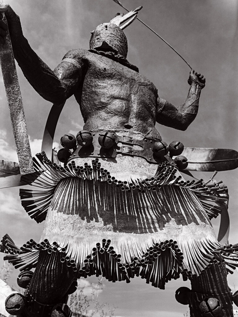
Apache Mountain Spirit Dancer at Museum Hill Santa Fe, by Craig Dan Goseyan

I made this picture Wednesday on Museum Hill in Santa Fe. The subject is a sculpture titled Apache Mountain Spirit Dancer, and it was made by Craig Dan Goseyan. It’s a very impressive piece. One of the things I hope this image captures is the effect created by the very large size of the work. Regardless of how I interpret the piece, and all photography of 3 dimensional objects, is interpretation, the effect of seeing a photograph is not the same as seeing the thing itself. If you see a photograph of the Grand Canyon, you haven’t seen the Grand Canyon. I think most people who have ever tried to photograph the Grand Canyon have discovered how photographs do not convey the effect of seeing the canyon.

I wanted to mention this because I have a related problem with sharing my images on computer screens. The effect of seeing the image on screens is not the same as seeing a print. First, as in the image of this sculpture, you do not have actual scale of the work. This sculpture must be close to 20 feet tall. If you’re looking at the image on a phone, you simply have no idea, and you also miss texture and much more. I’ve made many big prints over the years, some over 6 feet tall. In fact, one of the reasons I shoot large format film is that I can make big prints. The original size of the digital file of this image is 4 foot 6 inches tall at 300dpi. Actually, I could make an even bigger scan of this negative. If I were to make a traditional darkroom print of this shot, I could make it 9 feet tall, which would help convey the size of the sculpture. Of course, it would be an incredibly difficult thing to make such a print. A few old friends may remember that I once made an enlarger to make such huge prints. Another aspect of my interpretation of this sculpture is that I shot it in black and white. Any black and white image is certainly an interpretation of the original, since most of us see in color. Cole Weston was quoted as saying to his brother Brett “I see in color, don’t you?” I choose to shoot in black and white much of the time because I’m more interested in the shape and feel of my subjects and I want to push the viewers’ eye to see that way. That doesn’t mean I don’t use color; this image like most of my black and white images is subtly toned, which I hope affects the mood of the image. Of course, a print would allow me more control over the tone of an image because it wouldn’t be dependent on how you set up your monitor.

Often, I feel that sharing my images as small digital files is like listening to Tales From the Topographic Oceans done by the band Yes in 1973 on the original speaker of a 1967 Chrysler.  The sound that you hear are related to what the band recorded, but perhaps not closely related. Another disappointing aspect of sharing images this way is that the images from digital phones, and every other image making device out there, are the same size and on the same monitor as images that I crafted with large cameras and processed, painstakingly, in my darkroom.

When I began doing photograph, in the very early seventies, much of what we were taught was actually print making. In those days we were taught to print on silver chloride and silver bromide papers. In more recent times I’ve also learned to make Vandyke and cyanotype prints, both of which involve hand coating paper. I could scan and share these prints but you would lose just about every aspect of the prints which makes them special. Except for the cyanotypes which are a strong blue color. In addition to these types of prints I’ve also made type C prints and Cibachromes, both of which are color prints as well as a couple of platinum prints which are black and white. Print making is an art and craft which was once an integral part of photography; you could not learn to be a photographer without learning to be a print maker. Even when I started doing photography, by which time commercial color printing for amateur photographers was ubiquitous, photo classes always taught printmaking as part of the course. I was talking to another photographer, a guy who is really serious about it. He’s really into wet plate work, tin types and ambrotypes, but he has never actually seen a platinum print or a Vandyke print or an albumen print. These are all beautiful ways of presenting and interpreting a photographic image. One of the reasons that I like to shoot black and white film, rather than make wet plate negatives, is that I can print them in all these different ways. Truth be told, you can also convert your digital images into black and white negatives and print them out onto transparent media. You can make all these print types with these digital negatives. For a variety of reasons, I’ve made digital negatives of film images before printing them, this method works very well.

There are many very fine digital printers on the market and some very lovely papers designed for them. I certainly do not want to take anything away from the current Epson and Canon high end printers. I can’t think of any reason why I would want to make a color print using an enlarger and a darkroom. The simple fact is that these are better prints. Not only is the color spectacular, but the long-term stability of digital prints, if you do it right, is at least as good as prints made from color negatives using type C papers. The fact is that you can purchase one of these printers for much less than a 4×5 color enlarger would have cost you in 1980, in actual not corrected for inflation dollars, is fabulous. While people often mention the cost of paper and ink for these printers, you should have seen what paper and chemicals cost for color darkroom printing. I really like the Canon Pro 100 printer I use these days and I would certainly consider buying another printer from either Canon or Epson. These are terrific tools for color printing. They will also make a fine black and white print. But… the digitally printed black and white image is different from a darkroom print. The dyes or pigments used for the prints are different, and look different, from the silver halides used in traditional black and white prints. The digital prints will also look different, sometimes very different, from the various hand coated prints: Vandyke, cyanotype, platinum and so on. Still it’s no reason not to try and make black and white prints with an ink jet printer, and it might lead to hand made printing.

One more thing about digital printing: it’s really easy to make a bunch of prints. Thousands… So, I’ll sell a digital print for $75, but I won’t sell any darkroom print for less than $300, and some prints would be much more expensive. If you see any prints that you’re interested in on my site, or that I’ve posted, please contact me about buying a print!

In addition to buying images from me, PLEASE buy some photo books. I was looking around my office today and I have over 375 photo books, just in my office. You can look at the images of other photographers on line, and that will improve your seeing, but books allow the photographer to have greater control over the size color and presentation of the images. I believe that spending time with images, especially images the maker cared about, is the best way to improve your own image making.

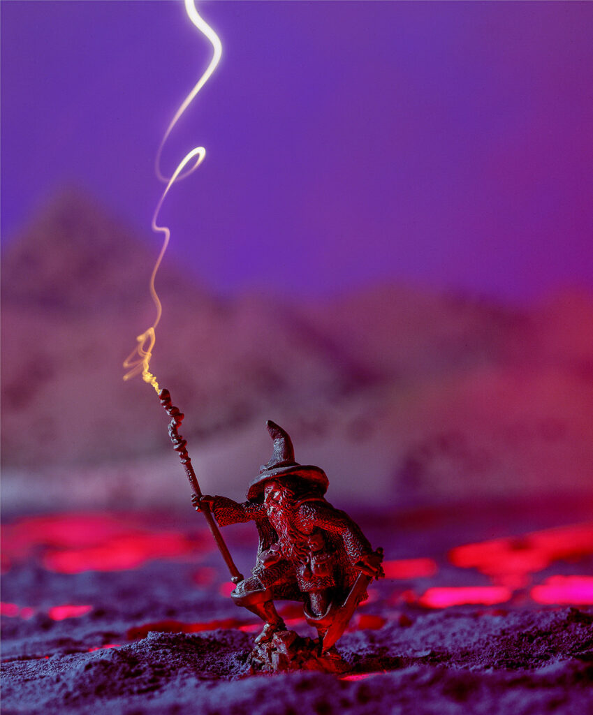
I thought it might be good to close this post with another image of a sculpture. By way of contrast with the first image in this post, this piece is 3 inches high. It’s a monochromatic piece of work. So, I added color and built a background for the piece in this shot. Also, if you’re interested, I made this image BEFORE Photoshop. The shot was done on a single piece of film using light, multiple exposure and props, old school!

Check out my books at Amazon. I’m not sure the links will work, but you can search for me at Amazon. A digital print of Apache Mountain Spirit Dancer is available for $75 which includes shipping the U.S.A. Such a deal. Please e-mail me at john@siskinphoto.com to order this or another print. Thanks for your attention!

Understanding and Controlling Strobe Lighting: A Guide for Digital Photographers

https://amzn.to/3tH5Dp9

Photographing Architecture: Lighting, Composition, Post production and Marketing Techniques

https://amzn.to/3c8nLlU

December 3, 2020

Courting Chaos

Curt #5
Published in Black and White Magazine

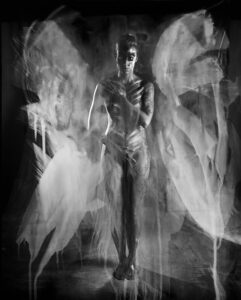
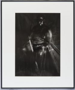
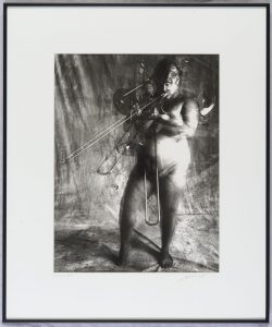
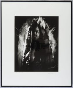
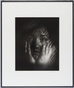
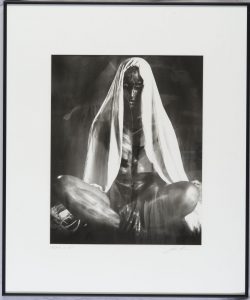
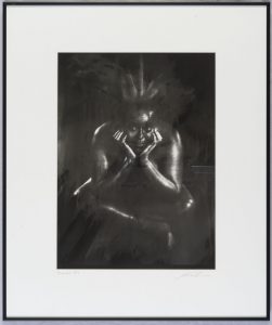
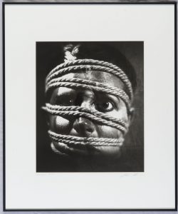
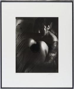
This post is about my Courting Chaos images, a group of images I made over more than two years, while I was working and teaching in Indianapolis. Black & White Magazine is going to publish one of these images in a few weeks! The work evolved over more than a dozen shoots with an 11×14 camera. The first show of this work was on November 2nd 2018 at Indiana Landmarks (1201 Central Ave, Indianapolis, IN 46202). Before I get any further, I should thank David Kidwell for assisting all through this project and Julie Powers for make-up and models. This work wouldn’t have happened without them.
Andrea #5

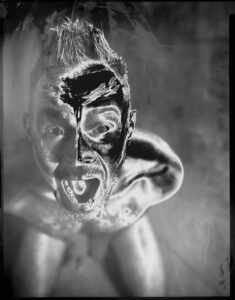
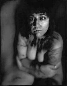
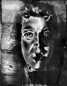
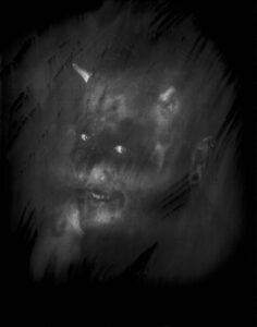
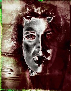
These images are figure studies handled with a very unusual and chaotic photographic process described below. Many of them are nudes and several of them are disturbing. I’m writing about the process in this post and also some thoughts about the results. I’ve enjoyed the entire project as a voyage of constant discovery. I really had no idea how the project would evolve when it began. My response to the images continues to change. I hope the images invite the viewer to create a narrative from them. My narrative involves ideas about escape. I hope you’ll find them interesting. My perception of the project continues to evolve.

Cassie #14

There are a lot of places I could begin to explain this work, because this project integrates traditional photographic techniques that I learned in high school with digital image manipulation techniques I’ve learned as recently as a few months ago. The project integrates inspiration from my first trip to Europe in 1971 and my visual inspiration continues to evolve to today. The greatest challenge, for me, is coming to accept chaos to be a co-creator in my photography. As a commercial photographer, for more than four decades, I’ve been fighting chaos. A commercial photographer generally wants to control and direct images to produce effective visual communication. In this project I’ve used special processes to push the images into shapes I couldn’t predict or control. The results have been the most surprising images of my career.

Gordon #1

I saw a series of sculptures by Michelangelo called the Prisoners when I was in Europe in 1971. I was about fifteen at the time. At first these images appear unfinished, especially in comparison with the David sculpture which was in the same museum. When I continued to stare at the pieces they seemed to be struggling to escape from the marble. The effect was quite surprising to me at the time: the seemingly unfinished sculpture conveyed movement while David sculpture remained a single moment of time. It’s now almost fifty years later and I still remember the effect and the details of these sculptures.

Bree #11

I remember seeing an Edward Weston photograph of a pepper just a few years after I saw the Prisoners. This image also had a lasting effect on my development as a visual artist. The design of the image was beautiful, but the medium: a silver gelatin photograph was also gorgeous. Of course, I had seen photographs before, but this was a contact print from a large format negative. Weston’s excellent craft created particularly beautiful prints. Over the years, in my classes and in working with photography, I’ve often met people that assume photographs are somehow independent of the medium in which they’re presented. For example, a person might think that they’ve seen “Moonrise Over Hernandez” by Ansel Adams because they’ve seen it on-line or in a magazine or a book, but a fine photographic print, made by Ansel himself, has a different effect than an image from an offset press or a computer display. In order to appreciate any creative work, it helps to see the work as the artist intended. Of course, there are many posters of paintings by Van Gogh or Monet and so many others, but is seeing these posters equivalent to seeing the original painting? It was the effect of the actual Weston print that allowed me to see beauty of the medium. I hope to share the actual prints of Courting Chaos again soon.

Wayne #2
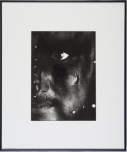
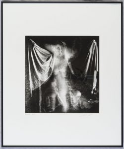
Framed silver gelatin print for the show

Of course, there are so many images that affected my way of seeing, and these images in particular, but the work of Man Ray is most important for this project. Man Ray worked in a variety of media: doing sculpture, painting and photography. My perception of his work changed when I saw original pieces at the Getty in Los Angeles. One aspect of his images was important to this project: he was solarizing his negatives in a way I had never seen before. The way that Man Ray integrated innovative technique with creative images is spell binding.

Pernicamera

On another level this project began when I purchased an 11X14 inch camera. While it’s not necessarily difficult to think about scaling up a camera “it’s just the same thing only bigger” the reality is pretty impressive. A full frame dSLR uses a sensor that is 1X1.5 inches, regardless of how high the sensor resolution; it’s a small area. The camera for this project has a capture area of 11X14 inches. In addition, while the sensor may have high resolution, film resolution is on the molecular level. The total amount of information you can capture is mind blowing. The costs of the thing are pretty impressive as well; a single sheet of 11X14 inch film costs eight dollars. Adams used 4X5 inch camera much of the time; Edward Weston used an 8X10; Brett Weston did use an 11X14 camera occasionally. The problems of using a camera this size are not just expense and weight, it also needs a lot of light. So, when I got the camera, I wasn’t sure that I would use it much, maybe just a couple of times to prove I could master the thing. Then, after a lot of thinking, I came up with a way of using the camera to make images that I couldn’t create with any other camera. I decided to explore solarizing (re-exposing) the negatives.

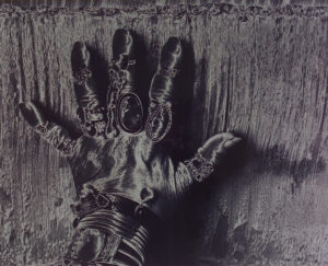
Bonnie Hunt, Hand
Print Solarization

This is similar to what Man Ray did, during the processing of his film he re-exposed the negative to light. This creates a reversal effect. This was a pretty common process when I was in high school, but we solarized prints rather than negatives. When you solarize a print the white area of the print black or gray, which can look pretty compelling. It’s impossible to entirely predict what will happen, and even if you do the same thing twice, the results will be different. The thing about Man Ray’s solarization process is that he turned the black areas of the image white AND he could make multiple prints that were the same. This was because he solarized the negative rather than the print. This creates another big problem: you have to process modern film in total darkness (yes, even black and white film) so you can’t see what you’re doing. When Man Ray did this people used orthochromatic films; films that couldn’t record red light, so he could see what he was doing. I realized that I could shoot 11×14 photographic paper, which can be used under safelight. Since I have an 11×14-inch scanner I could take these negatives, which were on paper, and scan them. This enables me to interpret the images in Adobe Photoshop. The large area of the negative is an advantage with this process because you can choose to re-expose and re-develop specific parts of the image. As I mentioned, what actually happens to the image when you re-expose and re-develop is chaotic, almost totally unpredictable. Thus, I am courting chaos in making these images.

Mindy K #7
Original Negative Scan

A great advantage of shooting the photographic paper, rather than film, is that the processing is quick and easy. You can develop the RC paper in about a minute. Even with re-exposure it was only about 5 minutes from exposing with the camera to seeing the negative in white light. Almost as quick as Polaroid! In addition, since the large scanner was in the studio I could scan and reverse the images in short order, so the subject was able to leave with digital prints! This project benefited immensely from the immediacy of this medium. For many of the models, this was their first experience in seeing photos develop.
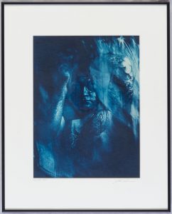
Cassie #1

This project is also the result of the work of David Kidwell, assistant extraordinaire, and Julie Powers, makeup artist for angels and devils. Julie did a couple of really remarkable things for this project: first she designed the make-up for all the models. This is tougher than it might appear because the Multigrade paper doesn’t react to color in an even way: reds and yellows are very dark while blues are brighter that you would suppose. Julie also arranged for all the models, THANKS! David managed set up and kept me on my feet all through the shoots. Now that I’m in my sixties I couldn’t have done it without him! Each of the models was special. It can be difficult to come to terms with normal pictures of yourself, it’s more of a challenge when you’re teaming up when chaos. You know that all of the images will present you in unpredictable ways. My thanks and gratitude to all!

Rachel #10

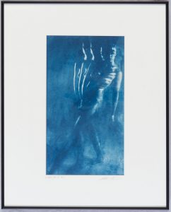
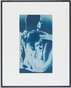
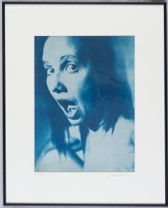
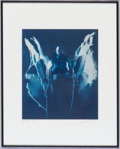
In another way this project began at University High School in Los Angeles, specifically in bungalow L79. At sort of the end of the campus was the photography classroom. I first learned about photography in that classroom. The instructor was Arnold Rubinoff. Arnold was teaching things that really weren’t common in high school photography, back then. I remember learning to make color prints from him. One of the things we learned was how to do solarization. He also introduced us to Cyanotype prints. Half of the show was printed as cyanotype images. You can see those prints at this link: https://siskinphoto.com/blog/?p=3630.

Cassie 1 #5
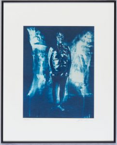
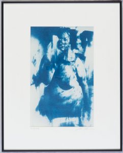
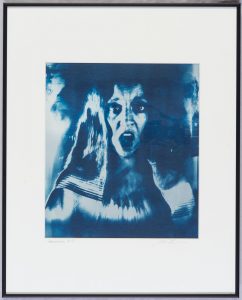
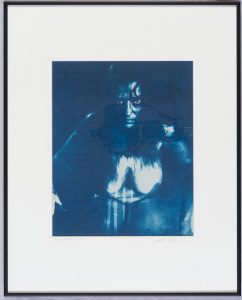
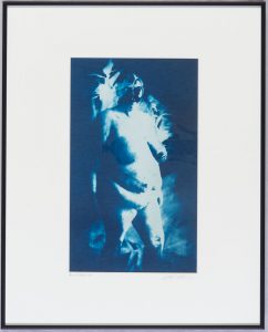
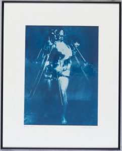
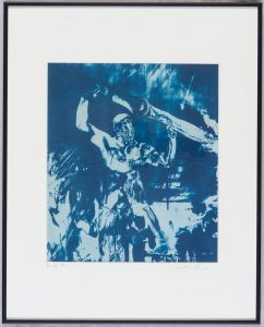
Framed cyanotype print for the show

There are a number of important technical insights that led to this project. One of the first problems that had to be solved was the cost of film; if film is too expensive it keeps the photographer from taking risks. One other advantage of the paper is that it has good light sensitivity: Ilford Multigrade is about ISO 100. Another important moment was when I realized that I had an oversized scanner. My original thought was to remove the emulsion from the paper and put it onto a clear base, which would have been very difficult. Scanning the images was easy and quick. I was then able to make new negatives on clear film using a digital printer. These prints, both silver and cyanotype, are much more beautiful than the digital prints. For this show I used multiple coats of cyanotype chemistry on blotter paper. The images have a very dark maximum tone as a result. Because the prints are hand coated each cyanotype print is different, even if made form the same negative. Cyanotype prints do change over time, which is part of the charm. For the silver gelatin prints (check here to see: https://siskinphoto.com/blog/?p=3571) I used Ilford Multigrade Warm Tone Fiber base paper. Fiber base papers use a barium clay coating called baryta that produces the white tones. In addition, when you air dry a glossy fiber-based paper the surface looks fabulous. I also toned all the silver gelatin prints with selenium, which makes a more agreeable print color as well as adding to the stability of the final print.

Tyler #12
Framed silver gelatin print for the show

Actually shooting with the camera is pretty tricky. Some things are like working with any large format camera, for instance the image is upside down and backwards on the ground glass. Over the years I’ve become used to that. One problem that particularly affects the 11X14 is bellows extension. The closer your lens is to the subject the further it is from the film. I know this seems exactly backwards, but trust me it’s the way it works. What might not be obvious is that as the lens gets further from the film, there is less light on the film. If you are shooting a head and shoulders portrait with a 35mm camera you don’t have any bellows extension; if you’re shooting with 4X5 film you might lose half stop to bellows extension; with the 11X14 camera you’ve lost about 2 stops of light to bellows extension. This means it’s dark on the ground glass when you’re focusing and composing AND you need a lot of light to make the exposure. Most of the time I was using between 5000 and 7000 watt-seconds of strobe power to make the exposure. My lens was generally set between f11 and f16. While this seems like it would give you plenty of depth of field on a digital camera, on the 11X14 it gives you only a matter of millimeters of focus depth. So, focus is critical, which makes it very important for the model to stay in place! Another aspect of bellows extension is the way it affects your lens choice. The normal lens, if there is one, for an 11X14 camera is about 450mm, or 18 inches. If you were shooting like you do with a full frame digital camera, you’d need about 1000mm (39 inches) of bellows to bring the lens into focus. That makes the camera really difficult to keep stable and to adjust. The answer is to shoot with shorter lenses, which bring the camera closer to the subject. My favorite lenses for this project were a 12 inch red dot Artar from Goerz (f9) and a 14 inch gold dot Dagor (f8) made by Kern for Schneider. I use the 12 inch Artar for head and shoulders and the 14 inch Dagor for full body shots. I used a few other lenses on occasion including a 48cm Goerz Dogmar (f5.5) and a 270mm Wide Angle G-Claron from Schneider (f6.3), but they just didn’t keep the subject/camera distance in a good range.

Mindy #7
The negative for this image is above

The camera itself has some basic challenges. The fact that it’s a working 11X14 camera must be in its favor but it’s built out of parts from other cameras. It’s built on top of a drawer, like something out of a card catalog. This allows it considerable expansion, but it also means the camera isn’t portable. It weighs a lot, so the tripod needs to be a beast. The focus skips out of alignment, which is annoying. The bellows sag. There is a plaque on the camera proclaiming it as the Pernicamera Model Number 0001, built in 1995 to 1997. I’d like to meet the person who built it. I don’t use a shutter with the camera at all. I keep the lens open, but all the illumination, once the paper is loaded, is from safelights. I trigger the strobes with a radio slave to make the exposure. This makes it easier to do multiple exposures and to move the subject between the exposures.

Leslie #6

I hope you’ll enjoy looking at more of the images from the first show.

Part 1, Silver Gelatin Show Prints:

Courting Chaos-The show, Part 1-Silver Gelatin Prints

Part 2, Cyanotype Show Prints:

Courting Chaos-The show, Part 2-Cyanotype Prints

Part 3, Color Glossy Show Prints:

Courting Chaos-The show, Part 3-Kodak Color Glossy prints

If you examine more of this blog you’ll see information about many other aspects of photography. If you’d like to look at some of my articles about photography, from View Camera, Photo Techniques and shutterbug, please look at this link: http://www.siskinphoto.com/magazinearticles.php

You can see my main site at: http://www.siskinphoto.com/

If you have any questions regarding these images or my photography please contact me at john@siskinphoto.com.

I generally post current work on Facebook. Perhaps you’d like to look me up there at https://www.facebook.com/john.siskin

I’ve written a couple of books. They’re available at Amazon. Here’s my author page there: https://www.amazon.com/John-Siskin/e/B004N73O36/ref=dp_byline_cont_pop_book_1

Wayne #13

Wayne #13

November 15, 2018

Courting Chaos-The show, Part 3-Kodak Color Glossy prints

This post includes the two Kodak color glossy prints from my current show at Indiana Landmarks. The color begins in the original process, but it is modified and enhanced in these images. The show is going to be on display until the end of November, so you still have a chance to see the real photographs. I say real photographs because looking at an online version of an image adds a sameness to all images. On your phone or monitor images always about the same size and the color is always affected by your monitor. These two images are BIG, 30 inches wide and about 40 inches tall. If you care about photography its a really good idea to see actual photographs, not just digital versions. I used 3 types of prints in the show: silver gelatin prints, cyanotypes and a couple of Kodak color glossy prints. As I mentioned in the last post you can visit this previous post for more information about print types: https://siskinphoto.com/blog/?p=2243. The other images, the silver gelatin and the color glossy images are posted as parts 2 and 3 of the show. The Silver Gelatin prints are at: https://siskinphoto.com/blog/?p=3571. The cyanotype images are at: https://siskinphoto.com/blog/?p=3630


The show has 41 images up on the walls; these are the two Kodak Color Glossy images. These are machine made images. I could print a hundred of them, all exactly the same, by pushing a button. The images are for sale. The images are about 30×40 inches and mounted on Gator board. The price is $350. The price includes shipping in the U.S. For this and all the other images please contact me directly at john@siskinphoto.com to arrange the purchase. Please contact me for more information about any of these images. These images are copyright by me and are NOT INTENDED to be shared. You are welcome to post the link to this blog, but do not re-post my images. Thanks for your respect.

Kodak Color Glossy Images

Curt #2

Leslie #6

Courting Chaos-The show, Part 2-Cyanotype Prints

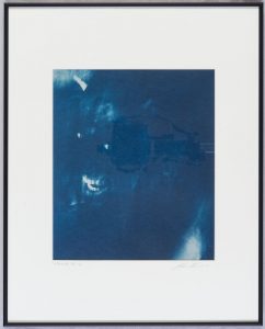
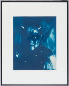
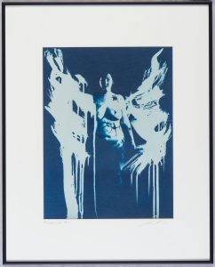
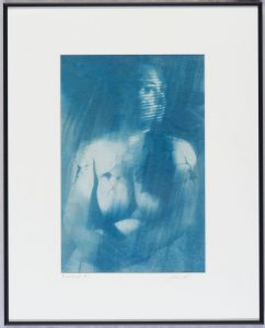
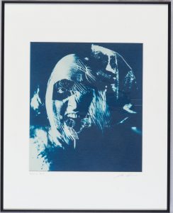
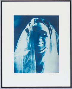
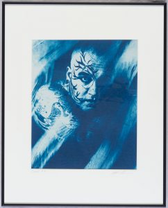
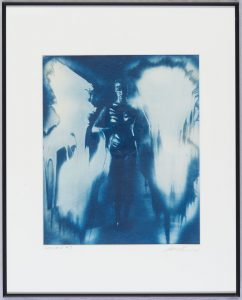
This post includes all the cyanotype images from my current show at Indiana Landmarks. The show is going to be on display until the end of November, so you still have a chance to see the real photographs. I say real photographs because looking at an online version of an image adds a sameness to all images. On your phone or monitor images always about the same size and the color is always affected by your monitor. If you care about photography its a really good idea to see actual photographs, not just digital versions. I used 3 types of prints in the show: silver gelatin prints, cyanotypes and a couple of Kodak color glossy prints. As I mentioned in the last post you can visit this previous post for more information about print types: https://siskinphoto.com/blog/?p=2243. The other images, the silver gelatin and the color glossy images are posted as parts 2 and 3 of the show. Kodak Color Glossy images are at https://siskinphoto.com/blog/?p=3633. The Silver Gelatin prints are at: https://siskinphoto.com/blog/?p=3571

The show has fourty-one images up on the walls, these are the twenty cyanotype images. Each time you make a cyanotype image it is different, even if made from the same negative. The images are for sale. The cyanotypes are matted to 16X20 inches and are priced at $500. The price includes shipping in the U.S. For this and all the other images please contact me directly at john@siskinphoto.com to arrange the purchase. Please contact me for more information about any of these images. These images are copyright by me and are NOT INTENDED to be shared. You are welcome to post the link to this blog, but do not re-post my images. Thanks for your respect.

Cyanotype Images

Wayne #12

Wayne #2

Rubella #5

Rubella #1

Rachel #7

Mindy #7

Jennifer #5

Jennifer #4

Dana #11

Dana #5

Curt #11

Curt #5

Cassie 2 #2

Cassie 1 #5

Cassie 1 #3

Andrea #2

Andrea #1

Alex #5

Alex #1

Courting Chaos-The show, Part 1-Silver Gelatin Prints

This post includes all twenty silver gelatin images from my current show at Indiana Landmarks. The show is going to be on display until the end of November, so you still have a chance to see the real photographs. I say real photographs because looking at an online version of images adds a sameness to all images. On line images are always about the same size and the color is always affected by your monitor. If you care about photography its a really good idea to see actual photographs, not just digital versions. I used 3 types of prints in the show: silver gelatin prints, cyanotypes and a couple of Kodak color glossy prints. As I mentioned in the last post you can visit this previous post for more information about print types: https://siskinphoto.com/blog/?p=2243. The other images, the cyanotypes and the color glossy images are posted as parts 2 and 3 of the show. The Cyanotypes are at: https://siskinphoto.com/blog/?p=3630 and the Kodak color glossy images are at: https://siskinphoto.com/blog/?p=3633

The show has 41 images up on the walls, these are the 20 traditional silver gelatin prints also called fiber base prints. The images are for sale. The silver gelatin prints, the first group below, are $550. They are matted to 20X24 inches. The price includes shipping in the U.S. For this and all the other images please contact me directly at john@siskinphoto.com to arrange the purchase. These are all hand made prints, done by me in my darkroom. Please contact me for more information about any of these images. These images are copyright by me and are NOT INTENDED to be shared. You are welcome to post the link to this blog, but do not re-post my images. Thanks for your respect.

Silver Gelatin Images

Bree #12

Cassie 2 #14

Leslie #14

Rachel #11

Andrea #5

Wayne #2 V3

Wayne #1

Tyler #12

Rubella #14

Rubella #4

Mindy #7

Wayne #13

Leslie #6

Jennifer #1

Shelby #2

Cassie 2 #7

Bunny #9

Rachel #10

Bree #4

Andrea #9

Older Posts »

Powered by WordPress