I hope you’ll check out my books: Photographing Architecture and Understanding and Controlling Strobe Lighting
. Please get copies, if you haven’t already. Of course you know that one reason for this blog is introduce the books and get you to consider one of my classes at BetterPhoto.com: An Introduction to Photographic Lighting, Portrait Lighting on Location and in the Studio, Getting Started in Commercial Photography
The second portfolio class was great. Please let me know if you want to be on the mailing list. Here’s some more information the next meeting is Tuesday June 18, 2013, 6:30 pm. We may be meeting at my new studio. Stay tuned for more about that! The class is a great opportunity to make a greater commitment to your work and learn more about how others see your work. Still only $20. I look forward to seeing you if you’re near Indianapolis.
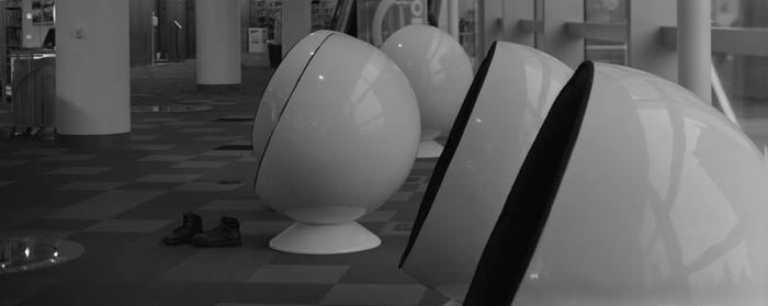
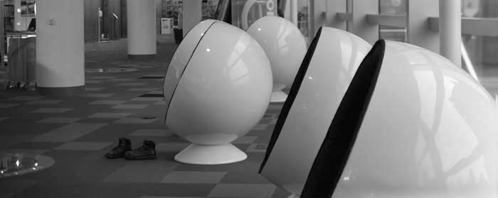
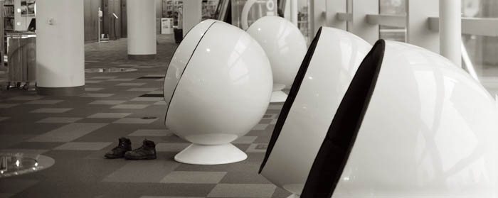
I’m going to discuss the kinds of prints I’ll be using in my show at Indiana Landmarks. The opening is on June 7 at 6pm. I hope I’ll see you there! For more information check this link. Most of the images in this week’s blog are going to the show at Landmarks. Please keep in mind that images on your screen aren’t good representations of what real prints look like. The images are linked to the fine art part of my website, which you can use to buy a print. The prints available on my website are made on the Moab Entrada rag paper discussed below.
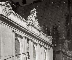 I’ll start with silver gelatin prints because in many ways they’re my favorites. These were the most common black and white prints for most of the twentieth century. The black part of the image is silver and the emulsion is made of gelatin, which is probably the reason for the name. One of the most beautiful aspects of these prints is the bright whites created by a layer of barium clay called baryta. This layer is on most prints made on a paper base, usually called fiber based paper. This layer was replaced by a titanium layer when resin coated papers were introduced. I think resin papers aren’t as beautiful because they don’t have the baryta layer.
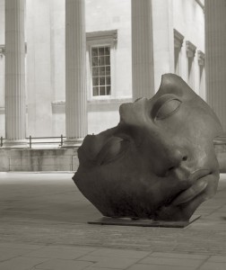 Fiber based silver gelatin papers are still available ready to use. The prints are exposed in a darkroom with an enlarger. Processing time is over an hour; most of this is wash time. If the prints are properly handled, particularly given through washing, they will last for at more than a hundred years. There are many examples of prints that have lasted longer than a hundred years. The photographer has considerable control over the print; in addition to changing density the photographer can also change contrast tone and local density.
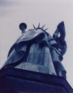 Cyanotypes have bright blue images on a base that is the color of the paper or other material you print on. Sir John Herschel invented the process in 1842. The light sensitive chemistry is iron based, and the final image is an iron compound. The final dye is called Prussian blue. The chemistry is mixed by hand and brush coated on the paper. Multiple coatings add to the saturation of the image, which is why I usually triple coat the paper I use for cyanotypes. Processing is just a long wash.
Cyanotype, Vandyke and other processes are usually referred to as alternate processes or alt process. The idea is that these are different from the more commercial photographic processed used for most photography. These processes are much more personal, for instance the paper is hand coated by the photographer. The processes are not very sensitive to light so enlargers can’t be used. Most often the original camera negative is pressed right against the hand coated paper. An alt process print is a handmade object and each print will be unique. Of course the photographer has to exercise considerable care when preparing and processing these prints in the darkroom.
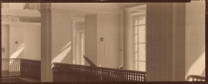 The Vandyke process produces a brown toned image. The image is made of silver, but the light sensitivity is based on iron chemistry, like cyanotypes rather than silver chemistry like a silver gelatin print. This process is often referred to as Kallitype. The sensitizer contains Ferric Ammonium Citrate, Tartaric Acid and Silver Nitrate. Processing includes considerable wash time as well as a bath in sodium thiosulfate. Properly processed Vandyke images have lasted for about a hundred years.
From the time that George Eastman introduced the Kodak camera with the slogan “You press the button, we do the rest” there have been places to get your processing work done for you. In some cases, for instance Kodachrome processing, there was literally no way to do it yourself. In addition much processing can’t be done economically unless you do a lot of printing everyday. Certainly many people have noticed that their ink jet printers don’t work well after sitting unused for several weeks. There are several things that are important to the photographer and the viewer with all of these processes; first is how much control does the photographer have over the images. The printer that I am using allows me to manipulate the image files in Photoshop. This gives me incredible control over the final print. Another consideration is how long will the prints last. While none of these processes have been around long enough to prove durability, prints can tested using light and heat.
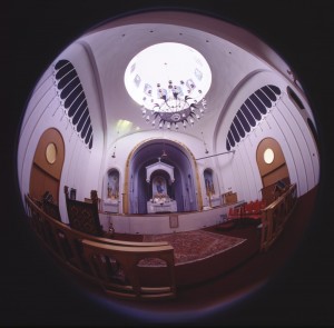 Fuji Type R Paper was actually used when photo labs had enlargers. The R stood for reversal. It allowed the lab to maker a print directly from a slide or a larger film positive. So you could make prints from Kodachrome or Ektachrome without making an inter negative. Labs generally used enlargers to work with this paper, so you could do dodging and burning, but there was not much other control. I am not sure if anyone is still making Type R paper. These prints had good saturation and good durability.
 Moab Entrada Rag 290 Bright paper is made to high standards and designed for specialized ink jet printers. It is a rag paper and has no acid or lignin. The Epson Ultrachrome inks are used. These are pigment inks so they will last for an exceptionally long time. I find that these prints have a very long tonal scale and very fine color. These prints are made from files that have been prepared with Photoshop. Both color and black and white prints can be made on this paper.
Fuji Crystal Archive Matte paper is a color photographic paper designed to be used with digital enlargers. Prints are made from files that have been prepared with Photoshop. This kind of paper is usually used to make color prints. I often use it to make mono-chrome images with a warm tone. Prints made with this product are expected to last more than twenty years.
Please check out my classes at BetterPhoto.com:
An Introduction to Photographic Lighting,
Portrait Lighting on Location and in the Studio,
Getting Started in Commercial Photography
Thanks, John


