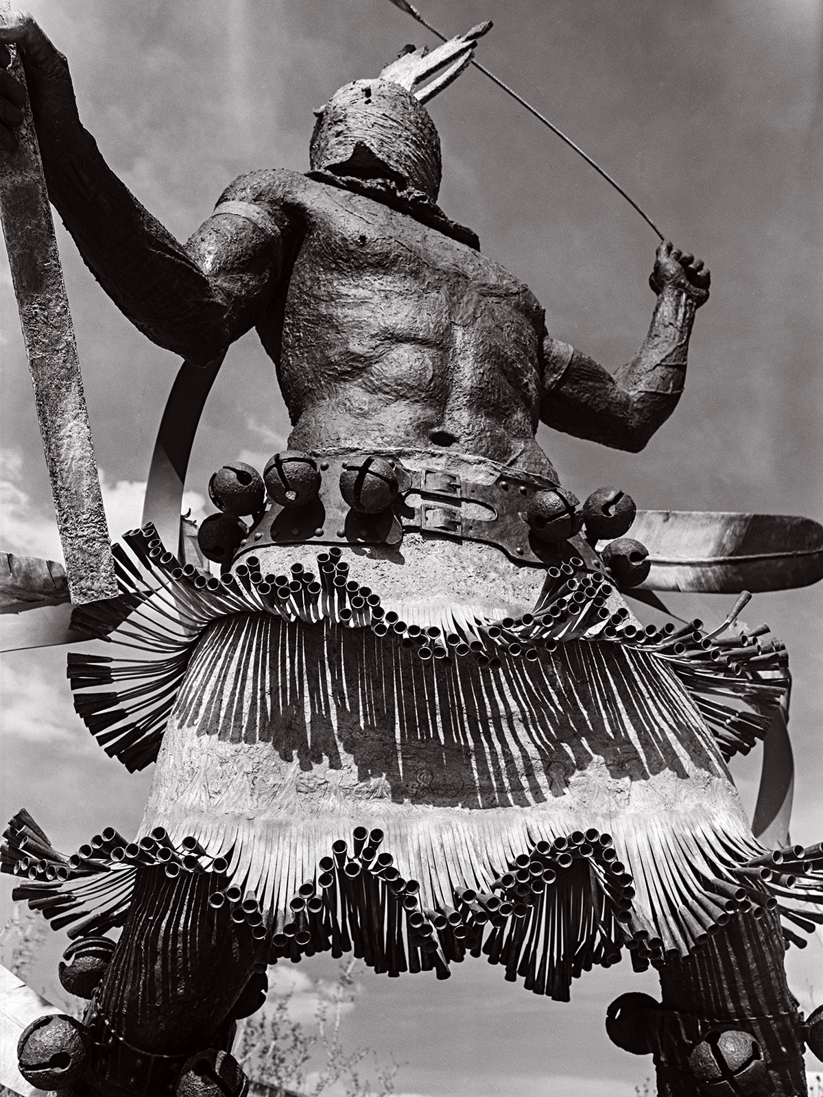
Apache Mountain Spirit Dancer at Museum Hill Santa Fe, by Craig Dan Goseyan
I made this picture Wednesday on Museum Hill in Santa Fe. The subject is a sculpture titled Apache Mountain Spirit Dancer, and it was made by Craig Dan Goseyan. It’s a very impressive piece. One of the things I hope this image captures is the effect created by the very large size of the work. Regardless of how I interpret the piece, and all photography of 3 dimensional objects, is interpretation, the effect of seeing a photograph is not the same as seeing the thing itself. If you see a photograph of the Grand Canyon, you haven’t seen the Grand Canyon. I think most people who have ever tried to photograph the Grand Canyon have discovered how photographs do not convey the effect of seeing the canyon.
I wanted to mention this because I have a related problem with sharing my images on computer screens. The effect of seeing the image on screens is not the same as seeing a print. First, as in the image of this sculpture, you do not have actual scale of the work. This sculpture must be close to 20 feet tall. If you’re looking at the image on a phone, you simply have no idea, and you also miss texture and much more. I’ve made many big prints over the years, some over 6 feet tall. In fact, one of the reasons I shoot large format film is that I can make big prints. The original size of the digital file of this image is 4 foot 6 inches tall at 300dpi. Actually, I could make an even bigger scan of this negative. If I were to make a traditional darkroom print of this shot, I could make it 9 feet tall, which would help convey the size of the sculpture. Of course, it would be an incredibly difficult thing to make such a print. A few old friends may remember that I once made an enlarger to make such huge prints. Another aspect of my interpretation of this sculpture is that I shot it in black and white. Any black and white image is certainly an interpretation of the original, since most of us see in color. Cole Weston was quoted as saying to his brother Brett “I see in color, don’t you?” I choose to shoot in black and white much of the time because I’m more interested in the shape and feel of my subjects and I want to push the viewers’ eye to see that way. That doesn’t mean I don’t use color; this image like most of my black and white images is subtly toned, which I hope affects the mood of the image. Of course, a print would allow me more control over the tone of an image because it wouldn’t be dependent on how you set up your monitor.
Often, I feel that sharing my images as small digital files is like listening to Tales From the Topographic Oceans done by the band Yes in 1973 on the original speaker of a 1967 Chrysler. The sound that you hear are related to what the band recorded, but perhaps not closely related. Another disappointing aspect of sharing images this way is that the images from digital phones, and every other image making device out there, are the same size and on the same monitor as images that I crafted with large cameras and processed, painstakingly, in my darkroom.
When I began doing photograph, in the very early seventies, much of what we were taught was actually print making. In those days we were taught to print on silver chloride and silver bromide papers. In more recent times I’ve also learned to make Vandyke and cyanotype prints, both of which involve hand coating paper. I could scan and share these prints but you would lose just about every aspect of the prints which makes them special. Except for the cyanotypes which are a strong blue color. In addition to these types of prints I’ve also made type C prints and Cibachromes, both of which are color prints as well as a couple of platinum prints which are black and white. Print making is an art and craft which was once an integral part of photography; you could not learn to be a photographer without learning to be a print maker. Even when I started doing photography, by which time commercial color printing for amateur photographers was ubiquitous, photo classes always taught printmaking as part of the course. I was talking to another photographer, a guy who is really serious about it. He’s really into wet plate work, tin types and ambrotypes, but he has never actually seen a platinum print or a Vandyke print or an albumen print. These are all beautiful ways of presenting and interpreting a photographic image. One of the reasons that I like to shoot black and white film, rather than make wet plate negatives, is that I can print them in all these different ways. Truth be told, you can also convert your digital images into black and white negatives and print them out onto transparent media. You can make all these print types with these digital negatives. For a variety of reasons, I’ve made digital negatives of film images before printing them, this method works very well.
There are many very fine digital printers on the market and some very lovely papers designed for them. I certainly do not want to take anything away from the current Epson and Canon high end printers. I can’t think of any reason why I would want to make a color print using an enlarger and a darkroom. The simple fact is that these are better prints. Not only is the color spectacular, but the long-term stability of digital prints, if you do it right, is at least as good as prints made from color negatives using type C papers. The fact is that you can purchase one of these printers for much less than a 4×5 color enlarger would have cost you in 1980, in actual not corrected for inflation dollars, is fabulous. While people often mention the cost of paper and ink for these printers, you should have seen what paper and chemicals cost for color darkroom printing. I really like the Canon Pro 100 printer I use these days and I would certainly consider buying another printer from either Canon or Epson. These are terrific tools for color printing. They will also make a fine black and white print. But… the digitally printed black and white image is different from a darkroom print. The dyes or pigments used for the prints are different, and look different, from the silver halides used in traditional black and white prints. The digital prints will also look different, sometimes very different, from the various hand coated prints: Vandyke, cyanotype, platinum and so on. Still it’s no reason not to try and make black and white prints with an ink jet printer, and it might lead to hand made printing.
One more thing about digital printing: it’s really easy to make a bunch of prints. Thousands… So, I’ll sell a digital print for $75, but I won’t sell any darkroom print for less than $300, and some prints would be much more expensive. If you see any prints that you’re interested in on my site, or that I’ve posted, please contact me about buying a print!
In addition to buying images from me, PLEASE buy some photo books. I was looking around my office today and I have over 375 photo books, just in my office. You can look at the images of other photographers on line, and that will improve your seeing, but books allow the photographer to have greater control over the size color and presentation of the images. I believe that spending time with images, especially images the maker cared about, is the best way to improve your own image making.
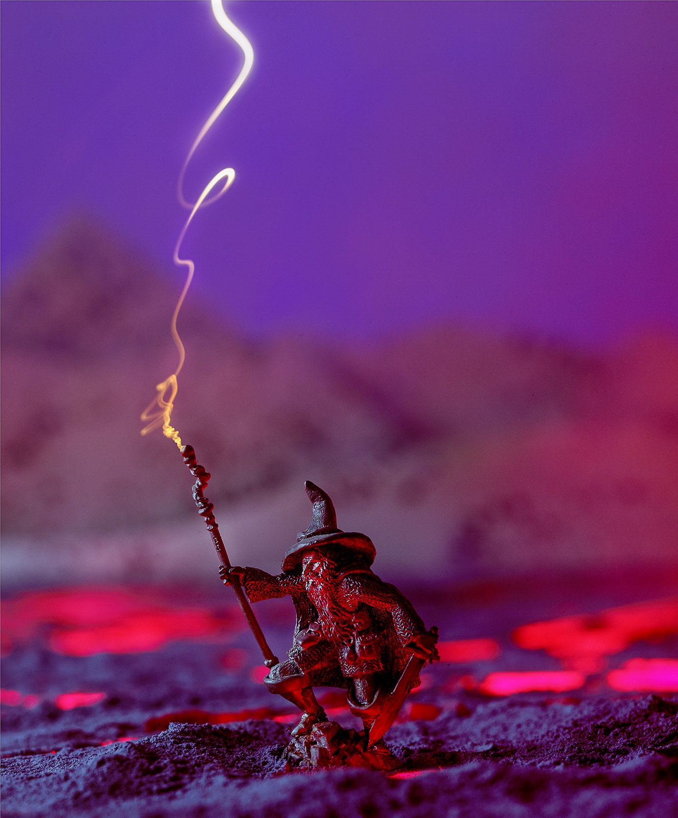
I thought it might be good to close this post with another image of a sculpture. By way of contrast with the first image in this post, this piece is 3 inches high. It’s a monochromatic piece of work. So, I added color and built a background for the piece in this shot. Also, if you’re interested, I made this image BEFORE Photoshop. The shot was done on a single piece of film using light, multiple exposure and props, old school!
Check out my books at Amazon. I’m not sure the links will work, but you can search for me at Amazon. A digital print of Apache Mountain Spirit Dancer is available for $75 which includes shipping the U.S.A. Such a deal. Please e-mail me at john@siskinphoto.com to order this or another print. Thanks for your attention!
Understanding and Controlling Strobe Lighting: A Guide for Digital Photographers
Photographing Architecture: Lighting, Composition, Post production and Marketing Techniques
A few links
I did a large show when I was still in Indianapolis called Courting Chaos. The link will take you to the pages which describe the work and its evolution. These images are, well, chaotic and many of them are nudes. I hope you’ll find it interesting.