 I wanted to post some information about my experience at The George Eastman House in Rochester. It’s been over a week since I got back, so I have had a chance to think about things a bit. I really wasn’t very interested in taking pictures of the house, so if you want to see the place, visit the site. The collection is huge and only a small amount is on display. You can see much more of the collection by making a request. I wanted to see large format Kodachrome, and the staff were kind enough to let me see dozens of example of 8X10 Kodachrome. Most of this blog will be devoted to what I learned. I wish I had some Kodachrome images to attach to this blog, but the scanner is still missing from the move. Besides you
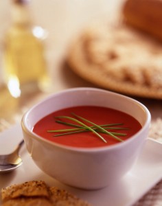
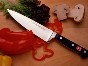 should look at original Kodachrome transparencies, the image on a computer is not the same. The computer makes everything the same size and removes other individual characteristic of images. So I’m just attaching a couple of food images.
Kodachrome was developed in the Kodak labs by a couple of musicians named Leopold: Mannes and Godowsky. The Kodak labs were run for most of the twentieth century by C. E. K. Mees. The Kodak lab was arguably the first industrial research lab. Kodachrome was a huge step forward in capturing color. The previous methods used a filter over a single emulsion, which is very similar to how digital cameras capture color. Kodachrome used three separate emulsions that captured individual colors. This
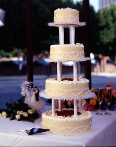 captures much more detail. In addition, with a Kodachorme image, the color went where the silver molecules were. As a consequence Kodachrome images last much longer than other color processes. This was something I wanted to see.
Most of my first color shots were made on Ektachrome color film in the middle seventies. These images are beginning to fade. The Kodachrome shots I saw at Eastman House were from the fifties. The color was as vivid and as crisp as if they were made yesterday. As with other Kodachromes that I’ve seen, the images had no visible grain. Certainly, in large format sizes, Kodachrome was capable of capturing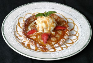 more information than most current digital cameras. of course you wouldn’t see this on print sizes less than 11X14, and probably not on print sizes less then 20X30 inches. Unfortunately all sizes of Kodachrome, and processing for Kodachrome film, are discontinued.
I also learned a lot about shooting food. The images I saw were made by Nickolas Muray.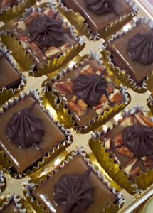 Almost all of them were images of food. I was interested to see how much hard light he used to make his shot. The food had shape and sparkle as a result of this. I was also interested to see the design of the shots. Many of his images included items that a current stylist would never use. These shots were probably made in the fifties and early sixties and our ideas of how food should look have changed. It must have been difficult to shoot the food for several reasons. 8X10 cameras heed to shoot at a small stop, perhaps f64 or smaller, which means you need a lot of light. He used quartz lights, so heat would have been a consideration especially with food. He had no Polaroid proofing, so I don’t know how he tested his lighting and exposure. Perhaps he set up the day before and ran a test sheet of film overnight. It was really a pleasure to look at the very fine work that Nickolas Murray shot.
You can learn a lot more about lighting in my BetterPhoto.com classes: An Introduction to Photographic Lighting, Portrait Lighting on Location and in the Studio and Getting Started in Commercial Photography You might also want to check out my book: Understanding and Controlling Strobe Lighting: A Guide for Digital Photographers. Here’s a sample chapter that discusses portraiture.
