Photo Notes A place to talk about making images.

July 6, 2014

Changing Your Way of Seeing

My books and my classes give me a reason to keep doing this blog. If you’re in Indiana I hope you’ll consider taking my Portfolio Workshop. You can see a little more information about this workshop if you check out this blog post . I’ve listed my BetterPhoto classes at the end of this post. Thanks so much for your attention.

Frame 16

I see as a photographer, constantly breaking the world into still images. I think that most people who spend a big chunk of life doing photography see a little differently from people who aren’t involved in static art forms. I’ll look at something and think: “I’d shoot that, maybe a little warmer and with more contrast” or maybe: “That was a really great instant” and: “Look at that design.” I think this is part of being a good photographer. I once heard a guy say that he always adjusted a TV to look like Kodachrome, since that was the way he saw the world. Of course this illustrates one of the problems with this way of seeing: you start to see everything the same way. I’ve been known to walk by an interesting subject while thinking that’s not the kind of shot I do. I often make my shots warmer, even my black and white shots, but I can’t remember the last time I made a shot cooler.

Frame 22

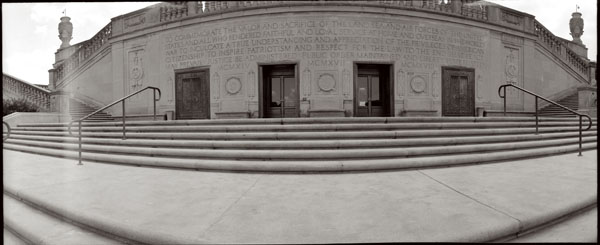
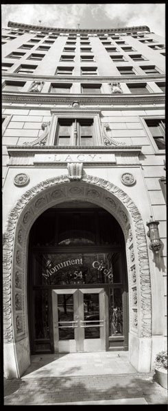
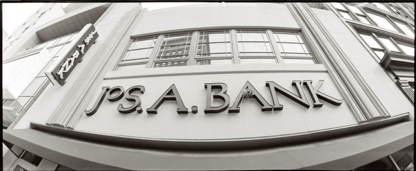
So I’m always looking for ways to break out of my way of seeing. I know that many people want to have a style, but not me. I’m a photographer, not a painter, so I can be prolific and do work that’s new. I want to push myself to see in different ways. One of the ways I do this is to work with different tools: cameras, lenses and software. I just got a Horizon Perfekt, which is really helping me to see differently. This camera shoots a 120º image, horizontally anyway. It’s really different from other wide-angle images because the lens actually moves during the shot.Frame 12


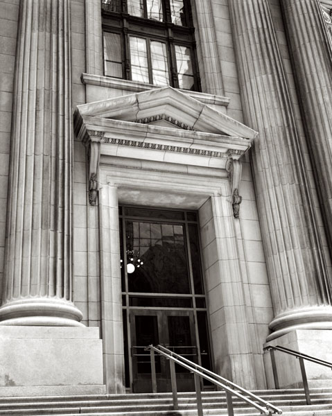
I shot with a Koni-Omega camera last week. It’s a medium format film camera. This is a manual camera with range finder. Shooting it reminded me of the acronym FAST: Focus, Aperture, Shutter and Think. I think that my digital camera has allowed me to get a little sloppy with technique. Of course shooting with a new camera is not the only way to open yourself to new ways of seeing, but it can be fun as well as enlightening.

Frame 15

I got an 11X14 camera recently, but I haven’t shot with it yet. I still have to build a lens board and order some film, but it should be a quite an experience. Whenever you work with a very large camera the difficulties increase and so does the expense. But if 11X14 is anything like 8X10 getting a good result will be really fun. Sometimes just getting a good exposure can make you feel great. There’s another practice tool I want to work with. I have an old Spiratone 400 mm f6.3 lens. I’ve really only used it a couple of times because I’m more interested in wide-angle lenses. But in an effort to expand my vision I’m going to put in on the digital camera and start shooting. Who knows how that will affect my seeing? By the way I’ve included a couple of panoramas from the Horizon camera and one more from the Koni-Omega. Also I recently updated my website so you can get an idea of how I’m seeing now. Please check it out at www.siskinphoto.com

Of course there are other ways of expanding your seeing, like taking a BetterPhoto course. Here are the three I teach, perhaps you’d like to take another one or share them with a friend.
An Introduction to Photographic Lighting
Portrait Lighting on Location and in the Studio
Getting Started in Commercial Photography
One other note about BetterPhoto: I’ve been in the habit of sending out a private note to all my former students at BetterPhoto (Almost a thousand people!) each month. There’s some sort of hang up in the e-mail system for thst so, for a while anyway, I won’t be sending that note. I hope no one is too disappointed.
Thanks,  John


May 30, 2013

Print Types

I hope you’ll check out my books: Photographing Architecture and Understanding and Controlling Strobe Lighting. Please get copies, if you haven’t already. Of course you know that one reason for this blog is introduce the books and get you to consider one of my classes at BetterPhoto.com: An Introduction to Photographic Lighting, Portrait Lighting on Location and in the Studio, Getting Started in Commercial Photography

The second portfolio class was great. Please let me know if you want to be on the mailing list. Here’s some more information the next meeting is Tuesday June 18, 2013, 6:30 pm. We may be meeting at my new studio. Stay tuned for more about that! The class is a great opportunity to make a greater commitment to your work and learn more about how others see your work. Still only $20. I look forward to seeing you if you’re near Indianapolis.

I’m going to discuss the kinds of prints I’ll be using in my show at Indiana Landmarks. The opening is on June 7 at 6pm. I hope I’ll see you there! For more information check this link. Most of the images in this week’s blog are going to the show at Landmarks. Please keep in mind that images on your screen aren’t good representations of what real prints look like. The images are linked to the fine art part of my website, which you can use to buy a print. The prints available on my website are made on the Moab Entrada rag paper discussed below.

I’ll start with silver gelatin prints because in many ways they’re my favorites. These were the most common black and white prints for most of the twentieth century. The black part of the image is silver and the emulsion is made of gelatin, which is probably the reason for the name. One of the most beautiful aspects of these prints is the bright whites created by a layer of barium clay called baryta. This layer is on most prints made on a paper base, usually called fiber based paper. This layer was replaced by a titanium layer when resin coated papers were introduced. I think resin papers aren’t as beautiful because they don’t have the baryta layer.

Fiber based silver gelatin papers are still available ready to use. The prints are exposed in a darkroom with an enlarger. Processing time is over an hour; most of this is wash time. If the prints are properly handled, particularly given through washing, they will last for at more than a hundred years. There are many examples of prints that have lasted longer than a hundred years. The photographer has considerable control over the print; in addition to changing density the photographer can also change contrast tone and local density.

Cyanotypes have bright blue images on a base that is the color of the paper or other material you print on. Sir John Herschel invented the process in 1842. The light sensitive chemistry is iron based, and the final image is an iron compound. The final dye is called Prussian blue. The chemistry is mixed by hand and brush coated on the paper. Multiple coatings add to the saturation of the image, which is why I usually triple coat the paper I use for cyanotypes. Processing is just a long wash.


Cyanotype, Vandyke and other processes are usually referred to as alternate processes or alt process. The idea is that these are different from the more commercial photographic processed used for most photography. These processes are much more personal, for instance the paper is hand coated by the photographer. The processes are not very sensitive to light so enlargers can’t be used. Most often the original camera negative is pressed right against the hand coated paper. An alt process print is a handmade object and each print will be unique. Of course the photographer has to exercise considerable care when preparing and processing these prints in the darkroom.

The Vandyke process produces a brown toned image. The image is made of silver, but the light sensitivity is based on iron chemistry, like cyanotypes rather than silver chemistry like a silver gelatin print. This process is often referred to as Kallitype. The sensitizer contains Ferric Ammonium Citrate, Tartaric Acid and Silver Nitrate. Processing includes considerable wash time as well as a bath in sodium thiosulfate. Properly processed Vandyke images have lasted for about a hundred years.


From the time that George Eastman introduced the Kodak camera with the slogan “You press the button, we do the rest” there have been places to get your processing work done for you. In some cases, for instance Kodachrome processing, there was literally no way to do it yourself. In addition much processing can’t be done economically unless you do a lot of printing everyday. Certainly many people have noticed that their ink jet printers don’t work well after sitting unused for several weeks. There are several things that are important to the photographer and the viewer with all of these processes; first is how much control does the photographer have over the images. The printer that I am using allows me to manipulate the image files in Photoshop. This gives me incredible control over the final print. Another consideration is how long will the prints last. While none of these processes have been around long enough to prove durability, prints can tested using light and heat.

Fuji Type R Paper was actually used when photo labs had enlargers. The R stood for reversal. It allowed the lab to maker a print directly from a slide or a larger film positive. So you could make prints from Kodachrome or Ektachrome without making an inter negative. Labs generally used enlargers to work with this paper, so you could do dodging and burning, but there was not much other control. I am not sure if anyone is still making Type R paper. These prints had good saturation and good durability.

Moab Entrada Rag 290 Bright paper is made to high standards and designed for specialized ink jet printers. It is a rag paper and has no acid or lignin. The Epson Ultrachrome inks are used. These are pigment inks so they will last for an exceptionally long time. I find that these prints have a very long tonal scale and very fine color. These prints are made from files that have been prepared with Photoshop. Both color and black and white prints can be made on this paper.

I am showing a 20X50 inch print of this image! It looks great.

Fuji Crystal Archive Matte paper is a color photographic paper designed to be used with digital enlargers. Prints are made from files that have been prepared with Photoshop. This kind of paper is usually used to make color prints. I often use it to make mono-chrome images with a warm tone. Prints made with this product are expected to last more than twenty years.

Please check out my classes at BetterPhoto.com:

An Introduction to Photographic Lighting,

Portrait Lighting on Location and in the Studio,

Getting Started in Commercial Photography

Thanks, John


May 6, 2013

Working in Black and White

I hope you’ll check out my books: Photographing Architecture and Understanding and Controlling Strobe Lighting. Please get copies, if you haven’t already. Of course you know that one reason for this blog is introduce the books and get you to consider one of my classes at BetterPhoto.com: An Introduction to Photographic Lighting, Portrait Lighting on Location and in the Studio, Getting Started in Commercial Photography

The first portfolio class went really well. Please let me know if you want to be on the mailing list. Here’s some more information the next meeting is Tuesday May 21, 2013, 6:30 pm room 407 at the Indianapolis Central Library. This is a great opportunity to make a greater commitment to your work and learn more about how others see your work. Still only $20. I look forward to seeing you if you’re near Indianapolis.

I started out with a Kodak Retina and a roll of Plus-X. The first film developer I used was D-76 and I printed with Dektol. I guess you could say that I have my roots in black and white. If you’ve looked at my work you can see that I still see a lot of shots in black and white. I’ve mentioned, in these notes, that I’m doing some work with my 8X10 film camera. I wanted to talk about how I’m working with those images in digital. It doesn’t really matter whether you start with a digital image or a film image; these techniques make better final images. I start with a low contrast scan of my negative. If I were shooting film, for traditional silver gelatin printing, I would want a negative that I could interpret in the darkroom and that is a low contrast negative. Of course my new negatives aren’t really low contrast, because they need high density so I can print them using the Vandyke technique. Even though these techniques aren’t  really new I think it’s important to work with them from time to time.

If I’m starting with a color image, usually from my digital camera, I’ll look at the red, green and blue channels. The differences can be really huge. When I shoot with black and white film I use color filters to get the kind of control. The important thing to keep in mind is that you can make choices about what parts of the picture you want to make black & white. In addition to the red, green and blue channels you can mix the channels together.

I know there are a lot of programs for working with your images, but I use Photoshop for just about everything. It’s big, it’s complex and it offers wonderful control over your image. I mention this because I’m going to show the changes I make to an image in Photoshop.

Scans always have some dust and perhaps the negative has some defects, so I’ll fix those right away. I like to do this at the beginning because I’m working on a gray-scale image rather than a color image so the fixes are quicker, especially with a big file. In this case the file is over 100 megs, because the original negative is 4X10 inches. I want to get the biggest scan I can. Negatives are delicate so it’s best to make a digital copy as soon as possible. I make a flat, long scale, scan to capture as much information as possible. I shoot digital images in RAW for the same reason: to have a copy that can be interpreted as many ways as possible. I’ll save this image, so I can return to it.

I’ll create a new copy of the image, and the first thing I’ll do is open up Levels. I’ll position the sliders at the edges of the histogram. I may move the center slider to adjust the middle of the curve. This isn’t as controlled as using curves, but it makes the image look better quickly. Next I convert the file to RGB using mode. When I printed with an enlarger on silver gelatin black & white paper I used warm toned paper much of the time. Even when I used a neutral toned paper I usually developed in Selectol to warm the paper up a little. I can change the pallet, warmer, cooler or whatever once I have an RGB file. Now I open up curves. I like to depress the bottom left of the curve and raise up the upper right, usually I don’t make big changes here.  This makes the middle tones of the shot a little more contrasty and makes the highlight ands shadows look a little more like a silver gelatin print. Next I’ll add color, while still in curves, by choosing the red curve. For most images I’ll raise the bottom of the curve about 7 units. Then I’ll go to the blue curve and remove about 8 units from the middle of the curve. You can add as much color as you would like this way.

I wanted to lighten the boots, so I used the dodging tool. On the original I also did some sharpening, but that doesn’t really show up on this small file.

I wanted to discuss another thing I like to do in curves. If you take the bottom left of the curve up to the top of the graph you file will be all white. If you pull the center of the curve back down, usually around 1/4 from the bottom of the graph, interesting things will happen.  If you didn’t add any color to your shot it will look a little like a solarisation (also referred to as the Sabatier Effect) an old darkroom technique. However if you did the toning you’ll get a sort of dual tone solarisation, which is really fun. You can see how well it worked here. I usually refer to this as a u-shaped curve.


Please check out my classes at BetterPhoto.com:
An Introduction to Photographic Lighting,
Portrait Lighting on Location and in the Studio,

Getting Started in Commercial Photography
Thanks, John


April 28, 2013

New Images from Indianapolis Central Library

I hope you’ll check out my books: Photographing Architecture and Understanding and Controlling Strobe Lighting. I hope you’ll get copies, if you haven’t already. Of course you know that one reason for this blog is introduce the books and get you to consider one of my classes at BetterPhoto.com: An Introduction to Photographic Lighting, Portrait Lighting on Location and in the Studio, Getting Started in Commercial Photography

Pictures this week are from a shoot I did at the Indianapolis Central Library. The first portfolio class went really well. Please let me know if you want to be on the mailing list. Here’s some more information the next meeting is Tuesday May 21, 2013 at the Indianapolis Central Library. This is a great opportunity to make a greater commitment to your work and learn more about how others see your work. Still only $20. I look forward to seeing you if you’re near Indianapolis.

I’m still looking for a studio space here in Indianapolis. I’ve checked on a couple of spaces, but they have been too large, and therefore too expensive. I’d like to have the extra space and I could have a couple of offices for related businesses, but I don’t want to have to commit to a more expensive lease. I’m going to continue checking out spaces. My goals, right now, are to have about 1600 feet, with a large commercial or cargo door. The actual studio space must be at least 20X30 feet. I will need air conditioning and heat. You always here “location, location, location” applied to real estate. I think the key is to be sure you understand what you want in a location. I want to be in a good area of town, but I don’t need to be in a mall or on an expensive street. I can be a couple of blocks off the boulevard especially if the parking is good.


I’ve written about processing film and scanning it before, but as I did a lot of work with my 8X10 Toyo recently I thought I would discuss this again. I’ve made some changes in the way I’m processing film for printing Vandykes. I’ll be discussing how I’m scanning the film as well.


I started out working with a two-part developer based on Kodak D-23. The idea of a two-part developer: separating developer and activator, is that you can process almost any film at almost any temperature, which certainly makes things easier. The problem was that the Vandyke process, and most alternate printing processes, requires a very long density range with a very high maximum density. That is the film records the information in a way the makes the whites and blacks further apart, because the printing process tends to push the tones closer together. So I’ve switched to Ilford ID-11 developer. The biggest differences between the two developers is the addition of hydroquinone and the inclusion of the activator (borax) in the single solution developer. I’m using a dilute version of this developer with a very long development time because it makes a longer tonal range. Of course it’s kind of annoying that the processing time is now thirty minutes. If I were going to try and print these negatives on traditional silver gelatin photographic paper it would be difficult, and would require special paper or special handling.


One of the great advantages of scanning a negative is that you make a good scan of a negative that wouldn’t print well without special handling. I set the scan to keep the detail in the whites and black while maintaining a lot of detail and light in the mid-tones. My actual scan looks pretty flat. Of course the scan is in black and white, and I scan in 8-bit depth. I’m making very large scans: 3200 dpi. The first thing I do with these scans is basically spotting. I remove dust and so on. Since the scans are the first thing I do after processing there isn’t much of this. The next step is to make a copy of the scan and convert it to RGB. As many of you know I like a warm color palette. I use curves for this. I will raise the red curve about 7 units at the very bottom of the curve. Then I’ll move the center of the blue curve down into the yellow about 8 to 10 units. This makes my black and white image a slightly warm black and white image. Then I’ll adjust the whole curve, usually by deepening the shadows and lightening the highlights. This is how I make the final image less flat. Of course sometimes the curves will get rather complex. Then I’ll do a little sharpening, usually with smart sharpening in Photoshop.

I used my own shoes


There is one more thing I do with curves: you can see it in the shot below. This is a u shaped curve. I raise the bottom left of the curve to the top of the box and lower the center of the curve, usually to about the 1/4 line. If you do this without adding the red and yellow first you get an image that looks a little like a solarization that you might make in a darkroom. If you change the curve after you change the color you get the two-tone effect you can see in this image. I think this is a really interesting effect; of course it doesn’t work with most images.

This image was processed with a U shaped curve

Please check out my classes at BetterPhoto.com:
An Introduction to Photographic Lighting,
Portrait Lighting on Location and in the Studio,

Getting Started in Commercial Photography
Thanks, John

February 4, 2013

Large Format Lenses

Filed under: Basic Photo Technique,Film Technique,Large Format Photography — John Siskin @ 11:06 am

I hope you’ll check out my books: Photographing Architecture and Understanding and Controlling Strobe Lighting. I hope you’ll get copies if you haven’t already. Of course you know that one reason for this blog is to sell the book and get you to consider one of my classes at BetterPhoto.com: An Introduction to Photographic Lighting, Portrait Lighting on Location and in the Studio, Getting Started in Commercial Photography


I was going to write about some more handy equipment in this issue, but I decided to put that off. I think I’ll be back to talking about stuff, particularly DIY stuff soon. I had breakfast with another experienced photographer, I don’t want to say old, a couple of days ago. We talked about some of the things we miss from the old days and both of us missed watching a print come up in a tray of developer. Whenever I talk about this with someone we end up using the word magic. When you put an exposed piece of silver gelatin paper into a tray of developer there is no picture, it’s just white paper. As you agitate the print in the developer the image slowly appears on the paper. If you’ve ever seen a Polaroid SX-70 print develop, it’s like that, only better. I know I’ve written about this stuff before, but I find it interesting and, well, magical.

8.25 inch Gold Barrel Dagor on 8X10 film

Photography, before digital was mostly about magic goo. Like baking a cake you followed a recipe, and if everything was done properly, you got a picture. If everything was done well the picture would last. It’s been that way since William Henry Fox Talbot first made a paper negative. Fox Talbot used sodium chloride, table salt to make his images safe in daylight, so salt was the first magic goo. The thing is that few people really understood how the chemicals interacted, but a lot of us understood how to control what they did. Perhaps the person who understood the interaction best was C.E. K. Mees who ran Kodak Labs.

63mm Zeiss Luminar on 6X7cm film


I bring this up because, as I’ve mentioned before, I’m doing some personal work with my 8X10 Toyo camera. This brings me back into the land of magic goo. I’m testing different developers in an attempt to make a more perfect negative. I used Kodak chemicals, both HC-110 and, more recently, Xtol, to develop film for decades. Now, however, Kodak is imperiled, so I need to look for another supplier. It’s amazing how many things that I relied on Kodak for. At breakfast I discussed the Kodak Camel Hair brush with my friend. Kodak made things that couldn’t possibly have made a difference to their bottom line, but made a difference to photographers everywhere, like a good brush for cleaning film holders. I’ve been mixing a version of a Kodak developer, D-23. I got the recipe from The Darkroom Cookbook. Those of us working in the old ways are going to have to make a lot of things from scratch.

48cm Goerz Berlin Dogmar 8X10in. film


The problem is to know if everything is working well. Today I processed test negatives in D-23 and in Xtol. I’ve ordered some ID-11, an Ilford developer, and I’ll process a negative in that next week. I find that I do a lot of testing. I’ve mentioned before that a photographer needs to test equipment. If you don’t test you’ll never really know what you’re doing. Then you’ll not only believe in magic, you’re relying on magic that you don’t understand. I’ve attached copies of the negatives I processed in Kodak Xtol, they have a longer contrast range than the negs I did in D-23.

65mm Schneider Super Angulon 4X5in. film


Another magical area of large format photography is lenses. Although I’ve studied the physics and worked with the thin lens equations, I still find the way in which lenses bend light quite magical. At least as far back as 1840, when Joseph Petzval developed the first portrait lenses, people understood how much the lens affected the image. The goals of lens design, at least until the 1960s, were to make a lens that was sharp, had large coverage, even illumination, strong contrast and was fully corrected for spherical aberration and chromatic aberration and eliminated coma, unless you were trying to make a soft focus lens, in which case none of these might apply. It’s important to understand that you couldn’t, and still can’t, make a perfect lens: all lenses designs are compromises. But older lenses made different compromises so some are considered classic and others crap. I’ve always been very interested in lenses from Goerz and Schneider. I am pleased that I currently own two Goerz lenses, an 8 1/4 inch Dagor from the American version of Goerz and a 48cm Dogmar that is from Berlin Goerz. I’ve already mentioned that I recently acquired a 14 inch Dagor that is a Schneider Dagor. The Schneider Dagors are the last of this noble design. I am also getting a lot of use from my older Schneider Angulon (actually it is old enough to be a Jos. Schneider & Co.) and I also use a wide angle G-Claron from the modern version of Schneider. Of course I also carry a bunch of diopters to create soft focus lenses, for more about these check out this article.

135mm Schenider Xenar 4X5in. film


The pictures this week are all large format images. I put the format and the lens name in the caption.

65mm Super Angulon 4X5in. film


I’m looking at apps for my phone that will help with metering and other aspects of large format photography. So far I’ve found that beeCam Lightmeter is interesting. If you have any suggestions let me know at john@siskinphoto. I’ll put up people suggestions in a future blog. By the way I’m using an android phone, but if you have a suggestion for an iPhone I’ll be happy to pass it along.

Please consider one of my classes at BetterPhoto.com:

An Introduction to Photographic Lighting

Portrait Lighting on Location and in the Studio

Getting Started in Commercial Photography

If you’re in the Indianapolis area there are other opportunities as well. I’ll be showing much of my personal architectural work in June at Indiana Landmarks. Please come look.

November 12, 2012

Shooting Large Format at Indiana Landmarks


Since I’ve been writing about architectural shooting lately, I should start off by mentioning my book Photographing Architecture. Available at Amazon and other fine booksellers.

Of course my other book: is also available, why not get the set?

And my classes continue at BetterPhoto.com. I’d like to meet you in class.
An Introduction to Photographic Lighting,
Portrait Lighting on Location and in the Studio,

Getting Started in Commercial Photography

I’ve been continuing to shoot architecture with the 8X10 camera, and I must say I am having a fabulous time doing it. I did a shoot at a building called the Indiana Landmarks Center, which was formerly the Central Avenue Methodist Church. After restoration the facility is just stunning. I did several shots with the big camera. Two of my favorites are reproduced here. These are scans of the Vandyke prints. As I mentioned in previous blog entries the reproductions are very different from original prints. I will be selling originals soon, so you’ll be able to have an original for yourself. I am going back to the Indiana landmarks Center, probably tomorrow, to do some more shooting.

I should add a few technical details, in case anybody is keeping track. Both these images were made with my widest lens: a 165mm Angulon. This lens has about an 85º angle of view, which is very wide for large format, but not quite as wide as a 20mm lens on full frame 35mm film. I’m continuing to process in a two-bath version of D-23. The first bath is 5 minutes and the second just 3 minutes. I’m pretty happy with this, but I do need to increase the exposure a little. I’m using HP-5 film from Ilford currently, but I’m looking at other options. A box of 25 sheets of 8X10 film costs almost $90, so I want to be careful about what I choose. I’m actually shooting two 4X10-inch images on a single sheet of 8X10-inch film. I use a dark slide I’ve cut in half to protect the unexposed side of the film in the camera. This works really well, but I have to be careful not to double expose.

The image on a Vandyke print is made from silver, like modern black and white photo papers. However the light sensitive coating is mixed by hand and the chemical reactions are very different from modern photo papers. The coating is then brushed onto watercolor or other fine art paper. I’ve been having some difficulty coating the paper, but I think I have it figured out now. If you’re interested in more information about hand coated papers and the chemical/mechanical history of photography you should check out The Keepers of Light by William Crawford. Since it is out of print a new copy can be quite expensive, but Amazon offers used copies at reasonable prices.

After shooting digital for the last few years it is really interesting to travel back in time to large format cameras and older printing processes. As always shooting a big camera makes me a more careful shooter when I return to shooting digital.
Please consider one of my classes at BetterPhoto.com:

An Introduction to Photographic Lighting

Portrait Lighting on Location and in the Studio

Getting Started in Commercial Photography

If you’re in the Indianapolis area there are other opportunities as well. I’ll be teaching a class in commercial photography next spring at Ivy Tech.

October 15, 2012

Updates and Light Opinions

I hope you’ll check out my books: Photographing Architecture and Understanding and Controlling Strobe Lighting. I hope you’ll get copies if you haven’t already. Of course you know that one reason for this blog is to sell the book and get you to consider one of my classes at BetterPhoto.com: An Introduction to Photographic Lighting, Portrait Lighting on Location and in the Studio, Getting Started in Commercial Photography

Updates on my project with the 8X10 camera: I went back to the Indiana Historical Society and made another negative. This didn’t have the defects on some of the last set, so I think it is time to go forward. Here’s the latest shot from the conservation lab:


I also made a Vandyke print of one of the original negatives. I need to stress that seeing this scan on your monitor isn’t like seeing the actual print. It never is. If you want to see original images you need to go to galleries or buy prints. At least look at well printed books made with the photographer’s supervision. Anyway, here is a scan of my print from the first shoot.


I wrote most of what follows for one of my students at BetterPhoto. I’ve said these things before in this blog, but that’s no reason not to say them again. The heart of the matter is: if you can’t make light, if you have to find light to take a picture, or if you believe that light designed by a photographer is inferior to found light, you will limit the pictures you can take and limit there quality. It is better to learn more skills, and get more tools, in order to allow yourself to be a better photographer.


I am aware that many people use the terms artificial light and natural light, but I don’t think that when a great number of people use a term that actually makes the term accurate. A photon doesn’t act differently because it comes from the sun or a light bulb. A given light source may have a different color balance, but that doesn’t mean that it is natural. Sunlight and lightning (note the word is lightning with an n. Instantaneous light from storm clouds) have a similar color balance, but a cloudy day, or a volcano or natural phosphorescence have very different color than daylight. People most often refer to strobes as being artificial, but call a light bulb is a natural light source. In fact a strobe is really a kind of controlled lightning, which is natural, while light bulbs doesn’t occur naturally. The real problem that people have with strobes is that they can’t visualize what the light will look like, so they find that their pictures look very differently from what they hope. This is why you need to practice with light in order to understand and visualize light, which will make it easier to work with any light source.


I do think that natural is a value laden term. Natural foods are assumed to be better than artificial food; natural fabrics are assumed to be better than artificial. I often hear people describe themselves as “natural light photographers.” I am sure they wouldn’t like to describe themselves as photographers who are handicapped by an inability to create and control light in their photographs. The term photography is from the Greek and can be translated as “writing with light,” and I do think a photographer is a better photographer when she/he can actually create a photograph by controlling the light. Lighting is not the only way to make better photographs, but it is one of the most important tools for creating better photographs. This is why I teach lighting courses, and write books and articles about lighting. If I can help more shooters learn to use this tool I can help a lot of people make better photos.


Some years ago I did a job for the Huntington Library in Pasadena, actually San Marino, at the same time [a well known photographer who I shouldn’t disparage on this blog] was shooting for them. He is known for using “natural” light. I talked to my contact about my shots and his after the shoot was over. My contact was much happier with my work because of issues with focus and light control and color, all the problems in the other photographer’s images existed because he had little ability to control the light.


People that I know and respect use the term natural light, which is too bad. The term has even slipped out of my mouth once or twice, which is unfortunate because natural isn’t precise. There, I am glad I got that off my chest, again. You might want to say: “I use ambient light” rather than “natural light” in order to be accurate.


The important thing is to learn to pre-visualize what the light will do. You can walk around hunting for good light outdoors, or even inside. But if you don’t understand the way light defines a subject you will be hunting for good light randomly, which may be a fruitless search. This is why I think that practice, with lights, is so important: it gives you a real sense of how light works. So if you think you need soft light for a portrait you’ll start with a large light modifier, perhaps the light panel. Then you might want to define the face a little more so you may add a hard light. Regardless you won’t have to just keep moving the lights around. The goal is to be able to see the portrait you want to make, or still life or architectural shot, in your head. This will enable you to make choices about the light. It is important to know there isn’t one right light that will fit everyone, or even a few lighting set-ups that will work in any situation. Lighting is not something you can set your camera to do automatically. Lighting requires you to take control and create the right situation for your subject.


Strobes create light by passing a spark though a tube filled with xenon gas. Both a dedicated on camera flash (say a Nikon SB900 or a Canon 580II EX) and a mono-light like an Alien Bee (http://www.paulcbuff.com/b1600.php) create light in exactly the same way. A dedicated unit (SB900, 580II EX) is better for work where you travel or cover events, like weddings. It is much lighter and will mount on the camera. It will expose automatically, but of course automatic light often looks bad, even when it is properly exposed. Mono-lights, or studio strobes will work all day without running out of batteries or taking longer to recycle because they run off AC power. They often have more power and better light modifiers. They are much better for studio work, and can be better for many location jobs.


The images I put into the lighting discussion are all strobe images. I’m aware that I use some images repeatedly in this blog. I am building a new portrait portfolio so I should have more shots where I can find them for the blog.


Please consider one of my classes at BetterPhoto.com:

An Introduction to Photographic Lighting

Portrait Lighting on Location and in the Studio

Getting Started in Commercial Photography

If you’re in the Indianapolis area there are other opportunities as well. I’ll be teaching a class in commercial photography next spring at Ivy Tech.

September 25, 2012

Project Begins!

I hope you’ll check out my books: Photographing Architecture and Understanding and Controlling Strobe Lighting. I hope you’ll get copies if you haven’t already. Of course you know that one reason for this blog is to sell the book and get you to consider one of my classes at BetterPhoto.com: An Introduction to Photographic Lighting, Portrait Lighting on Location and in the Studio, Getting Started in Commercial Photography If you’re in the Indianapolis area there are other opportunities as well. I’ll be teaching a class in commercial photography next spring at Ivy Tech.


I did my first shoot for the project I discussed in the last blog entry. These are the images I used in this entry. Of course these don’t really look like prints, they look like the way you balanced your screen. My working title is Interiors. This shoot went well, there are, however, some defects in some negatives. I did the shoot at the Indiana Historical Society. They were very accommodating about my large camera and tripod. Many of the people in the building seemed to assume that I was one of the displays. There was more light inside the building than I had expected so the exposures were a little shorter than I expected; ranging from 1 to 12 seconds. I shot at f32 or f45 and used my two Dagors; the 8.25 inch and the 14 inch I discussed in the last blog. When you use a larger image area you need a longer lens to create the same field of view. So a 12 inch (300 mm) lens on an 8X10 camera sees like a 50 mm (2 inch) lens on my full frame Nikon D800. When you use longer lenses and a larger capture area you also need to stop the lens down further to get the same depth of field. A 12 inch lens will need to be stopped down to f64 to get the same depth of field as a 50mm lens at f16. Of course this means the shutter will be open eight times as long.

I have to work out shutter issues on some lenses before I can use them in the field. When you use long exposures you don’t need a very sophisticated shutter, in fact a lens cap will do! The problem with a lens cap is that you may shake the camera when you remove it. I have used Packard shutters, which are air driven, in the studio. These work especially well with strobes, but I’m not sure I can mount them on the camera in the field. My Dagors are both mounted in leaf shutters.

I have been using a recipe for developing the film I got from The Darkroom Cookbook, Third Edition. I used a recipe for a divided developer: D-23. The developing agents are separate from the accelerators. There are several reasons that this is advantageous for this project: one is that I can process several types of film in the same way. As I may change films, or use older film, this will help me get printable negatives. I had processing problem with the second sheet of film I shot at the Indiana Historical Society. I think I contaminated my developer. You can see streaking in one of the images I’ve attached to this blog.

As I suggested at the top of this entry, the images I’ve attached aren’t really my goal. I will be contact printing these negatives onto watercolor paper using the Van Dyke process. This is the next step in this project. I may consider other processes, like Cyanotype or Kallitype, but I hope that Van Dykes will work out. More as the project evolves.


September 10, 2012

Shooting Large Spaces

Filed under: Film Technique,Large Format Photography,Photography Communication — John Siskin @ 9:35 am

I hope you’ll check out my books: Photographing Architecture and Understanding and Controlling Strobe Lighting. I hope you’ll get copies if you haven’t already. Of course you know that one reason for this blog is to sell the book and get you to consider one of my classes at BetterPhoto.com: An Introduction to Photographic Lighting, Portrait Lighting on Location and in the Studio, Getting Started in Commercial Photography If you’re in the Indianapolis area there are other opportunities as well. I’ll be teaching a class in commercial photography next spring at Ivy Tech.

This is an image I made with the Toyo on the 4X10 format. The original has a great level of detail. I made a couple of prints that were more than 6 feet wide.

Most of the time I try to make photographs. That means individual images that I create in whatever way is appropriate or available for that particular image. If I am shooting with my fish eye camera or my super-wide camera I am going to make images that have a particular view of the world. If I shoot with my new digital camera I can make images with a very extensive pallet because that camera is such a flexible tool. It is also possible to create a series of images that have an internal constancy because they are made in a similar way with a set of basic rules. It isn’t better to make a group of images in this way, but it is an interesting way to approach photography. I have made a couple of portfolios in this way, and I found the work and the results very rewarding.

This is a cyanotype print. I made the sensitive emulsion for the image and coated it onto paper. While the cyanotype is blue the Van Dyke print is dark brown or black.


I have decided to do a project that is a little more challenging in this manner. I am going to shoot large format images of public spaces here in Indiana. I will be shooting auditoriums, halls and religious sanctuaries. I may include such places as hotel lobbies or malls. I have seen many photographers shoot the remains of great buildings, but I think it will be interesting to shoot buildings that are in use. I want to shoot these places with my 8X10 Toyo Field Camera, which is a fantastic tool for architectural subjects. The biggest reason for using the 8X10 Toyo is that I can create alternate process prints with the large negatives. I have done considerable work with cyanotype images in the past, but in this case I expect to make Van Dyke prints. I will also be able to scan the images so that I can make very large prints from the same negatives.

This is a shot of a public space that I like very much. I hope to work with more images like this one.


Although I expect to shoot with the 8X10 camera I will probably actually make 4X10 inch negatives. The more panoramic format is well suited to the project and I can make two images on each piece of film. The 8X10 film is quite expensive, about $4.00 a sheet. I’ve decided to start the project shooting HP5 Plus from Ilford. I like the high ISO, 400 and the film has good detail. I considered Kodak T-Max, but it is much more expensive; also I do not know how long Kodak will continue to supply large format film.

This shot was made on my super-wide camera. It makes great images but isn't good for very large scans or alternative process prints.


In this blog entry I have picked images that are related to this new project either by subject or by methodology or both. The captions will give you information about the relationship between the image and the project.

Made with my super-wide camera. I am interested in how people interact with a public space.

One of the great pleasures of shooting a large format camera is the lenses. Both Nikon and Canon make very fine lenses for their digital cameras, but there is a more individual characteristic to large format lenses. Just the names: Dagor, Angulon and G-Claron conjure up a certain magic. I will start with a 165mm Angulon, which is extremely wide for the 8X10 format. I will also use an 8.25 inch Gold Barrel Dagor and a 14 inch Gold Dot Dagor, for my first shoots. I also have a 270 wide angle G-Claron and a 480mm Dogmar which might be used later in the project. I did some earlier work with home made large format lenses, which was quite successful. I may use these lenses as the project develops.

There are wonderful opportunities to shoot in public spaces.


If you are interested in large format lenses I am going to sell one that you might want: a 360 f5.6 Schneider Symmar. Please send me an e-mail if you are interested. I will probably put the lens on eBay soon. This is a fascinating convertible lens that is very fast. This is the link to the auction at eBay.

July 14, 2012

I’m Showing in Indianapolis!


I had an opportunity to show a few images at a local coffer house, Lazy Daze, drop into my lap. If you’re in Indiana I hope you’ll check it out: the address is 10 S. Johnson Ave. Indianapolis, IN 46219.  The images on display are 16X20 inches, so these on line images aren’t really as effective, but at least you can see them. The text is the artist’s statement I included with the show. The images are on sale for $275. If you’d like to buy one I’ll get it to you for that price, plus shipping, after the show. All prints are silver gelatin, and are hand made by me.

Time and Shadow

Photography is an art form that is evolving. William Henry Fox Talbot realized that photography would become a means of communication when he created his first images back in the late 1830s. He used his camera to record household goods as buildings people and plants. When he published Pencil of Nature starting in 1844 he presented many of the ways the world would use photographs up to the present time. In the beginning photography was extraordinarily difficult to do. Exposures were long, so cameras had to be supported by a tripod. The chemical processes were almost as arcane as a witch’s brew, and sometimes more dangerous. It’s very important to remember that the photographs a person takes are always constrained by the limitations of the medium: the photographs a person could take.

The photographs I present here are from a certain time in photography. I used large cameras at this time to increase detail and reduce grain. I made prints by hand in a darkroom. I watched each of these images develop on a white sheet of paper under a safelight. It was a good time.

One of the most significant differences between working in this fashion and working with a digital camera is that each image you captured involved certain costs of time and material, so I would choose an image much more carefully. Now I more often shoot everything and edit, which is a very effective way to work with a digital camera. One more time the change in the technology of making pictures has changed the way we take pictures.

I hope these images will share not just how I see, but also some of the magic of making an image. These images were made with 4X5 film cameras. They were printed by hand with an enlarger in a darkroom. I enjoyed this way of fixing my vision onto paper. I hope you will find some joy in these images as well.

John Siskin

I hope you’ll check out my books: Photographing Architecture and Understanding and Controlling Strobe Lighting. I hope you’ll get copies if you haven’t already. Of course you know that one reason for this blog is to sell the book and get you to consider one of my classes at BetterPhoto.com:
An Introduction to Photographic Lighting

Portrait Lighting on Location and in the Studio
Getting Started in Commercial Photography
If you’re in the Indianapolis area there are other opportunities as well. I’ll be teaching a class in commercial photography next spring at Ivy Tech.

« Newer PostsOlder Posts »

Powered by WordPress