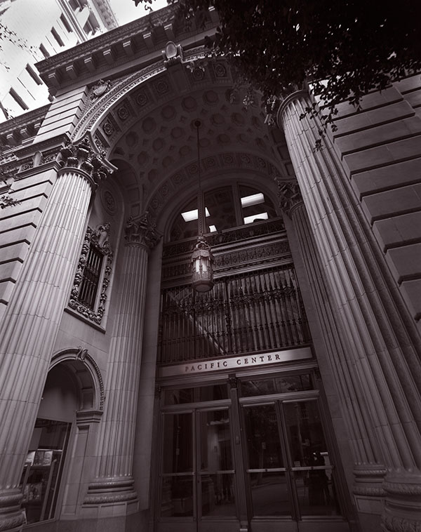
Pacific Center #1, Los Angeles
Often the approach to an architectural image is to maintain a neutral perspective. So when you shoot the front of a building you try to keep the parallel lines in the subject parallel. When the lines come together, as they do in this shot, the effect is called key stoning. The thing is that often buildings are designed to impress, even intimidate, people. The neutral perspective tends to weaken or remove that effect. In this case I used my 65mm f8 Super Angulon, so that I could shoot close to the building. I did this for a couple of reasons, first I wanted to capture the imposing design of the entrance, and second I didn’t want to stand in the middle of the street. I used my Speed Graphic as the camera. Many people don’t know that the Speed will accommodate extreme wide angle lenses.
I’m not sure exactly when I shot this, but at least 20 years ago. Time flies when you’re making pictures. It’s always been a favorite of mine, in fact there’s a big print hanging in my office. One of the reasons I like this image so much is that I learned a lot printing it.
Photographers often talk about the zone system. This is a way of discussing the relationship between exposure, negative processing and final negative density. The system was first described by Ansel Adams and Fred Archer. One of the most important aspects of the system, and one that is often forgotten, is the way processing affects the contrast of the negative, and thus the final print. I mention this because one of the things I learned from this image is that even if you have a good negative, one that accurately reflects the tonal values of the subject, you may not be able to make a good print with normal printing processes. Black and white photographic paper comes in various contrast levels, from soft paper that has low contrast to hard paper that is very contrasty. The idea is that if you make a good negative you’ll be able to print it on a middle contrast paper. I learned that this isn’t always true when I tried to print this negative. While a print on middle grade paper showed all the tones of the negative, it was flat and not really effective. When I printed the image on a higher contrast paper the middle tones of the print looked much better, but much of the shadows and highlights were to far gone to see. In order to make a good print I needed to use high contrast paper and do considerable dodging and burning to maintain the highlights and shadows. Even when photographers shot film there was a lot of work done after you tripped the shutter.
Many of my images were first scanned quite a few years ago, so when I wanted to add this image to the fine art section of my site and blog, I went back to the original negative. Once again I had to do a lot of work to get the original scan to agree with the way I wanted to see the final print. I used several layers to change the contrast and exposure values in different areas of the image. I’ve learned a lot about working with an image in Photoshop over the years. For this image I choose a different color pallet from the one I normally use for black and white images. I usually add a little red to the shadows and some yellow to the mid tones. This creates a similar effect to the warm tone photo papers I used to use. In this case I added some red to the shadows, but I added a very small amount of blue top the mid tones. This creates an effect like a cold toned paper toned with selenium, which was the way I handled the original printed version of this image.
If you’d like to get a fine art print of this image you can click on the PayPal link below. As I’ve mentioned I hope to add alternative presentations of my images as I continue to review my fine art images. The current prints are almost 13 inches wide. They’ll be mounted and matted to 16X20 inches. The price, just $125, includes shipping in the United States. If you’d like to have me ship somewhere else, or order another size please contact me at john@siskinphoto.com.

