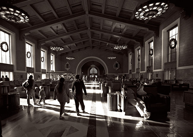
Another shot of Union Station in Los Angeles. This is a beautiful place fallen on hard times. It’s still busy, but people in L.A. don’t use transit service like they do in New York, and trains just aren’t part of the mix in California. Still I’ve take trains out of here a couple of times, and it’s always interesting. It’s also a fabulous place to shoot, but don’t take my word for it-look for Union Station on television. It’s used for a lot of shoots. Consequently the management is difficult about using a camera, and won’t let use a tripod at all. I really like the way the super wide effect changes this building, and I also like the way the people appear in the shot. I particularly like the child on the left side of the frame.
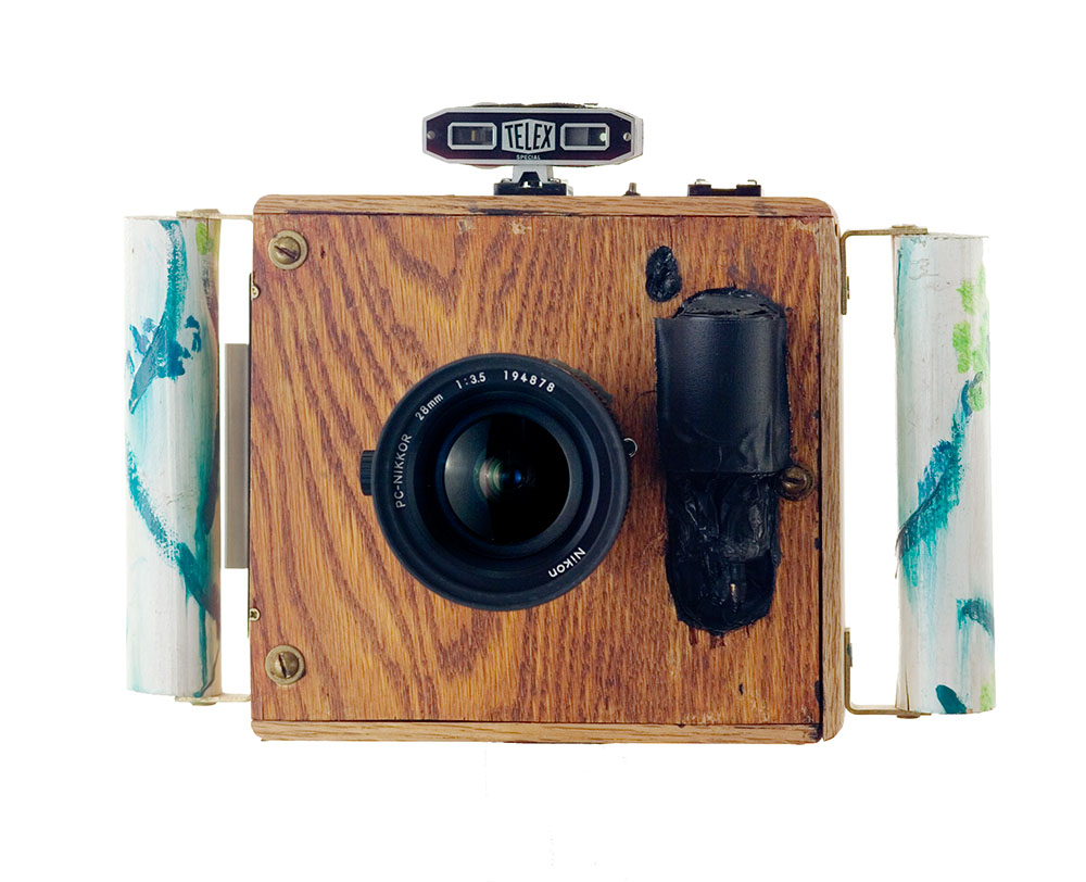
Super-wide Camera
This shot was made with the super-wide camera I build. I used the same one for shots at El Matador and other places. I’ve included a scan of the original negative so you can see the way the lens cuts the corners off on a 6X6cm piece of film. This was always an interesting camera to use. It wasn’t possible to really predict hos the camera would see, or even if the negative would be sharp. So it was always exciting to see the film. You can check out an article I did on making cameras at this link. I hope you’ll check it out.
original scan
Just so I’ve mentioned it my family’s company Angelus Furniture built the benches and some of the other furnishings in this room.
If you want a print of Union Station, Los Angeles #2, use the link below. I’ll send you a print mounted and matted to 16X20 inches. No additional charge for shipping in the U.S.
I hope you’ll also check out my books, use the links below:
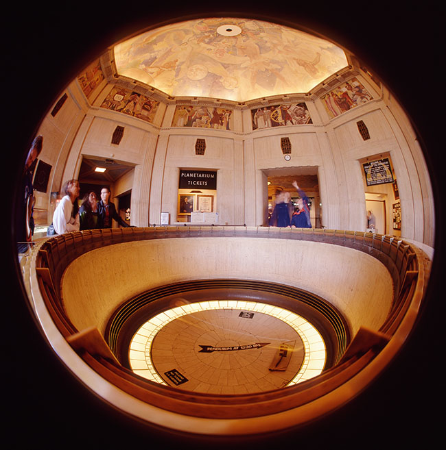
The last blog was about my Super-Wide Camera, which has 110º angle of view. Of course it’s possible to go even wider, and I built a camera to do that also. The thing is that when you go beyond super wide you get distortion. Just as it’s not really possible to make a flat map of the entire planet that makes all the continents and distances look right, it’s impossible to show everything in front of the lens without distortion. This camera/lens combination shows everything in front of the camera: 180º in all directions, but the images bows out in the center. This is called fisheye effect.
The shot was made at the Griffith Observatory in Los Angeles, maybe you’ve seen it in an old James Dean movie? There is a pendulum in the center of this shot, but it’s hard to see because it’s moving. The pendulum demonstrates that the earth is moving, but I’m not sure how that works. I made the shot on 4X5 Ektachrome film, and the exposure is long enough for the pendulum to have moved from side to side. Didn’t use a tripod, but I did have the camera steadied against the rail. The transparency looks a little like a Christmas tree ornament. The actual image is about 80mm across on the film, pretty impressive.
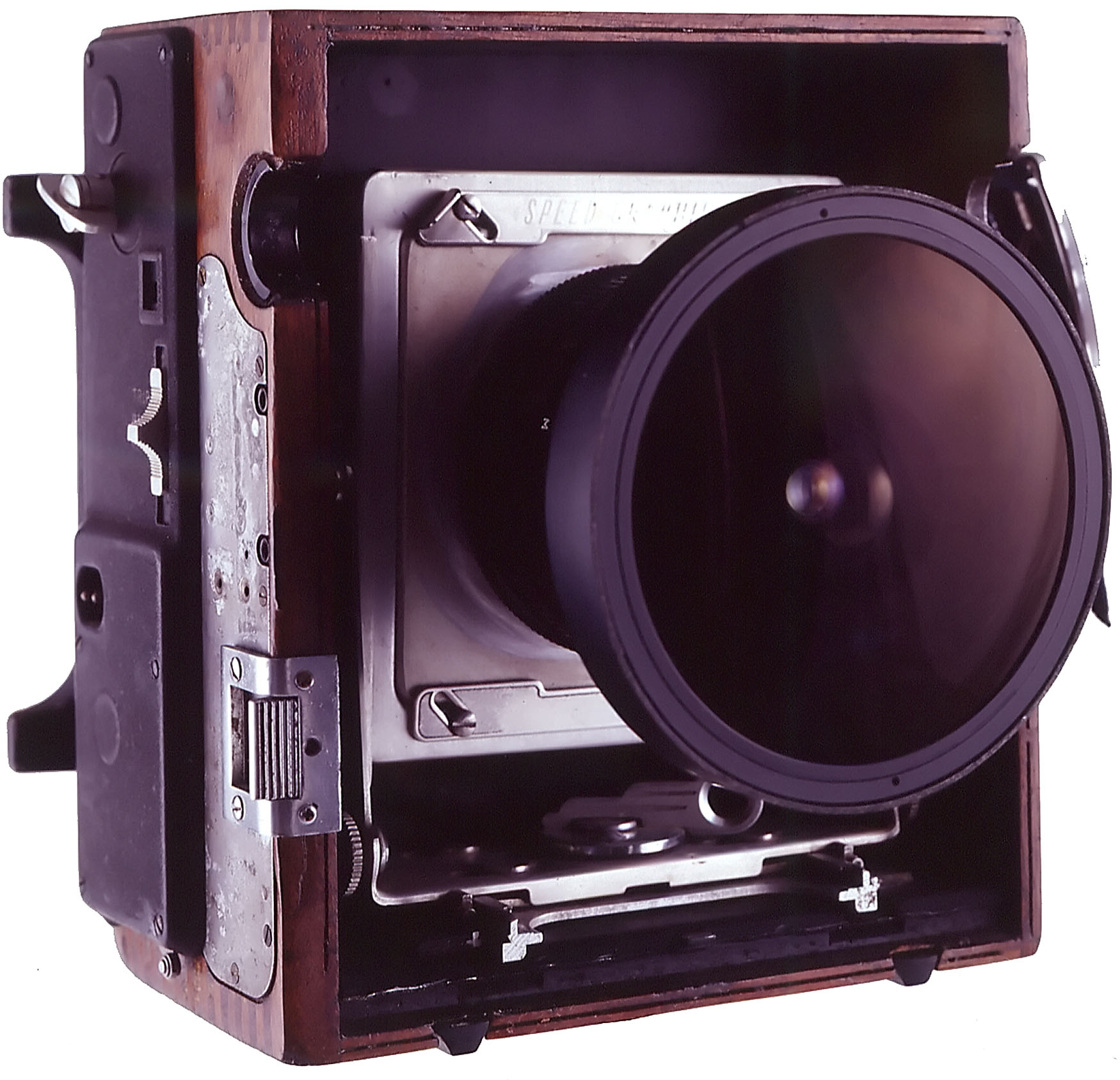
Fisheye Camera
I should say that I didn’t build these cameras because you couldn’t get super wide lenses or fisheye lenses for 35mm cameras. I did it because the resolution of film was so poor. If you made an 8X image of shot like this from 35mm film the image would already show grain and a loss of detail. Because this shot uses at least 10 times more film than there would be with a 35mm shot the grain and detail are much better! I’ve made prints 24 inches wide that looked fabulous. You can use the PayPal link below to get a print that’s about 13 inches wide, on a black background. I normally mount and mat on white board, if you’d like something else let me know when you order the print. I’ll be adding more links as this project goes forward.
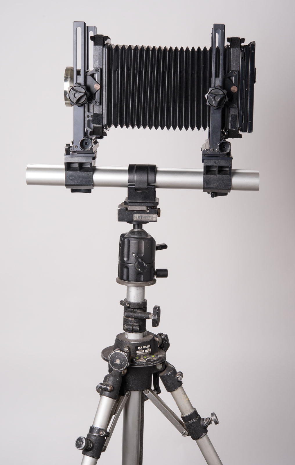
The camera started life as a Speed Graphic, a classic press camera. The lens is from a Russian Kiev 60 camera that shot 6X6 cm images. The lens made full frame (edge to edge) square fisheye images on the original camera. I modified the lens by removing the built in lens hood. Then I customized the Speed Graphic to take the Kiev lenses. I also had to remove the base board (front) of the camera so it wouldn’t show up in the shot. The camera was a junker when I began, with a very rough appearance. I took the leather off the outside of the camera and refinished the mahogany surface. On the whole, I think it is the best looking camera I ever built. The camera focuses using the ground glass or the focus scale on the lens. Speed Graphics have a built in focal plane shutter so that’s what the camera uses. You can see my article about camera building here.
I’ve attached a couple of the other images I made with the camera below. I hope to add posts and PayPal links for these images soon.
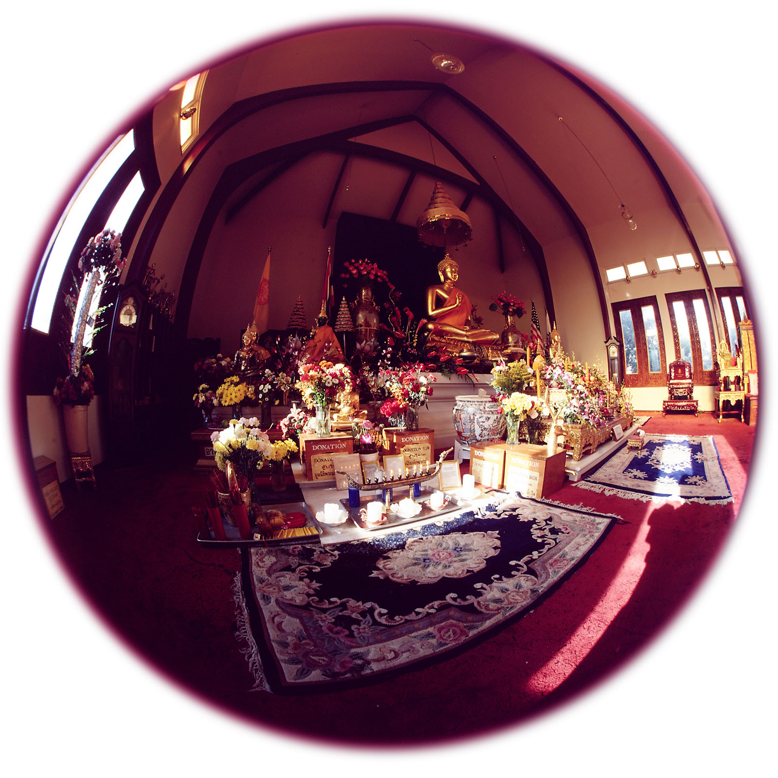
Wat Thai Temple, Los Angeles
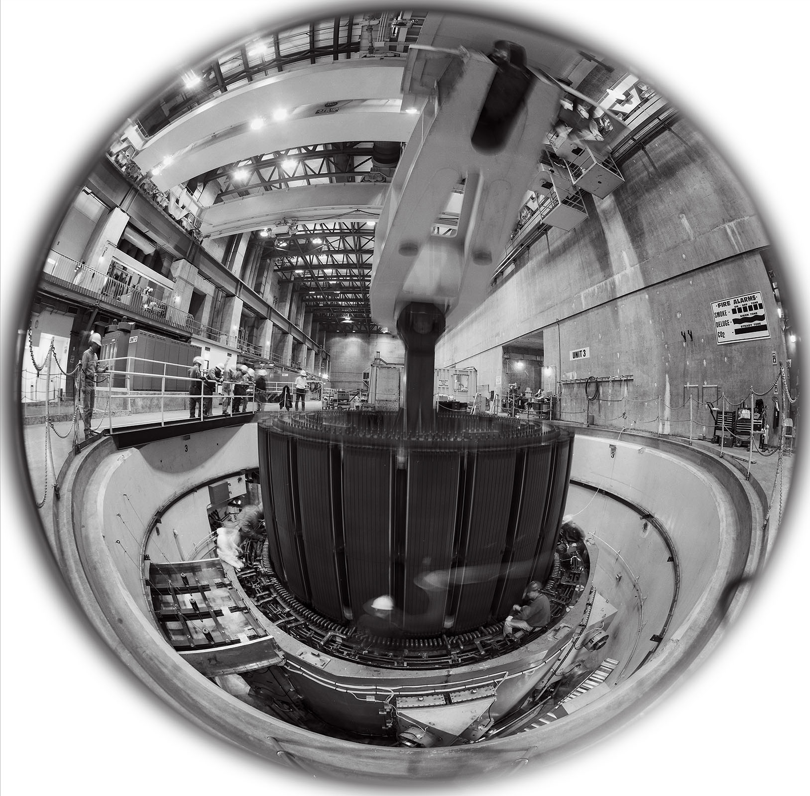
Castaic Power Plant-Pulling Rotor, California
I hope you’ll order a print of this image. As usual the price, $125, includes mounting and matting. The image will be about 1X13 inches. Please let me know about the mat at john@siskinphoto.com. Also contact me if you’d like the print shipped outside the United States. You can also get the image, and many others, in my book B-Four.
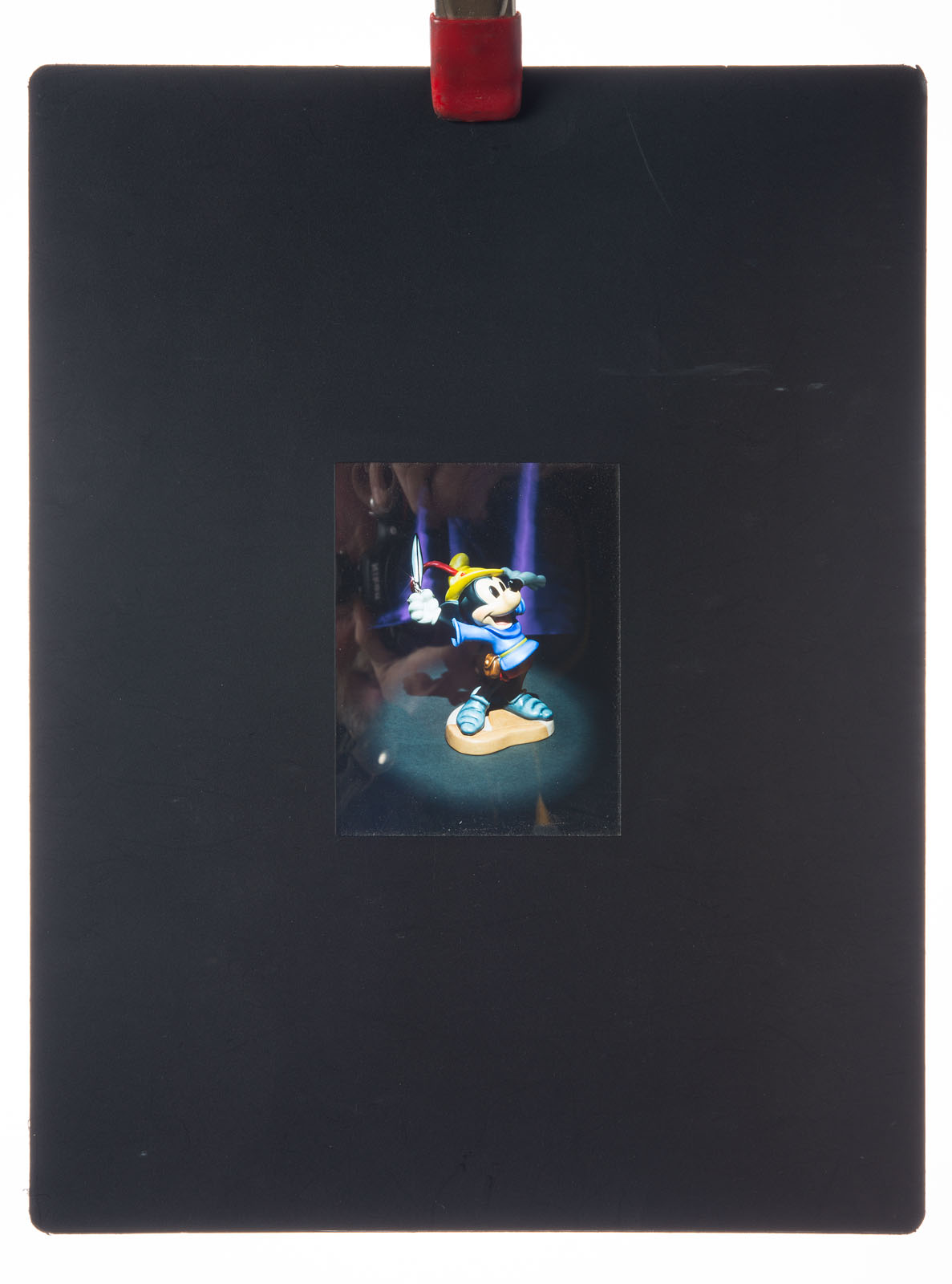
I’ve been stumbling through my archives as I prepare these posts and begin to put together the fine art pages for my website. Some of the images create an effect I like to call involuntary time travel; the pictures really take me back. I was surprised when I saw this image in my files. I though the original transparency was encapsulated in my portfolio. I used to get presentation pages made from my best shots that permanently held the transparencies. I thought the original was in one of these pages. The things looked great, if you happened to have a light box. It was a very effective way to present my portfolio, at the time anyway. For more information about portfolios you might want to check out my Portfolio Workshop. Anyway I found the original in my files, so this is a new scan. I really should consider more creative titles.
Encapsulated Portfolio Image, Mickey for Disney. Richard Duerrstein Art Director
I remember taking this image. I think I was with Richard Risemberg, in fact I think he pointed out this composition. I learned a lot from Richard: he helped develop my fascination with lenses. The shot was taken on my Omega View Camera, really a cheap Toyo. I know that because the image is cut off on the top because of the considerable camera movement used to keep the subject straight. I guess this image was made with my Fujinon 210, f5.6 lens. This was one of the first really modern view camera lenses I had. It’s also possible I shot it with a 210 Komura, f6.3 I got from Bernie Sayers. This was a four element lens and really the first good view camera lens I had. I think I gave that lens to Jeri Grover when I got the Fujinon. I told you this shot triggered a trip down memory lane. I guess the shot was made in the mid-eighties. I can’t tell you much about the technical details, but I do know it was made on Fuji Film.
My Toyo 4X5 Camera-about the same size as my original Omega. 121mm Super Angulon Lens.
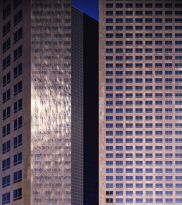
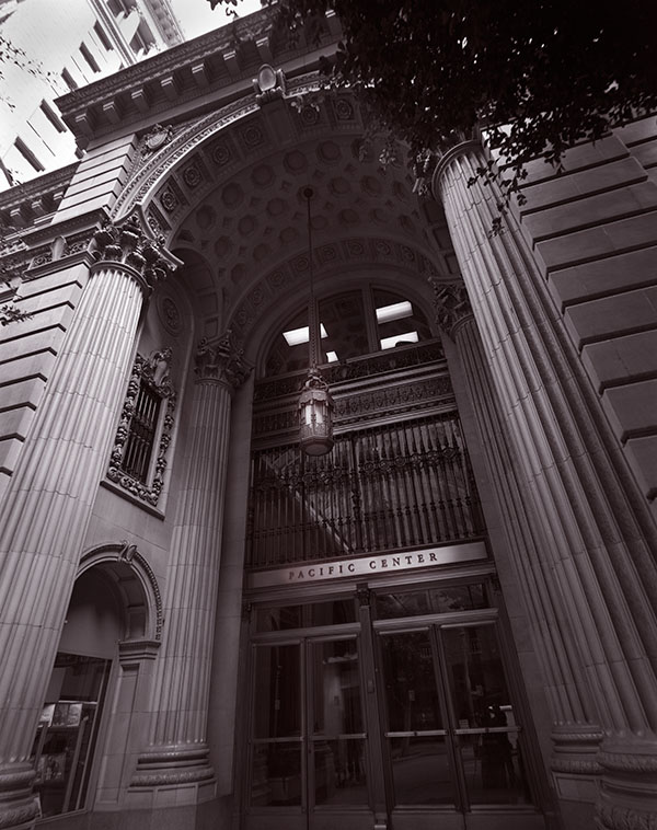
On one level this shot is sort of a basic straight view of a building detail, but what makes it special is the play of light and reflection in the buildings. Sometimes you get to make a special image just because you’re present and awake to the moment. Richard helped me learn that lesson here. I often talk about making images rather than just taking them, but sometimes you have the tools and subject at the same time, that’s good. In this case the camera was a 4X5 Toyo monorail camera, really a big camera. I haven’t used this camera for field work in many years; it was just too bulky. I’m glad I had it on this day because I couldn’t have made the same image with a Speed Graphic, they don’t have enough camera movements.
If you’d like to get a fine art print of Los Angeles, Downtown #1 you can click on the PayPal link below. The image will be almost 13 inches wide. It’s mounted and matted to 16X20 inches. The price, just $125, includes shipping in the United States. If you’d like to have me ship somewhere else, or order another size please contact me at john@siskinphoto.com.
Often the approach to an architectural image is to maintain a neutral perspective. So when you shoot the front of a building you try to keep the parallel lines in the subject parallel. When the lines come together, as they do in this shot, the effect is called key stoning. The thing is that often buildings are designed to impress, even intimidate, people. The neutral perspective tends to weaken or remove that effect. In this case I used my 65mm f8 Super Angulon, so that I could shoot close to the building. I did this for a couple of reasons, first I wanted to capture the imposing design of the entrance, and second I didn’t want to stand in the middle of the street. I used my Speed Graphic as the camera. Many people don’t know that the Speed will accommodate extreme wide angle lenses.
I’m not sure exactly when I shot this, but at least 20 years ago. Time flies when you’re making pictures. It’s always been a favorite of mine, in fact there’s a big print hanging in my office. One of the reasons I like this image so much is that I learned a lot printing it.
Photographers often talk about the zone system. This is a way of discussing the relationship between exposure, negative processing and final negative density. The system was first described by Ansel Adams and Fred Archer. One of the most important aspects of the system, and one that is often forgotten, is the way processing affects the contrast of the negative, and thus the final print. I mention this because one of the things I learned from this image is that even if you have a good negative, one that accurately reflects the tonal values of the subject, you may not be able to make a good print with normal printing processes. Black and white photographic paper comes in various contrast levels, from soft paper that has low contrast to hard paper that is very contrasty. The idea is that if you make a good negative you’ll be able to print it on a middle contrast paper. I learned that this isn’t always true when I tried to print this negative. While a print on middle grade paper showed all the tones of the negative, it was flat and not really effective. When I printed the image on a higher contrast paper the middle tones of the print looked much better, but much of the shadows and highlights were to far gone to see. In order to make a good print I needed to use high contrast paper and do considerable dodging and burning to maintain the highlights and shadows. Even when photographers shot film there was a lot of work done after you tripped the shutter.
Many of my images were first scanned quite a few years ago, so when I wanted to add this image to the fine art section of my site and blog, I went back to the original negative. Once again I had to do a lot of work to get the original scan to agree with the way I wanted to see the final print. I used several layers to change the contrast and exposure values in different areas of the image. I’ve learned a lot about working with an image in Photoshop over the years. For this image I choose a different color pallet from the one I normally use for black and white images. I usually add a little red to the shadows and some yellow to the mid tones. This creates a similar effect to the warm tone photo papers I used to use. In this case I added some red to the shadows, but I added a very small amount of blue top the mid tones. This creates an effect like a cold toned paper toned with selenium, which was the way I handled the original printed version of this image.
If you’d like to get a fine art print of this image you can click on the PayPal link below. As I’ve mentioned I hope to add alternative presentations of my images as I continue to review my fine art images. The current prints are almost 13 inches wide. They’ll be mounted and matted to 16X20 inches. The price, just $125, includes shipping in the United States. If you’d like to have me ship somewhere else, or order another size please contact me at john@siskinphoto.com.